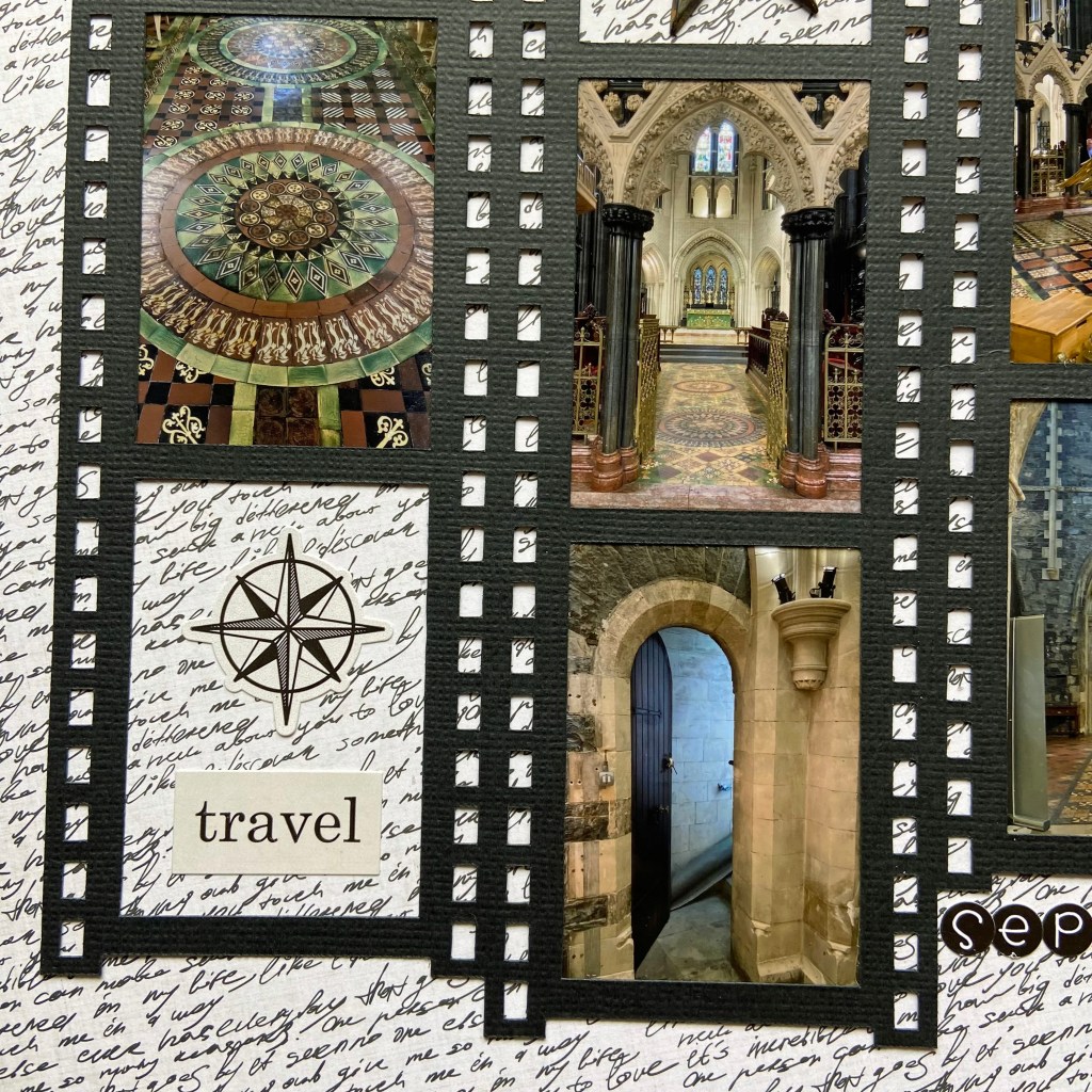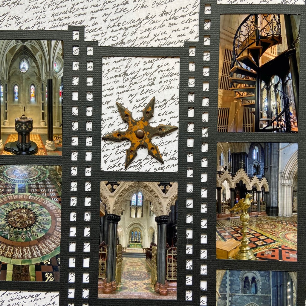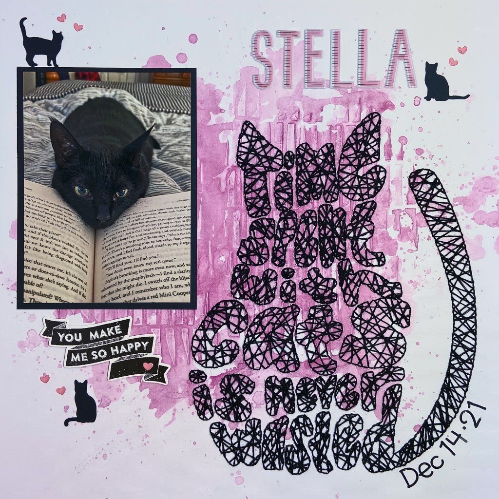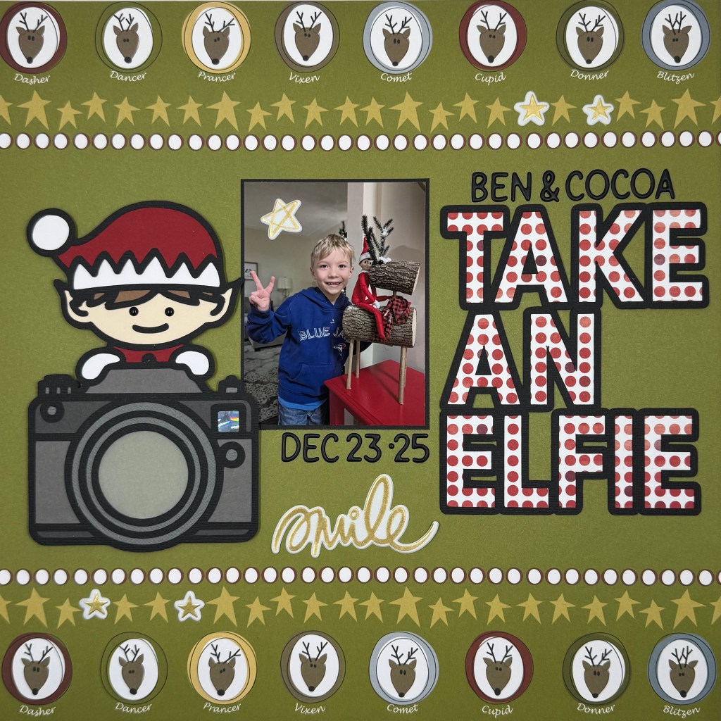
Happy New Year, my scrappy friends! I hope your Christmas was full of love, laughter, and wonderful memories. We were very fortunate to have our entire family home for the holidays this year! A rare treat, and we enjoyed every moment together. Christmas is extra special when you have a family member who still believes in Santa. It makes every day special and Christmas Eve and Christmas Day magical! Our youngest Grandson still believes in Santa Claus and the magic of his Elf on a Shelf, Cocoa. This year, my daughter took a cute picture of the two just before Christmas. Ben was so excited to count down the days as Christmas approached.

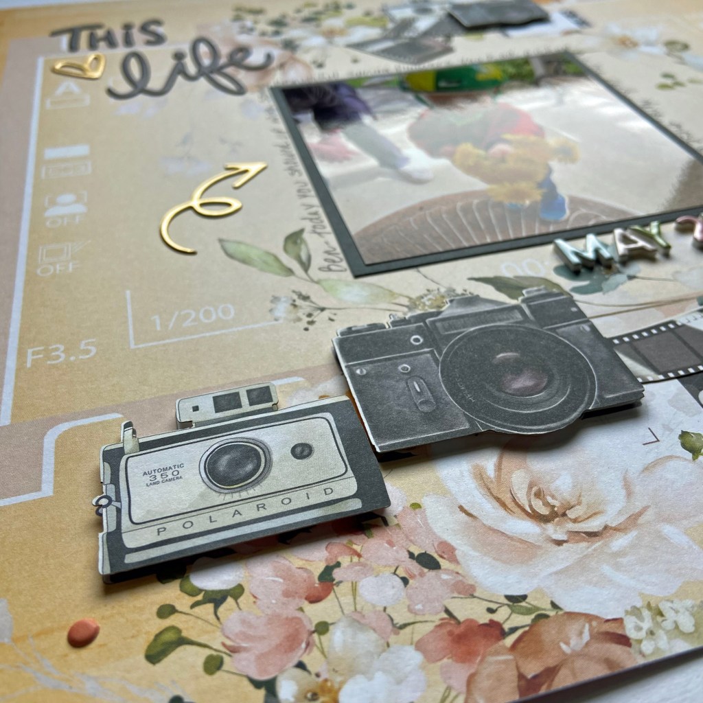
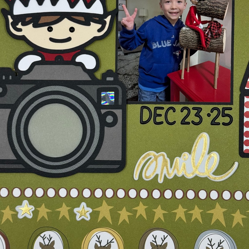
I dug deep into my patterned paper stash to find this background paper from 3bugsinarug, entitled Reindeer Games. Peartree Cutfiles had the perfect cut file to document this special picture. The Take An Elfie cut file contains two cut files: the title and the elf with a camera. I chose to back the elf and the camera with multiple coloured cardstock pieces, used vellum for the camera lens, and the Holographic 2.0 paper from Lawn Fawn for the camera’s flash. I find working with small paper pieces like the eyes in the elf quite tedious, so I opted to use Concord & 9th’s black enamel dots instead. Next, I backed the Take An Elfie title with patterned paper from BoBunny entitled Mistletoe. This patterned paper has also been in my Christmas collection for several years.
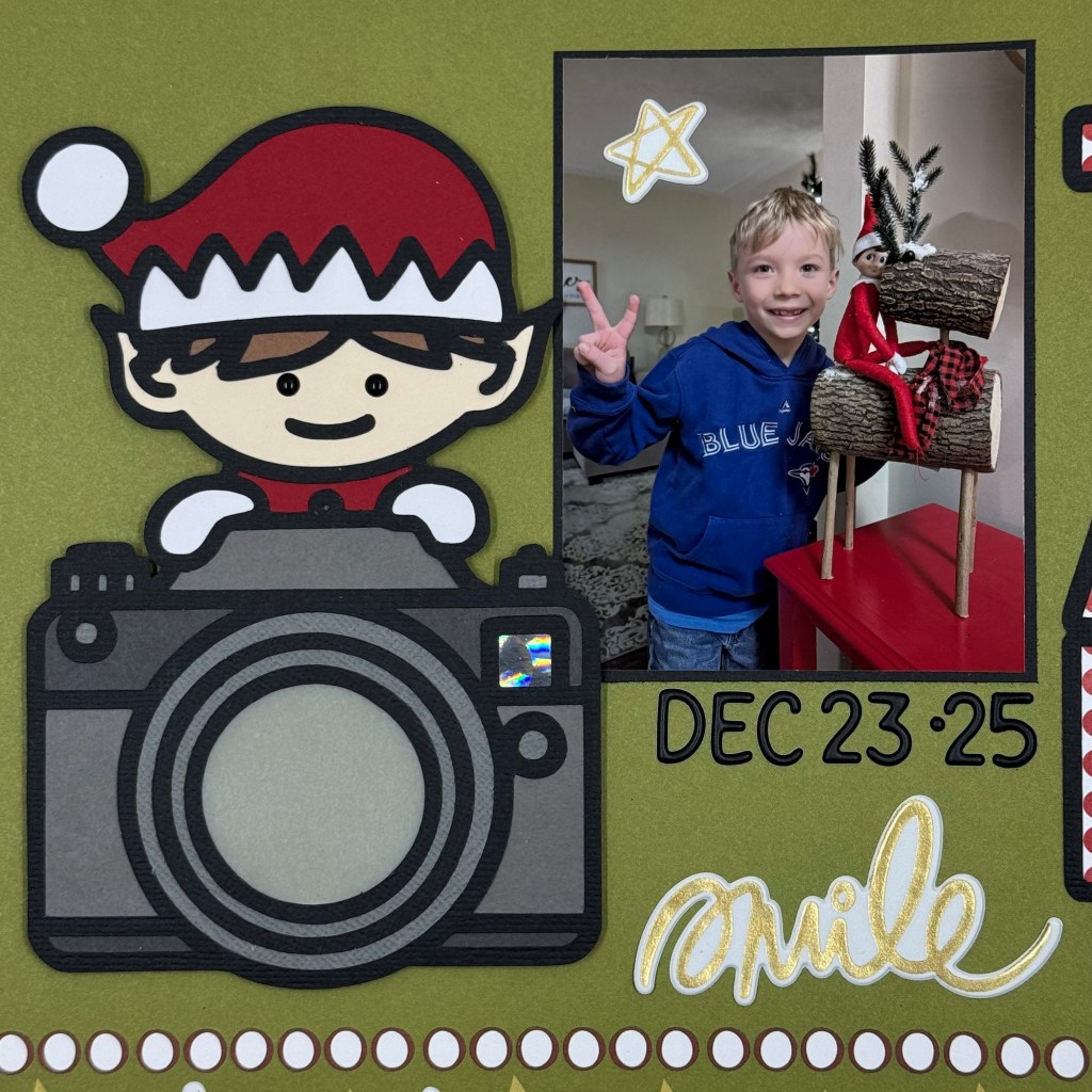
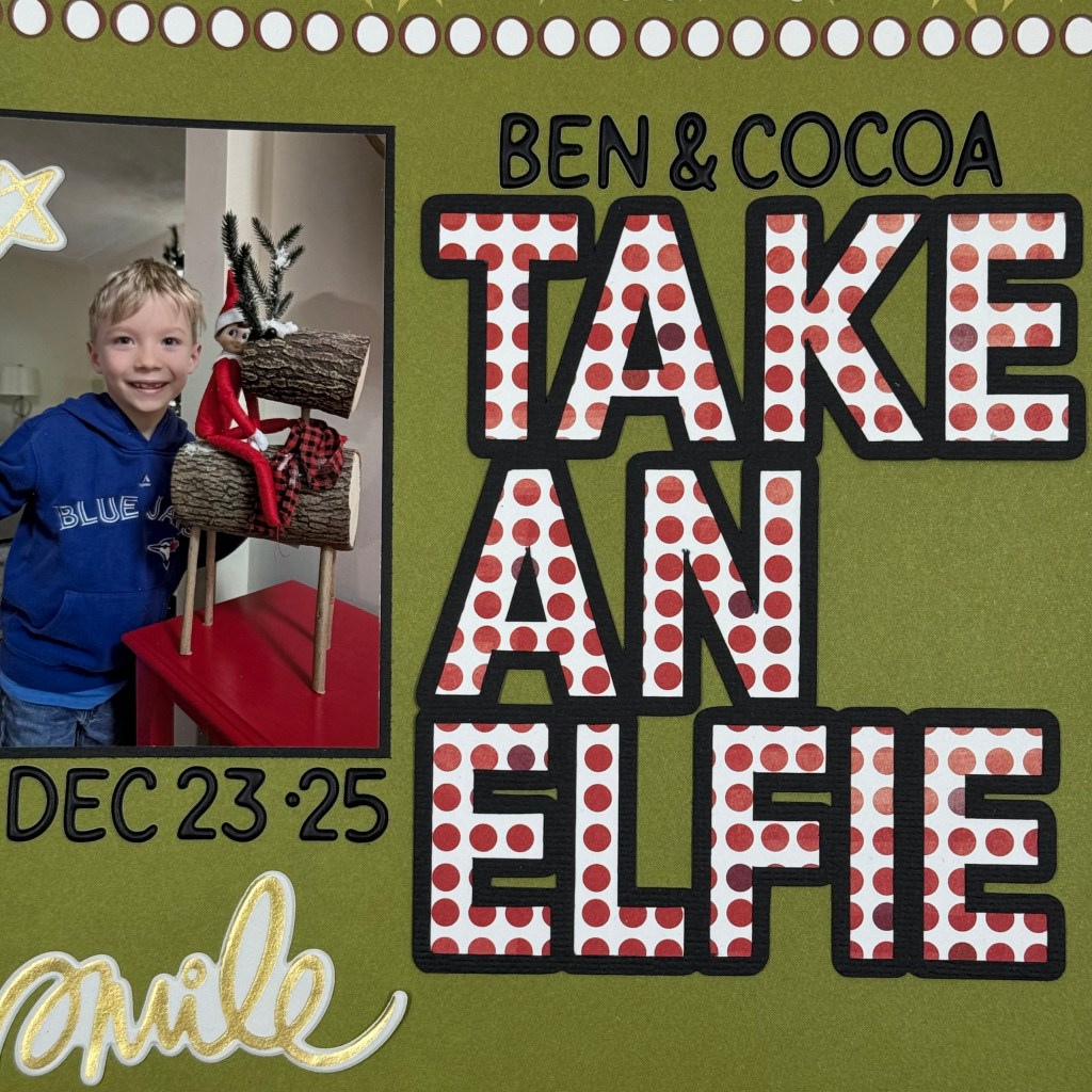
To complete the layout, I adhered the two cut files on either side of the picture. The elf and the camera were adhered using double-sided adhesive foam tape. I did not adhere the foam tape to the back of the vellum lens. I used Doodlebug Designs Black Alphabet Soup Puffy Stickers to add the names and date to the layout. And finally, I added some gold accents to the page using Vicki Boutin’s Thickers from her Print Shop and Warm Wishes collections.
And that’s a wrap on my first Christmas layout for 2025. Thanks for popping in today. Until next time, stay safe, stay well, and Happy Scrapping!