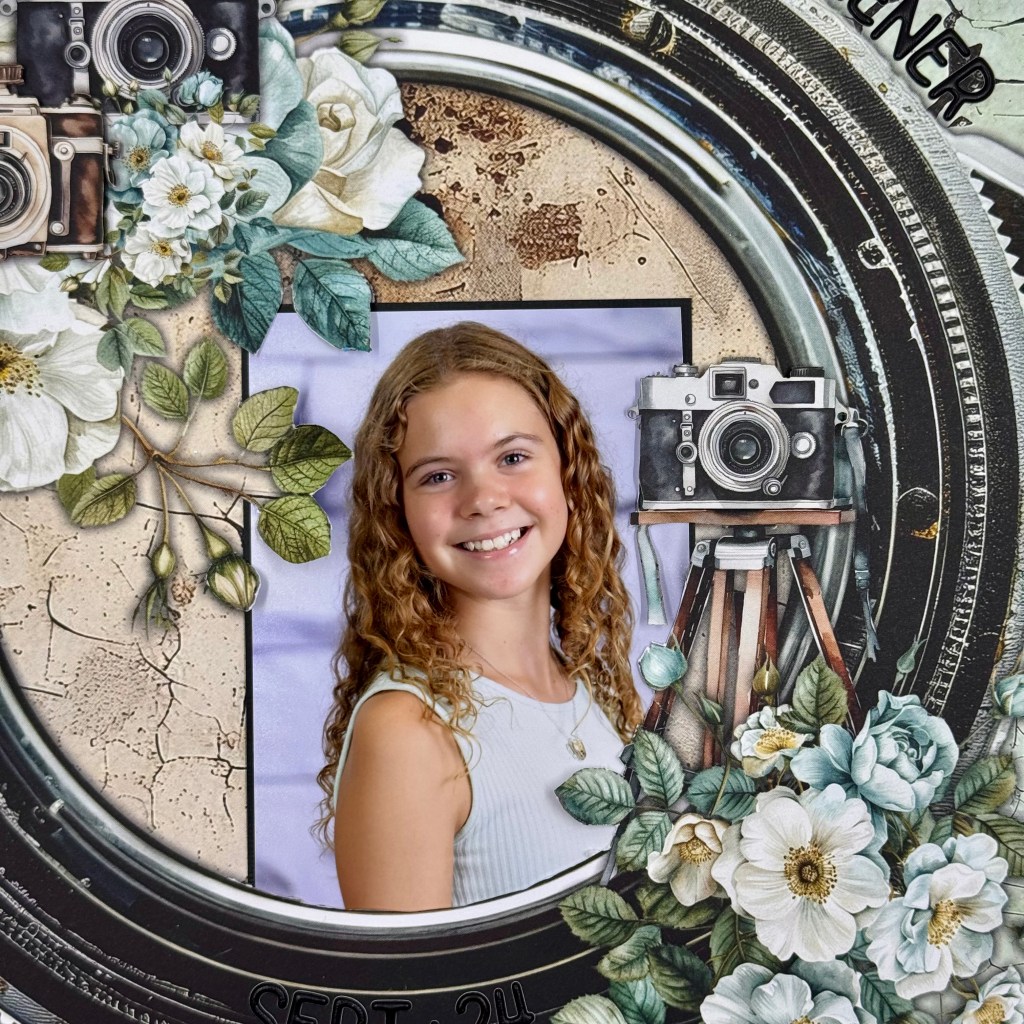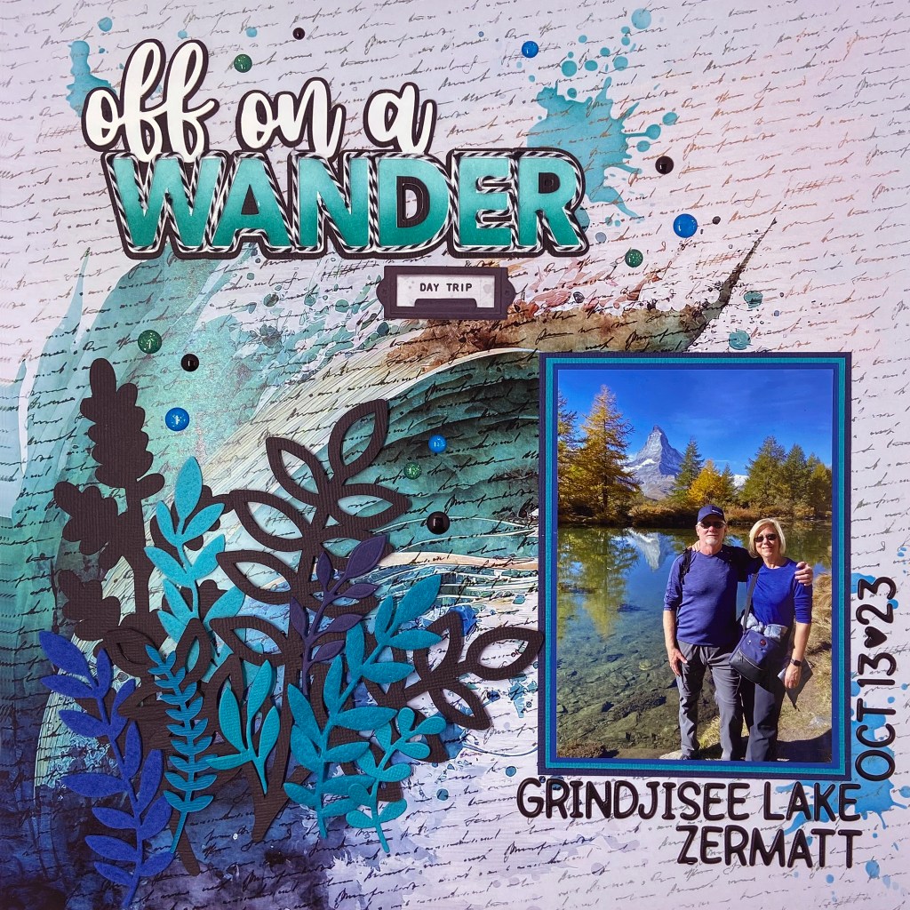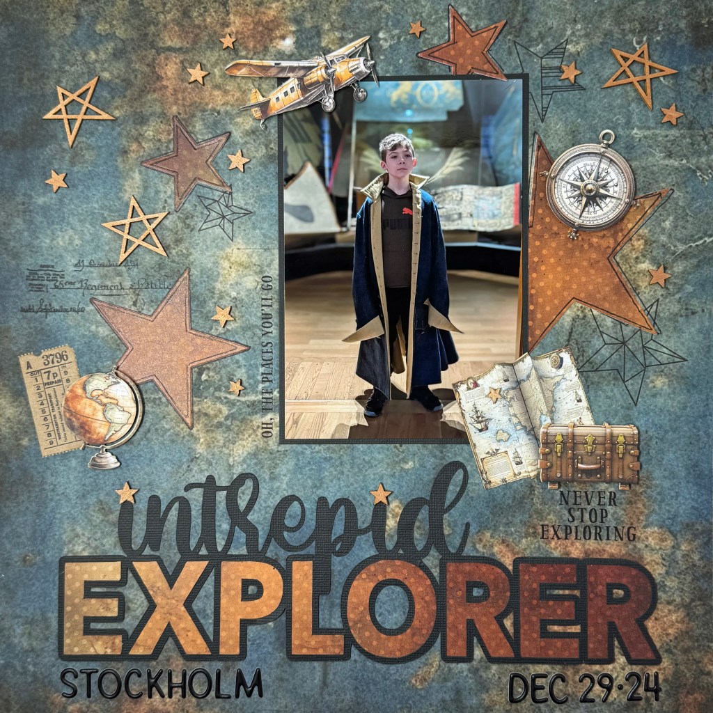
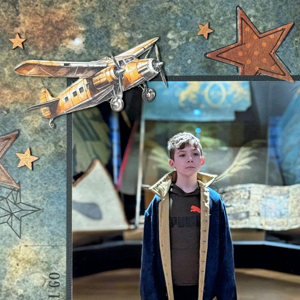
My oldest grandson, Owen, has a keen interest in history. During the Christmas holidays, his family traveled to Stockholm, Sweden, and visited the exhibits at the Armémuseum (Swedish Army Museum). Owen enjoys getting immersed in the events he’s learning about. I love this picture of him wearing an old army coat from the exhibit. This picture inspired me to create a layout to celebrate his love of history and discovery.

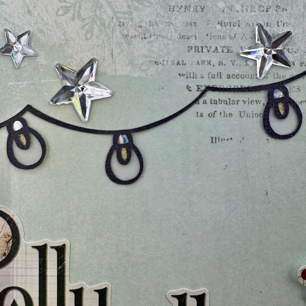
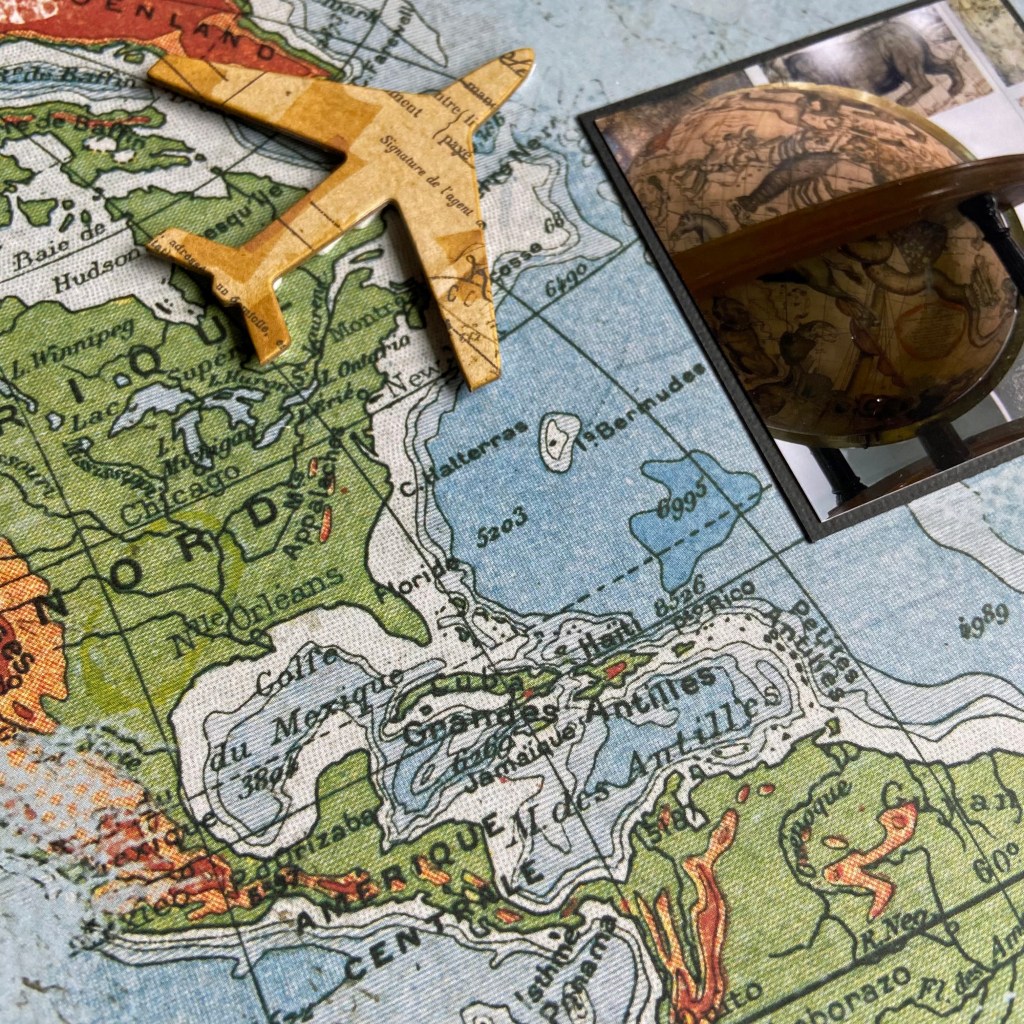
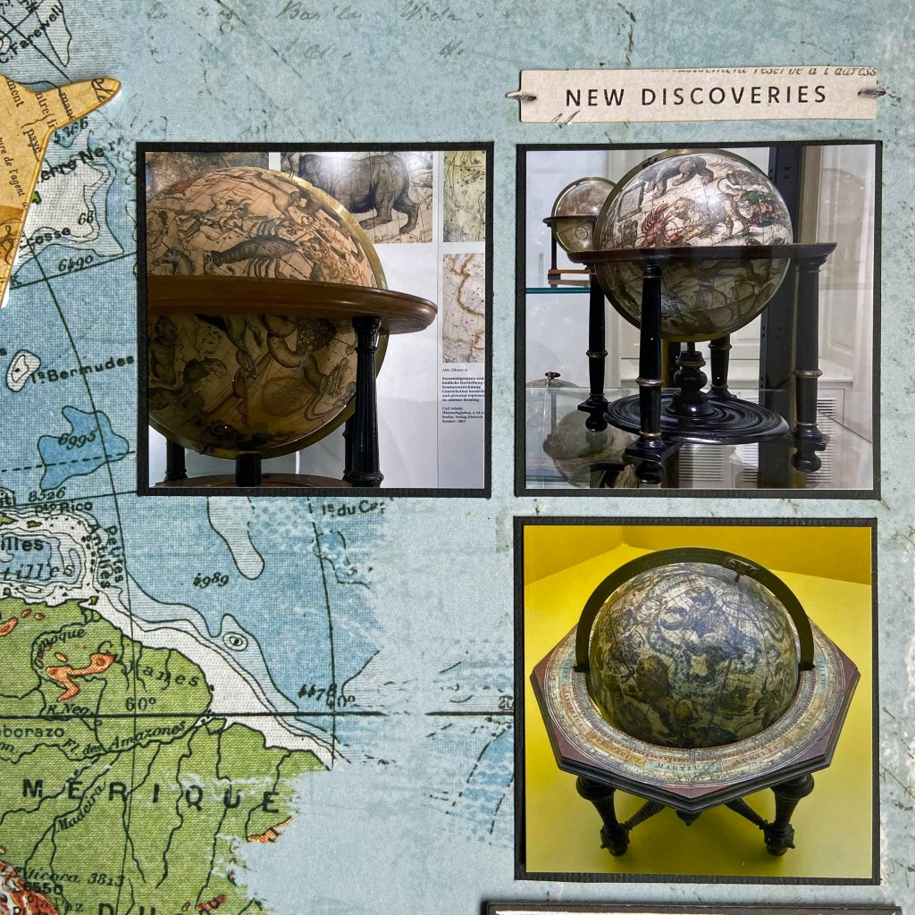
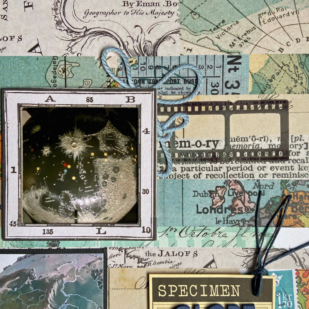
I enjoyed creating this layout and drew on ten brands for the final product. Unfortunately, some of the products used have been in my scrapbook stash for years and are no longer available for purchase. The Intrepid Explorer cut file for this layout came from Peartree Cutfiles. I cut it from black Bazzill cardstock and partnered it with rusty patterned paper from 49 and Market’s Rust and Revs collection. The beautiful rusty patterned paper helped highlight the rust in the base paper. This background paper belongs to Mintay Paper’s Traveller collection. When I buy a collection, I often purchase the smaller add-on paper packs, which are handy for backing cut files or cutting additional items without wasting the large 12″ x 12″ designs. In this case, the rusty, dotted patterned paper had a slightly smaller and more variegated pattern. I loved the effect it brought to the layout. I also used a nested star die set from Sizzix to cut several star shapes from this patterned paper. The stars had slightly beveled edges, which I highlighted with a thin black Sharpie marker.
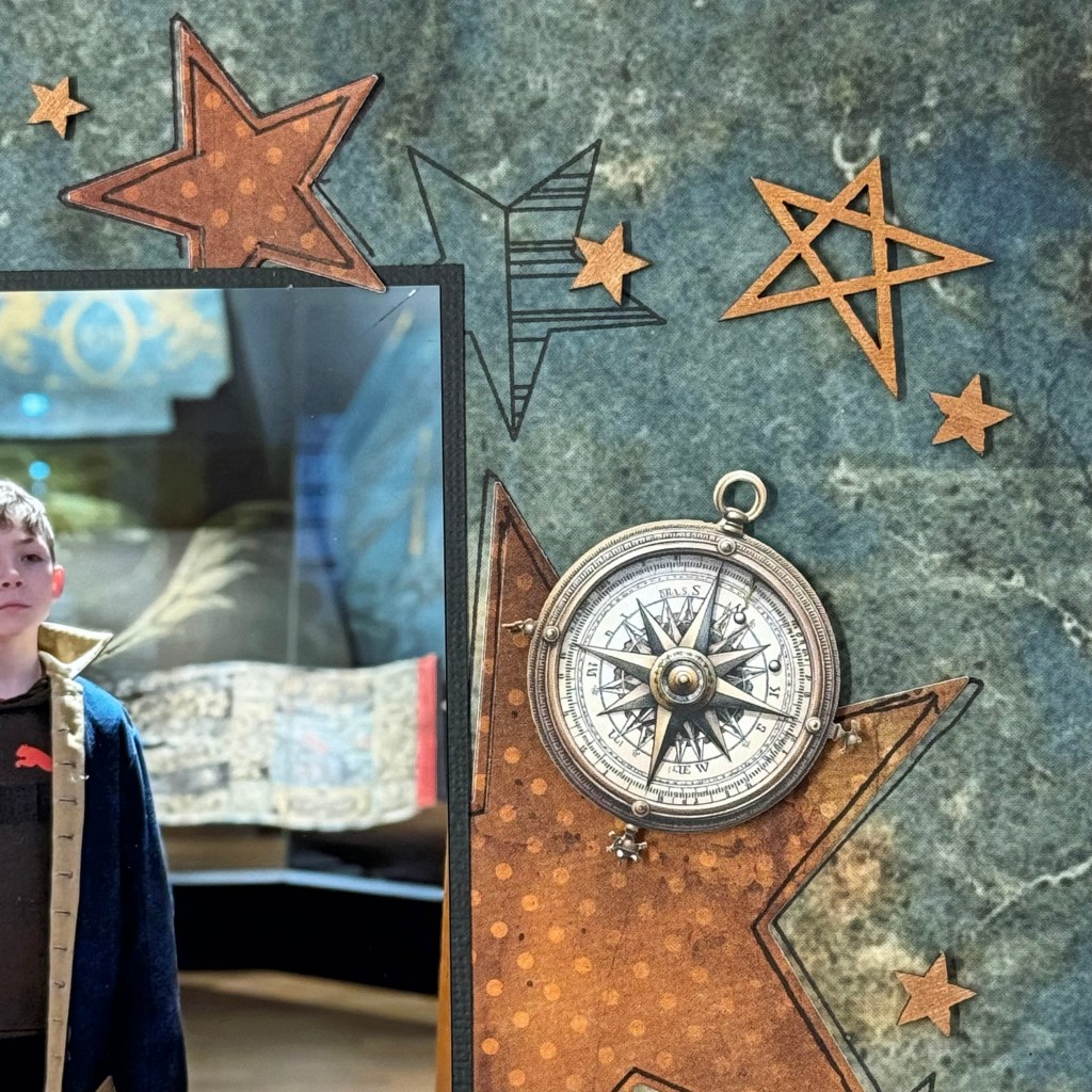

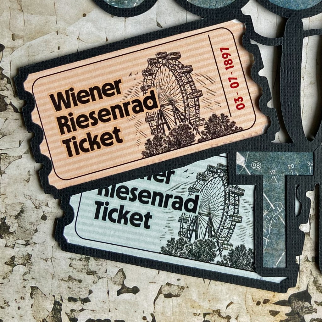
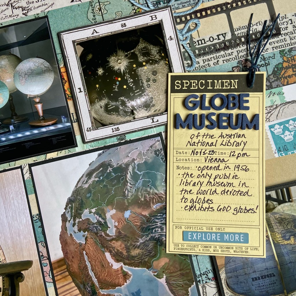
I stamped several different star images from the My Favorite Things, Stars Above stamp set to give the layout more depth and texture. This stamp set is an older release and is no longer available. The script stamp came from a 7 Gypsies stamp set called Avignon and is also no longer available. The wood veneer stars are also vintage and came from Studio Calico. I sprayed them with Tim Holtz’s Rusty Hinge Distress SPRITZ to highlight the background paper’s rusty tones. As seen behind the globe, the ticket came from 49 and Market’s Ticket Essentials pack (Color Swatch Toast).

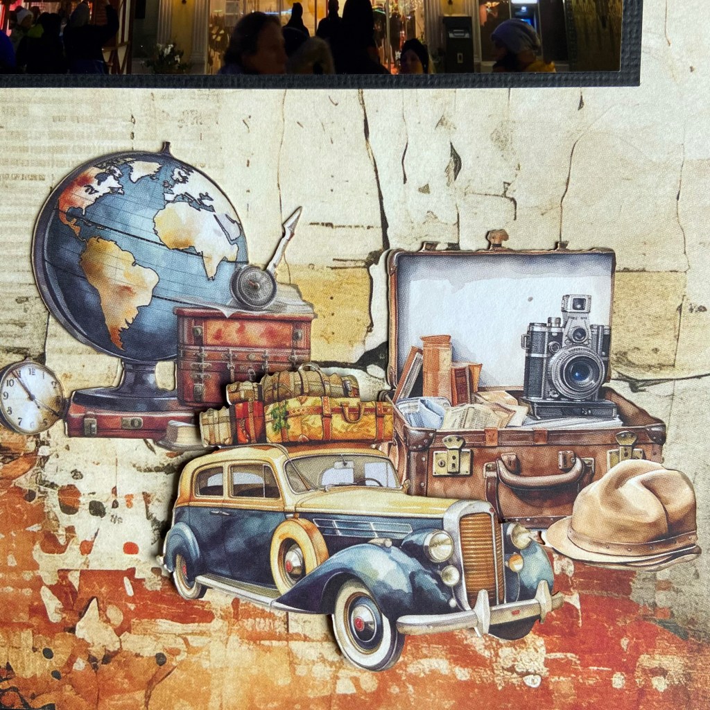
The phrases on the layout, “Never Stop Exploring” and “Oh, The Places You Will Go,” are rub-ons from the 49 and Market Wherever Ride Rub-on Transfer set. The detailed travel theme ephemera belongs to the coordinating Traveller paper die-cut package by Mintay Papers. I placed fun foam and pop dots behind some of the ephemera pieces to give the layout additional dimension. I added the location and date below the title to complete the design using Doodlebug Designs Alphabet Soup Puffy Stickers in beetle black.
I am happy with the final layout and its overall look and feel. I hope my grandson’s interest in history grows and he continues to learn and discover more about those who paved the way for us today. Thanks for stopping in today, and until next time, stay safe, stay well, and Happy Scrapping!