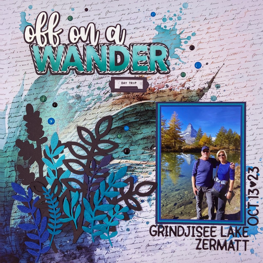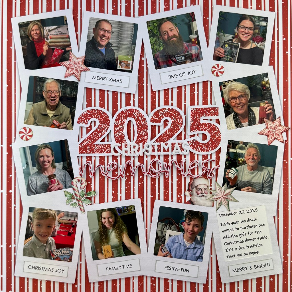
I love the family time we get during the Christmas season when everyone has a chance to slow down and have fun together. This year was an exceptionally fun Christmas, as our entire family was together for the first time in 3.5 years. We made the most of every moment together. Game playing was the main activity, followed very closely by eating! Every day was full of laughter and love, and I am still smiling from the great memories we had together. It was important to me to document these fun days and the traditions that we carry on.
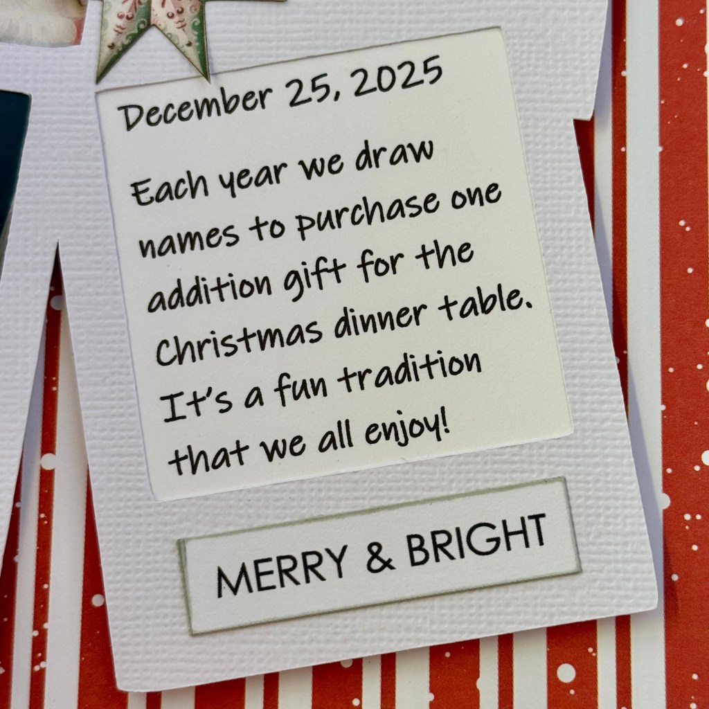
One tradition everyone loves is our small gift exchange just before we eat our Christmas dinner. We draw names for these gifts ahead of time and purchase gifts no higher than $20 for this exchange. The recipient has no idea who purchased their gift, and to complicate it further, we wound ribbons from the packages to each designated seat at the Christmas table. This way, you can’t easily identify your gift when you sit down. We take turns, one by one, pulling our ribbons to find out which gift is ours. It is fun to watch everyone open their small gifts individually. This year, I documented this fun tradition. I think my grandchildren will get a kick looking back at this page as the years go by!
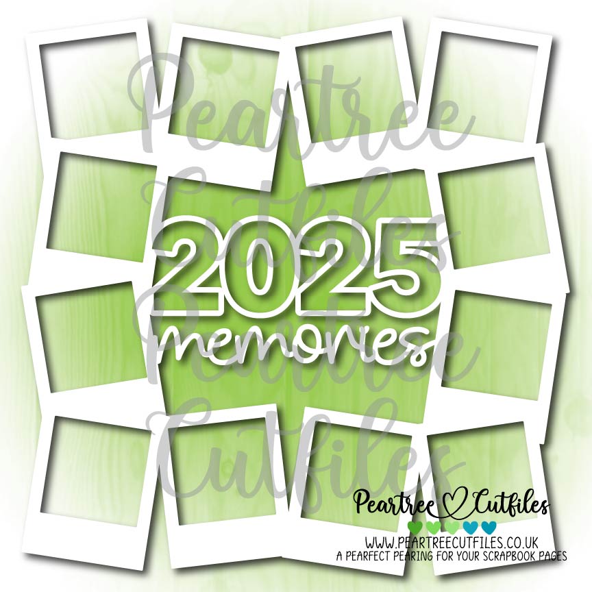
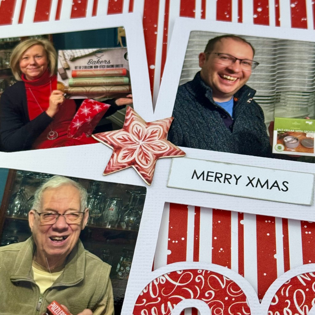
Peartree Cutfiles had an excellent cut file to help me document this tradition. It is called the 2025 Memories Frame. The photo frames around the title were precisely what I needed to capture a picture of everyone around the table, leaving one frame for my journaling. After choosing the pictures to include, I cropped each to fit the photo frames. These frames remind me of the years my parents took pictures at Christmas with the older Polaroid cameras!
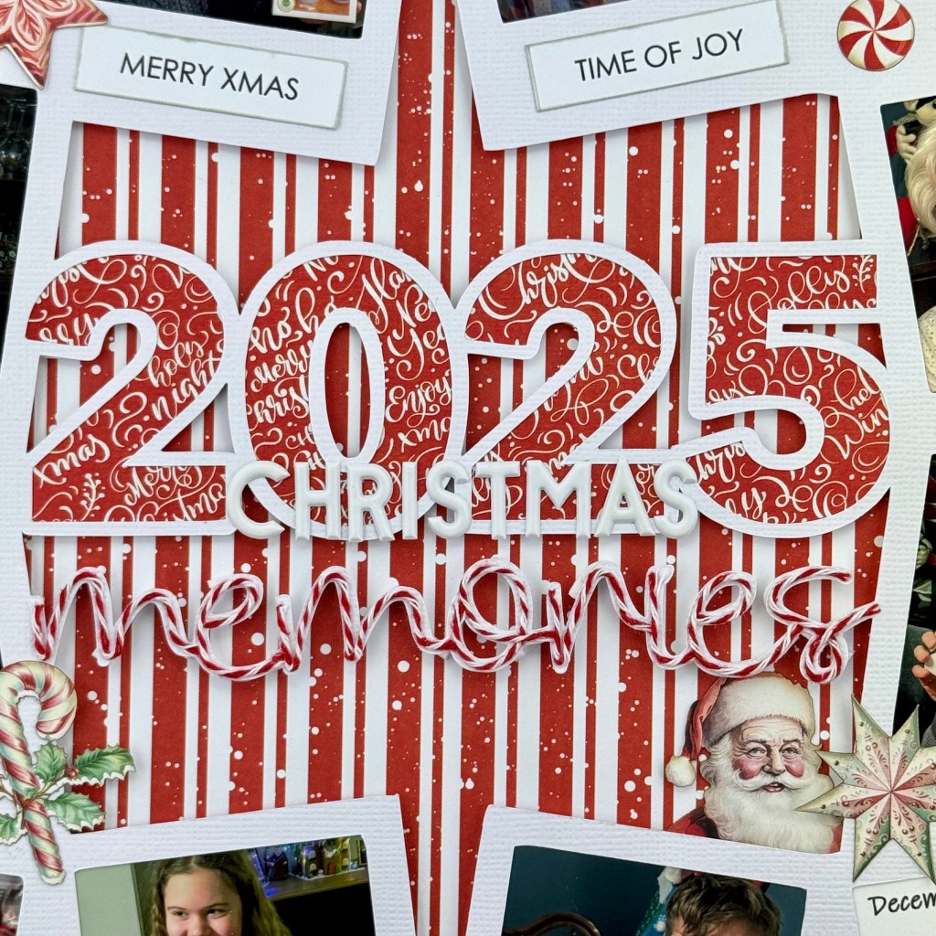
I chose coordinating paper from Mintay Papers Merry & Joy collection for the background and to back the title numbers. To enhance the red-and-white theme, I added Recollections red-and-white twine to the word ‘memories‘. The process to add the twine is easier than it looks. I used liquid glue and worked in sections, moving across the word until it was complete. The twine sticks very well to the cardstock using this method. After completing these steps, I decided I wasn’t happy with the cut file lying directly on the background paper. So I took the time to add dimensional fun foam to the back of the cut file. I used Foam Sticky Strips from Taylored Expressions to add the dimension to the back of the scripted word memories. This process did take some time, as I cut each strip in half lengthwise to keep it hidden from the viewer. Once the entire cut file was adhered to the background paper, I applied the word Christmas to the bottom of the 2025 numbers using PinkFresh Studios white Simple & Sweet puffy alpha stickers.

The final touches to this layout included adding bits and pieces of ephemera from the Merry & Joy Die Cuts package, and adhering phrases cut from Mintay’s Christmas phrase sheet. My favourite ephemera is Santa peaking out of the inside corner of the cut file, just above the journaling!
Thanks for stopping in once again. I hope you’ve found some inspiration in my design today. Until next time, stay safe, stay well, and Happy Scrapping!