Tour – Salzburg

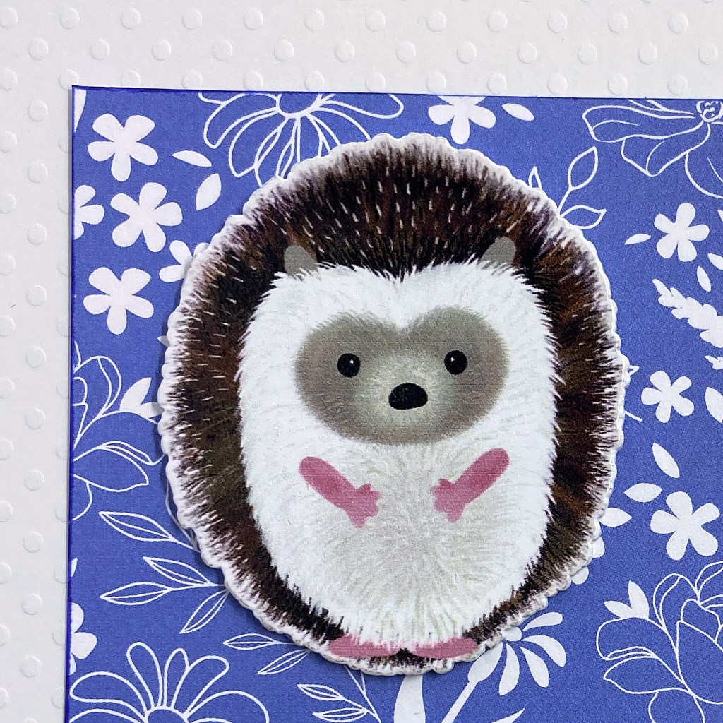
I’ve been having so much fun creating these past two months! Today’s layout focuses on a photo my husband took in Salzburg, Austria. Although it wasn’t one of the best weather days on our trip, the colours and perspective in this photo instantly take me back to that moment every time I look at it. Most of you would know Salzburg from the musical “The Sound of Music”. This magical city is full of breathtaking discoveries around every corner.

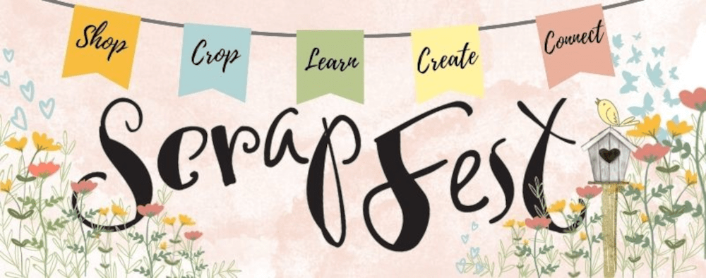
Before I describe the details of creating this layout, I must give a shout-out to Lisa Furtney, owner of ScrapFest. Lisa owns and operates this event-based business and hosts large and small face-to-face and virtual events throughout the year with her wonderful team. I am a member of ScrapFest Connect – a virtual membership group of fellow crafters on Facebook. ScrapFest Connect offers members several virtual events a year, plus they run a monthly challenge open to all members. I was honoured to be the March Challenge Winner this year, and I used products from my prize package to create this layout. I have plenty of leftover products from my prize package, so you can expect more designs using them. Thank you Lisa and Team for this beautiful prize package!

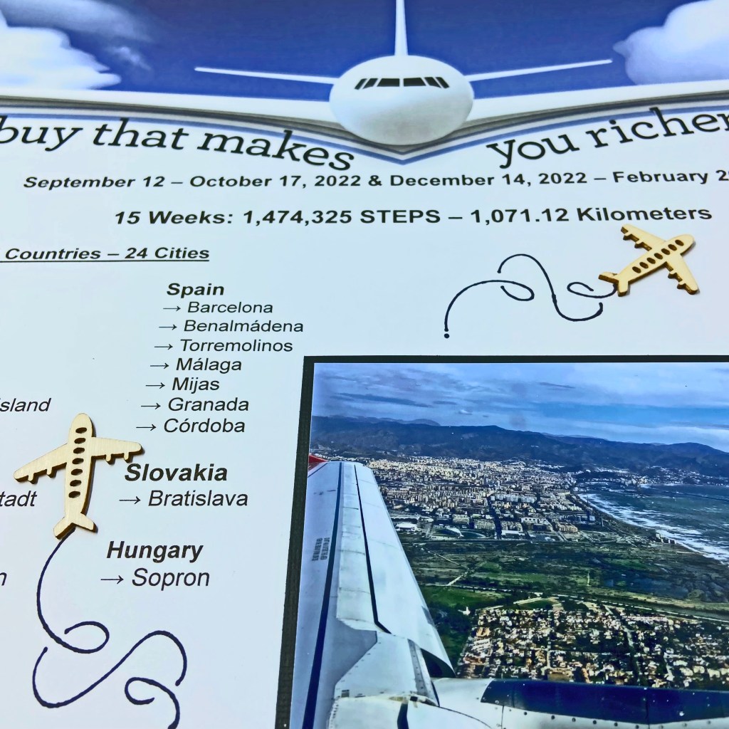
My prize pack included the 49 and Market 12′ x 12′ Paper Collection Pack of Vintage Artistry Everywhere and several coordinating embellishments, including the Chipboard Set, Laser Cut Elements, Epoxy Coat Sticker Embellishments and Tag Set. Absolutely perfect for all the pictures we took on our recent travels overseas! I chose the back side of the Great Big World patterned paper for the background of this layout. Each patterned paper comes with a strip at the bottom that provides details on the brand and name of the paper. In this case, the back side of this strip had a coordinating row of tickets. I decided to keep this element in my layout and therefore trimmed off the top part of the patterned paper to fit the 12″ x 12″ layout.

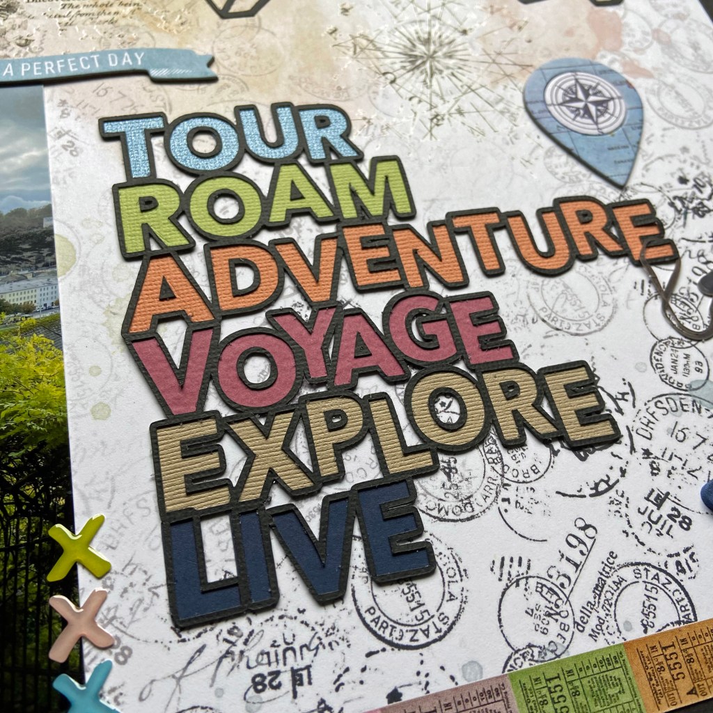
I used two cut files to create this layout. The first cut file comes from Peartree Cutfiles and is entitled Travel Words. I find it very helpful to use the software in Silhouette Studio to size all my files and pictures before cutting or printing. For this layout, the cut file was reduced considerably to fit the space. I backed each word with a coordinating piece of cardstock to complete the title.

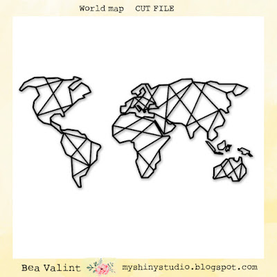
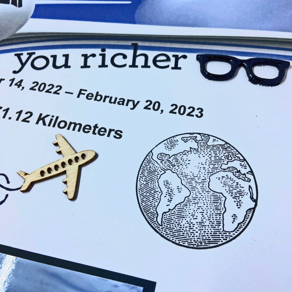
The second cut file comes from Bea Valint at My Shiny Studio and is appropriately titled World Map. Bea’s file is a free download from her blog. To replicate a perfect alignment of the cut file on my page, I cut the outline of the cut file from a 12″ x 12″ piece of vellum. The vellum was then positioned over the patterned paper and used as a template to secure the cut file in place.

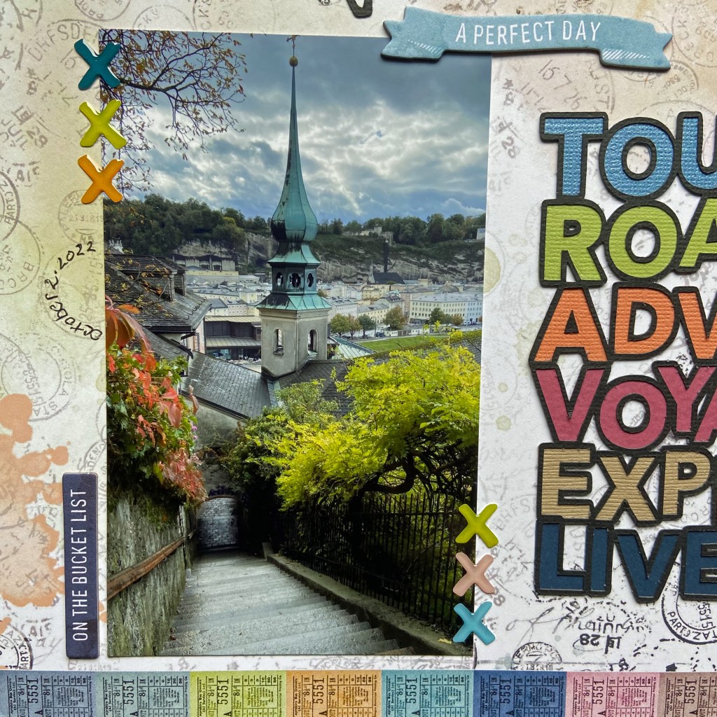
To complete the design, I added some epoxy coat sticker embellishments on either side of the photo, and the geotag with the “Right Here” bauble to the world map to indicate Austria. Two rubons were added to the centre of the layout for added depth and texture. The large blue geotag, “On the Bucket List” and “A Perfect Day” banners were utilized from the Chipboard Set. The final embellishment is the set of binoculars that hang off the end of the word Adventure. These were found in the Laser Cut Elements package. The location of the photo was added using Thickers “Happy Life” foam stickers. And last, but not least, I included the date by writing it on the inside of one of the date stamps on the patterned paper. It can be found to the left of the photo.

Thanks for stopping by, and I hope I’ve inspired you to scrapbook a few of your own travel pictures. Until next time, stay safe, stay well, and Happy Scrapping!

Travel

Travel is the only thing you buy that makes you richer. I couldn’t agree more with this statement!

Hello Friends! I’ve been absent from my blog for quite some time for good reason. Last August, my daughter and her family of 5 moved to Austria on a 3-year contract. Incredible changes for all of us, but BIG OPPORTUNITIES as well! Over the fall and winter, my husband and I have travelled twice to Austria to visit with our family and explore Europe. We feel fortunate to have the opportunity to do so, and the next trip is well underway in the planning stages.

It feels good to be back in my scrapbook room creating again, and this layout seemed the logical place to start sharing with you. It was inspired by my Aunt who asked “Do you know how many steps you’re taking on these journeys?” That question got me thinking, and when I was back home I sat down with an excel spreadsheet and my fitness tracker to figure it out. We were constantly on the go, taking advantage of every day and opportunity while we were overseas. However, I had no idea we had logged over 1,000 kilometres and almost 1 & 1/2 million steps! Of course, I had to scrapbook this accomplishment and include the beautiful places we visited during our travels.

I turned to the Designs by Reminisce collection called Take Flight to create this layout. The specific paper is called “In the Clouds“. I love how the plane’s wings stretch across the whole page, and I knew I could fill in the white space below with lots of trip details. I turned to Microsoft Word and my Canon PRO-100 to print these details directly onto the 12″ x 12″ patterned paper. Before taking this step, I printed a draft copy onto a 12″ x 12” piece of vellum, and overlay it on the patterned paper to ensure everything fit within the space available. This process allowed me to make any adjustments required without wasting the beautiful patterned paper.

Once the picture was in place, small wooden airplanes were added to emphasize that we made multiple trips during our stay. These wooden airplanes were a Dollar Store purchase. The tails on the planes were traced with a thin Sharpie Marker by utilizing the Mini Swirls & Dots stencil from The Crafters Workshop. I have owned this stencil for well over 10 years, and I don’t believe it is still available.

The globe was stamped using my 12″ by 12″ Memory MISTI. This stamp comes from a travel collection called Road Trip by Recollections and was purchased at Michaels. The sunglasses are a small wooden embellishment also purchased at the Dollar Store. They were sprayed black and then covered with Ranger’s Glossy Accents to help them stand out and look more authentic. The title phrase was added using my type cardstock stickers from Doodlebug Designs Inc., and Malaga (found below the picture) was added using black Alphabet Soup Puffy Stickers, also from Doodlebug.

I hope you’ve enjoyed my first travel post. I look forward to sharing more of our travels and our family’s adventures overseas soon. Until next time, stay safe, stay well and Happy Scrapping!

Corn Maze

Last fall Lindsay, Bill and I had the opportunity to take Ben to the Apple Land Station Corn Maze. This outing was a big deal – Covid restrictions meant this sweet boy had missed out on many fun activities in his early years. It was a perfect autumn day to experience this with him, and Ben loved it! It didn’t take Ben long to figure out the maze, but he had fun pretending that he was confused and didn’t know the way back out. I love how this layout captures the sheer joy of being a child and the precious memories we shared that we will cherish for a lifetime.

To create this double-page layout I combined two cut files from the Silhouette Design Store. I started with the Fun Maze Game, Design ID #8489 and used my Silhouette design space to blow it up as large as possible to fit on this layout. The end result was a cut file approximately 11″ x 13 “. I then laid the maze on the white cardstock to determine the best positioning to cut it vertically. Once the maze was secured to the background of both pages, I used sticky notes to map out the path of the machine stitching to mimic physically walking through the maze. 

Next, I cut two corn stalks from three coordinating pieces of beige cardstock to create a frame for the layout. This cut file is called Corn Stalk and is Design ID #12866. Each completed corn stalk was firmly secured at the bottom, but the tops were left free to provide texture and the illusion of depth and movement. 

To put the finishing touches on this layout I used Cork Chipboard Thickers to add the Corn Maze title. I utilized my 12″ x 12″ Memory Misti to add some stamping to the design. Using an older My Favorite Things (MFT) stamp collection entitled You’re Amazing, I stamped the START, FINISH and the You’re A-maze-ing sub-title directly on the white cardstock. I had several pictures to add to this layout and still wanted to add some journalling for Ben to reflect on in the coming years. Because I didn’t want to distract from the overall design at this stage, I included hidden journaling by sliding a tag behind one of the pictures (pictured on the left-hand side of the double page). I used another MFT product entitled Scallop X-Stitch Tag to make this tag. A gold ribbon was secured to the top of the tag for easy access to the journaling card. 

These moments will be cherished for years to come. Fast forward to a year later, and this sweet boy and his family are now living in Austria. Rather than be sad about it, we’ll look for new ways to make memories when we are together!

Thanks for stopping by today, and until next time, stay safe, stay well, and Happy Scrapping!

Roarsome

In late June, we travelled out west for our son’s wedding. My daughter and her family planned a few side trips while we were there, and Drumheller was their first destination. Drumheller, Alberta, is located northeast of Calgary. It is known as the dinosaur capital of the world, and it was a huge hit with our grandchildren!

I chose the Roarsome title from Peartree Cutfiles to showcase a picture from their trip. I loved the addition of the dinosaur on top and wanted to make it a bit whimsical as I designed the layout. The patterned papers in the title come from an older Carta Bella Paper Co collection aptly entitled Dinosaurs.

While I backed the words in the title, I chose to lift the pieces of the dinosaur by securing a piece of black fun foam underneath each piece to create dimension and the illusion of flight. I added green googly eyes to the dinosaur to enhance the whimsical feel of the layout. Once the title was complete, both the picture and title adhered to the fun background paper 12″ Life in Color Bricks. This background page also belongs to an older BoBunny collection called Life in Color.

The final elements of the layout came together quite quickly. The “vacay” puffy phrase and accent stickers came from a Vicki Boutin collection of Thickers called Loving This. The date and location of the picture were documented with Doodlebug Design Inc.’s teensy-type stickers.

And there you have it, a simple and whimsical page that focuses the attention on the picture and title. Thanks for stopping by today, and until next time, stay safe, stay well and Happy Scrapping!

Hey Bestie

This layout is very special to me. I designed it as a birthday gift for one of my life-long friends, Gail, who was celebrating a milestone birthday. We’ve been through decades together, and she’s been there for me through thick and thin. While there may be a few years difference in ages, we’ve had fun together as if we were classmates growing up together. It turned out that we both married the man of our dreams the same year. Coincidently, our husbands share the same first name. The picture in this layout comes from our mutually celebrated 25th wedding anniversary trip to Italy. A dream come true for all four of us!

I used the Hey Bestie cut file from Cut to You as the centrepiece for this design. The cut file was cut from white cardstock and then pierced with a paper piercer to allow a stitched border.

The letters were stitched with pale peach embroidery floss and the heart with pale blue. Cocoa Vanilla Studio’s, These Days, coordinating patterned paper, was used to backfill the letters in the title.

I created a shaker pocket for the heart and added some sequin mix from Cocoa Vanilla’s Daydream collection. These sequins coordinated with this collection beautifully. At this stage, the title was set aside. The background paper for this design came from a Vicki Boutin collection of Ready-to-Use Mixed Media Paper pads. The gold, pink, and peach background was a stunning backdrop for this completed title. In preparation for securing the title to the page, it was backed with Foam Sticky Strips from Taylored Expressions. The photo was placed on a coordinating patterned paper used in backing the title. Once I was happy with the positioning of each, they were both secured to the page.

The page was completed by adding various coordinating embellishments from the These Days collection. The flower cluster, seen at the top left of the photo, was created using various elements from the Floral Ephemera pack. The yellow butterfly was used from the Die Cut Ephemera pack and the small colour-coordinated hearts came from the Puffy Stickers collection. The final embellishments added were the gold heart and the YOU ARE SO LOVED phrase to the bottom right of the title.

When the layout was complete, it was placed in a white shadow box before it was gifted to Gail. She loved her gift and the beautiful reminder of our special friendship. I hope you have at least one friend this special. Here’s to girlfriends everywhere!

Until next time, stay safe, stay well, and Happy Scrapping!

You Can Never Have Too Much Happy

These two! There may be a 5+ year gap between them, but they are thick as thieves, as the saying goes. It is lovely to see them playing together, enjoying each other’s company! My daughter captured this beautiful moment as they played on the sidelines of their sister’s tennis lesson last week.

Once again, I turned to Pretty Little Studio’s Wildflower collection to document this precious moment. The base patterned paper is called Wildflowers, and I used a coordinating Bazzill cardstock called Nixon to create the grass boundary on the bottom of the layout design. To create the border, I started by sketching borders on scrap paper and then placed them on the patterned paper to get a preview of the result. Once I was happy with sizing and positioning, I traced these patterns onto the cardstock and hand cut. Using a pair of Fringing Scissors, I cut a fringe along the rolling tops to replicate grass.

Before adhering the cardstock to the base paper, I chose several clusters of flowers from the Wildflower Stems coordinating ephemera pack. I made placement decisions for these clusters and used removable adhesive to adhere the bottom of each stem cluster to its respective grass border. The larger grass border was secured directly to the base paper, while the top grass border was added by using a layer of thin black Crafty Foam Tape from Scrapbook Adhesives. This dimension helps to accentuate the look and feel of grass and provides some texture to the overall design. NOTE: I find it very helpful to place my layout in my 12″ x 12″ Scor-pal to secure it tightly and ensure proper alignment of borders, such as those found in this layout. With the grass borders firmly adhered to the page, I placed small white 3D Foam Squares behind each flower cluster to raise them off the page and provide the illusion of flowers growing in the field.

The picture in this layout was mounted on black Precision cardstock by American Crafts. The title to the left of the photo is from the Chocolate Bunny Word Die-Cuts package belonging to the Wildflowers collection.

The three phrases above the picture belong to the Delightful Spring Word Stickers, also belonging to this paper collection. All the coordinating butterflies and bees found on the layout came from various Wildflowers coordinating ephemera packs; Garden Blooms Die-Cuts, Spring Mix Die-Cuts, and Wildflower Stems Die Cuts. The butterflies were folded down the middle and glued down the centre to the base paper using a strong, clear adhesive. The wings were lifted off the page using small 3D Foam Squares. The bees were adhered to the page using more 3D Foam Squares.

And that’s a wrap on the design process for this layout. The final product came together quite quickly. I hope you get a chance to relax on the grass this summer and soak in all the beauty around us. Wildflowers is the perfect collection for documenting these special memories!

Until next time, stay safe, stay well, and Happy Scrapping!

Rainbow Vibes

Well, life derailed me these past three months, but I’m happy to say I’m back in my craft room and starting to get creative again! After a few false starts, I’m pleased with the results of this layout. It seemed fitting to work on a layout about rainbows after the ups and downs we’ve been through lately. This fun picture of our youngest grandson, Ben, captures the joy he was feeling at that moment. And let’s admit it, who wouldn’t want to play on that rainbow xylophone?!

I was excited to use Pretty Little Studio’s Wildflowers collection to create this layout. The background paper is called Color Palette. I paired it with a cut file from Peartree Cutfiles called Rainbow Vibes. I used black American Crafts Precision Cardstock to cut the main title and backed it with coordinating cardstock colours matching the page’s rainbow. I took the liberty of adding a soft green to mirror the colours found in a rainbow. Once I reached this stage with the title, I set it aside.

The next step was to add stitching to the rainbow on the patterned paper. A paper piercer was used to punch holes in the small white channels found between each colour of the rainbow. Each channel was stitched with a separate colour using a simple straight stitch. Seven colours were used overall, including a soft green to bring continuity to the layout. The following DMC embroidery threads were used, moving from left across the layout (718, 3689, 725, 907, 3761, 0851, 554). One exception is the teal embroidery floss; it is an Anchor product. I love the bit of texture these stitched channels add to the design. After the stitching was completed, I placed the title and photo in their respective positions. The title was elevated slightly by using Taylored Expressions Foam Sticky Strips. These strips are highly flexible and come in both black and white options.

The final steps included adding ephemera from the Wildflowers collection. Three hearts and the rainbow phrase were added from the Chocolate Bunny Word Die-Cuts package. The pink and yellow hearts were included in the package, but the third heart, teal in colour, came as a black and white image. I used a Copic marker to colour the centre to coordinate with the Rainbow Vibes title and the rainbow on the patterned paper. Doodlebug Designs “my type” stickers were used to add “Storybook Gardens”.

To complete the layout, I used more ephemera from the Wildflowers collection found in the Spring Mix Die-Cuts package. These elements include the tab above the picture where the date was stamped and the two small flag banners in the bottom right-hand corner of the completed design. Foam Sticky Stips were used to raise these two small elements.

And there you have it! Such a fun layout to design and work on as I try to get back in my creative groove! I hope it’s brought a smile to your face today. Thanks so much for checking in.

Until next time, stay safe, stay well, and Happy Scrapping!

Right Here Right Now

Do you remember the joy of Springtime and the welcome change of activities from winter? Owen wanted a basketball for his birthday and was thrilled when his wishes came true this year. I turned, once again, to Cocoa Vanilla Studio’s No Limits collection to document this special moment. I love how the colours in the photo work so well with the colours in this collection. The background patterned paper for this layout is called Spark.

The Right Here Right Now title came from Peartree Cutfiles. I chose several coordinating papers from the No Limits collection to complete this title.

I backed the words in the cut file with four coordinating patterned papers (Stardust, Latitude, Nebula and Orbit) while I popped up the orange arrows (Spark) using fun foam. By doing this, I helped draw emphasis to the picture below.

The Always be Your Awesome Self phrase was cut from the Universal patterned paper sheet. I chose a coordinating green ink and inked around the edges of this 3″ x 4″ phrase for further emphasis. It was also backed with fun foam for dimension. Next, I chose two coordinating phrase strips from the 3″ x 4″ rainbow phrase block as seen on the Universal patterned paper. The edges of these phrase strips were highlighted in coordinating inks.

Before adhering any of the phrase elements to the layout, I took time to plan out the remaining embellishments I would use from this collection. The blue star, rocket ship, and blue ticket were all chosen from the coordinating Die Cut Ephemera package. The edges of the star and ticket were inked with coordinating blue ink. At this stage, all of the phrases and ephemera were layered and adhered directly to the layout. The final touch was adding the date for prosperity. Doodlebug Designs Inc., Teensy Type alphabet stickers, were used to do this.

Thanks for joining me today, I hope you’ve enjoyed learning how this layout came together. This is a wonderful collection of papers and ephemera for all the boys and men in your life. I hope you have as much fun creating with it as I did!

Until next time, stay safe, stay well, and Happy Scrapping!

You Rock My World

I had the pleasure of scrapbooking with dear friends at ScrapFest this past weekend. It was a fun-filled weekend of shopping, cropping, connecting and creating! This is the first of two layouts I completed using Cocoa Vanilla Studio’s newest collection, No Limits. I purchased this collection from Scrapbook Your Joy, a Canadian online store with excellent products and customer service.

Big Bang is the name of the patterned paper base. I wanted to add texture and layers to the page, so I was inspired to stitch the rays on the page. Using a paper piercer to establish the start and endpoints of each line, I stitched them using coordinating embroidery floss. If a line reached the edge of a page, I wrapped the embroidery floss over the edge and secured it with tape. The embroidery flosses used in this layout were DMC 762 and 3848.

Once the stitching was complete, I added a random splattering of coordinating foil stars in teal and silver. The patterned paper had a ring of stars in this area, and I used the foil stars to highlight it and draw your eye to the picture. The picture was matted using teal cardstock and secured to a piece of fun foam for added texture and dimension before adding it to the layout.

I chose some of the random phrases from the No Limits coordinating sticker sheet and added them to the layout between the stitched rays. The remaining elements for this layout came from the No Limits coordinating ephemera, chipboard and puffy stickers. Some of the ephemera were backed with fun foam to provide continued texture and dimension. I added the date using white Doodbug Designs Inc Teensy Type stickers.

This is the first time, in a very long time, that I did not use an electronic cut file on a layout. I did not want to cover up any of the stitched elements on this page nor detract from drawing your attention to the picture.

Thanks again for stopping by, I hope I’ve inspired you to look at your patterned papers in new and creative ways. Until next time, stay safe, stay well, and Happy Scrapping!

Hedgehugs

Who needs a hug today? I know I will take one anytime, especially from this sweet boy! Today’s post celebrates my youngest grandson’s love for hedgehogs. One of his favourite stuffed animals is a hedgehog fondly referred to as “Hedgie”. For Christmas, I made him a t-shirt with a hedgehog and the word Hedgehugs on it. It was an instant hit! You can see the t-shirt throughout the layout.

The cut file for the shirt came from the Silhouette Design Store. It is a creation from Planeta Silhouette and is Design ID #212569. It became the inspiration for this layout! I used this cut file to create the title on the left-hand page and repeated it on the right-hand side of the design.

The hedgehog on the left is a cut file from Confessions of a Paper Addict (COAPA). It was a perfect fit for this page. I used coordinating cardstocks to complete most of the cut file.

To give it a bit more punch I used coloured glitter papers to back the flowers, leaves, heart and ear of the hedgehog. Once it was secured to the layout, pearl beads were added to the flowers on its head. The final touch was adding a large googly eye for some dimension.

The patterned papers used in this layout come from PinkFresh Studio’s Let’s Stay Home collection. It was released early in the pandemic.

The adorable hedgehog wooden shapes, found on the right-hand page of the layout, came from Craft Consortium and from a collection called Over the Hedge.

The final touches for this two-page layout included adding a few foam stickers from the Simple Stories Good Stuff collection and then doodling the lines around each page with a fine sharpie. The date was added with Teensy Type cardstock stickers in Blue Jean from Doodlebug Design Inc.

I hope you’ve enjoyed this whimsical layout celebrating hedgehogs and the all-important HUG! This double page layout also shows you how you can mix and match many of the papers, ephemera and embellishments you have in your crafting stash. Thanks for dropping by today, and until next time, stay safe, stay well, and Happy Scrapping!