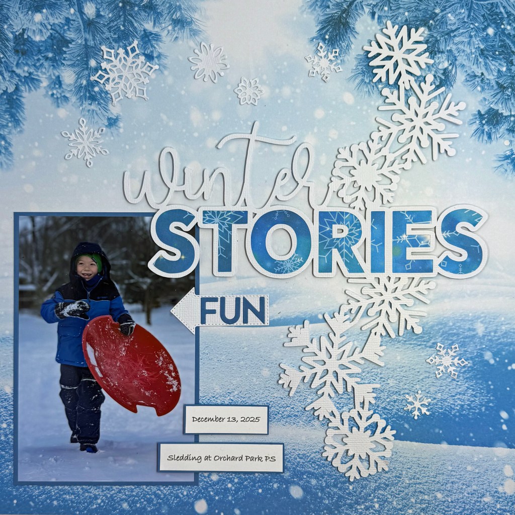
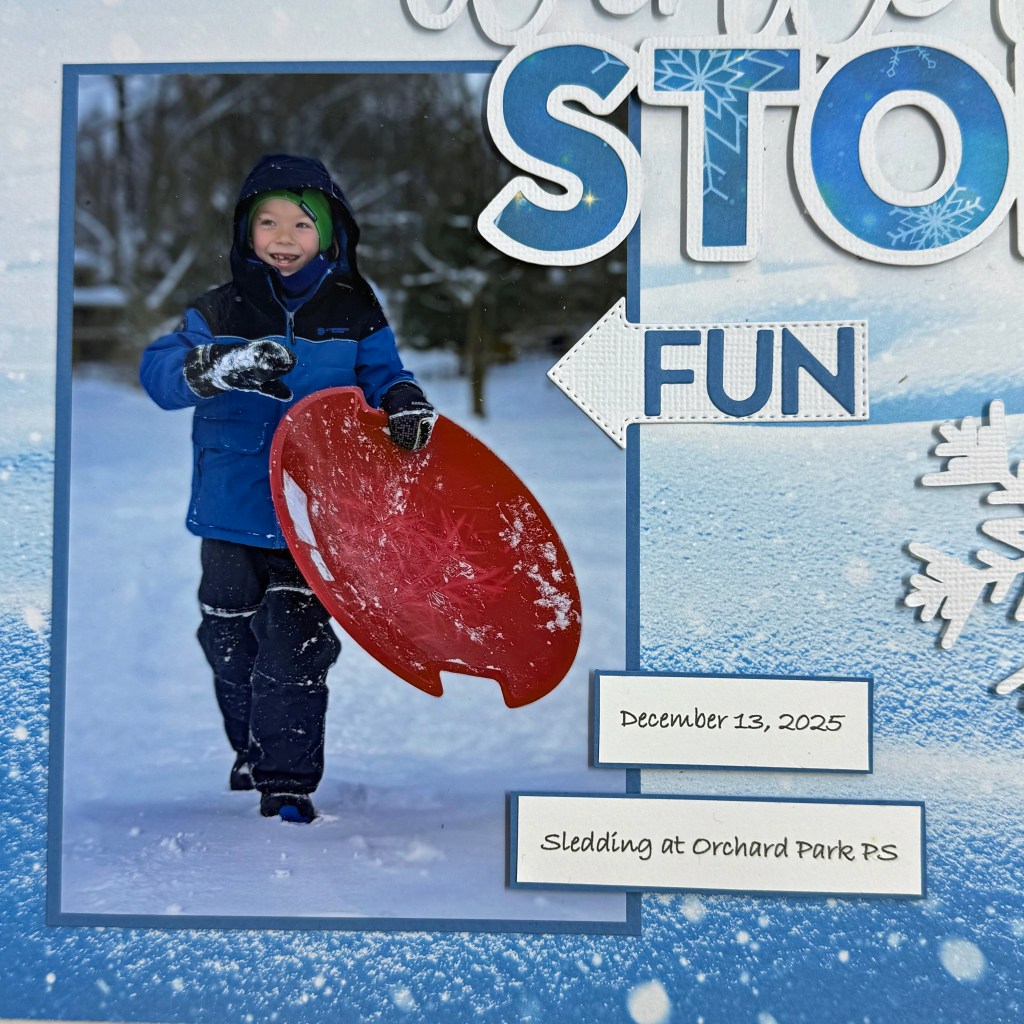
Do you remember the joy of playing in the snow when you were young and carefree? This fun photo of my grandson, captured by my daughter, brings back all those memories. The fresh snow, the thrill of the ride down the hill and the snow that gets caught between your glove and sleeve, providing a quick chill. This is fun personified for every Canadian child!
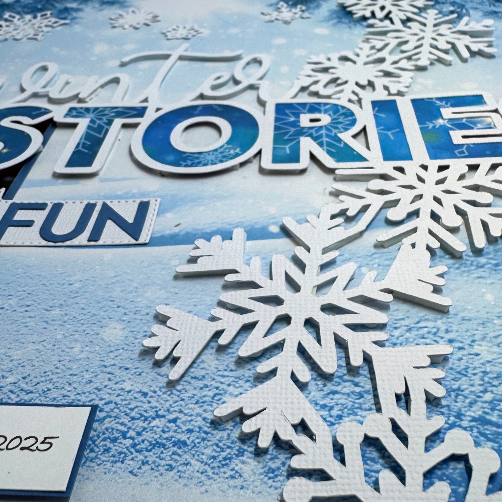
I chose the Peartree cut file, Winter Stories, from the January 2024Pearscription, to document this special time. I love the cascading snowflakes that fall from top to bottom in this cut file. If you don’t have this cut file, you can go back and purchase the January 2024 set here. The background paper for this layout comes from the Designsbyreminisce, Winter Wonderland collection. I used the Winter Stars paper for the background, and the coordinating Snowflakes Galore to back the word Stories in the title. I was drawn to this paper because it enhanced the blues and white of my grandson’s snow-covered snowsuit.
Before I adhered this cut file to the layout, I took the time (and it did take quite a while, and a bit of patience) to back it with dimensional adhesive fun foam. I wanted the snowflakes to appear as if they were falling onto the page.
I felt the picture told most of the story in this layout, so I typed the date and details on my computer and printed them to round out the details. The arrow and the word FUN are both die-cut elements from Elizabeth Craft DesignsPlanner Essentials – Arrows.
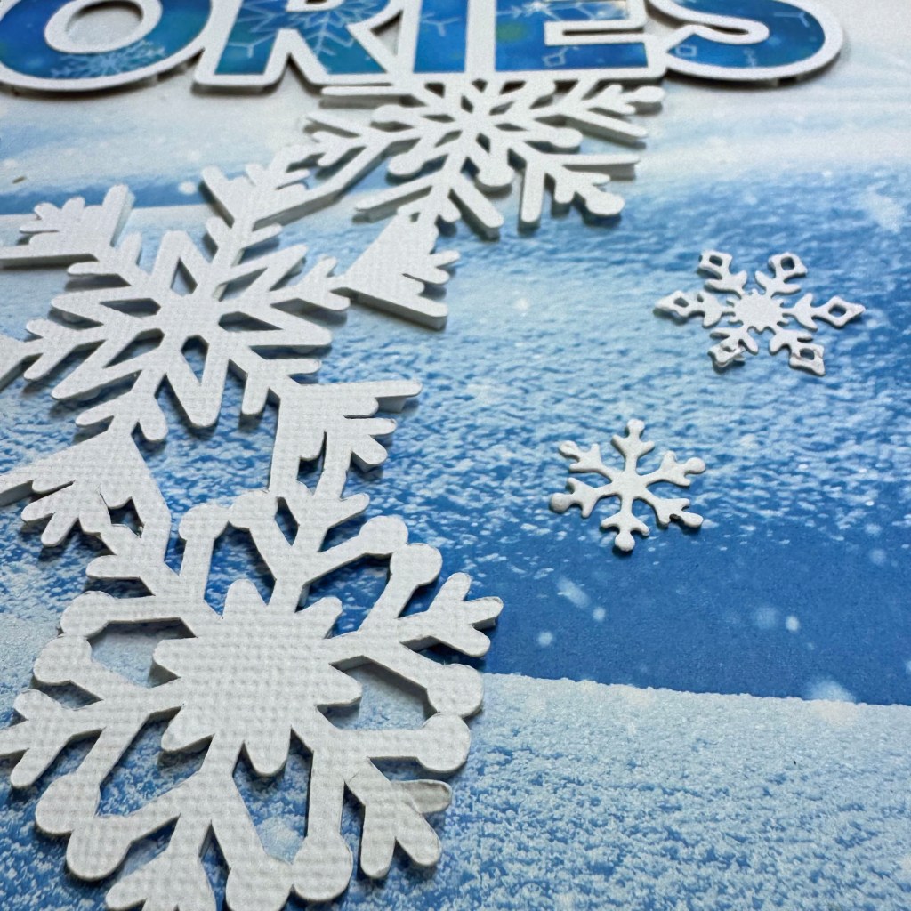
The final elements to complete the layout were the addition of the smaller snowflakes at the top and bottom of the design. These snowflakes are from an older collection of die-cuts from Sizzix, made for StampinUP!
And that’s another wrap on a fun-filled layout. It came together quite easily; the only time-consuming piece was adding the dimensional fun foam behind such an intricate die-cut. I’m pleased I stuck with this process and saw it through to completion!
Thanks for stopping by today. It’s always a thrill to know I’ve encouraged fellow paper crafters to try new things. Until next time, stay safe, stay well, and Happy Scrapping!
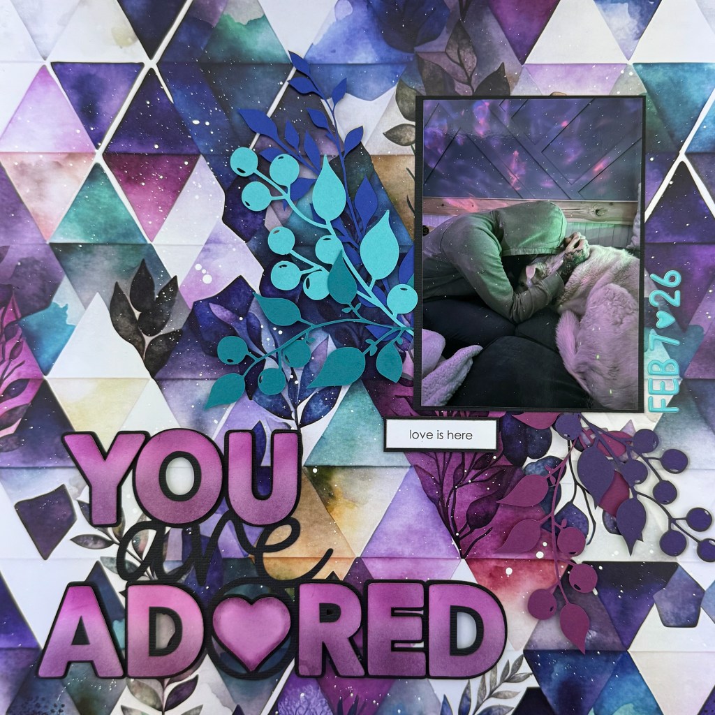
To quote M. K. Clinton, “The world would be a nicer place if everyone had the ability to love as unconditionally as a dog.” This picture gives me all the feels. To me, it fully represents the unconditional love between a man and his dog. There’s an unspoken language in this picture, and it is the language of love. It is powerful, reassuring and comforting. It is everything we need, when we need it most. This beautiful picture, taken by my daughter-in-law, captures my son and their dog Lillie. It is a moment of everyday life that I wanted to remember and document.
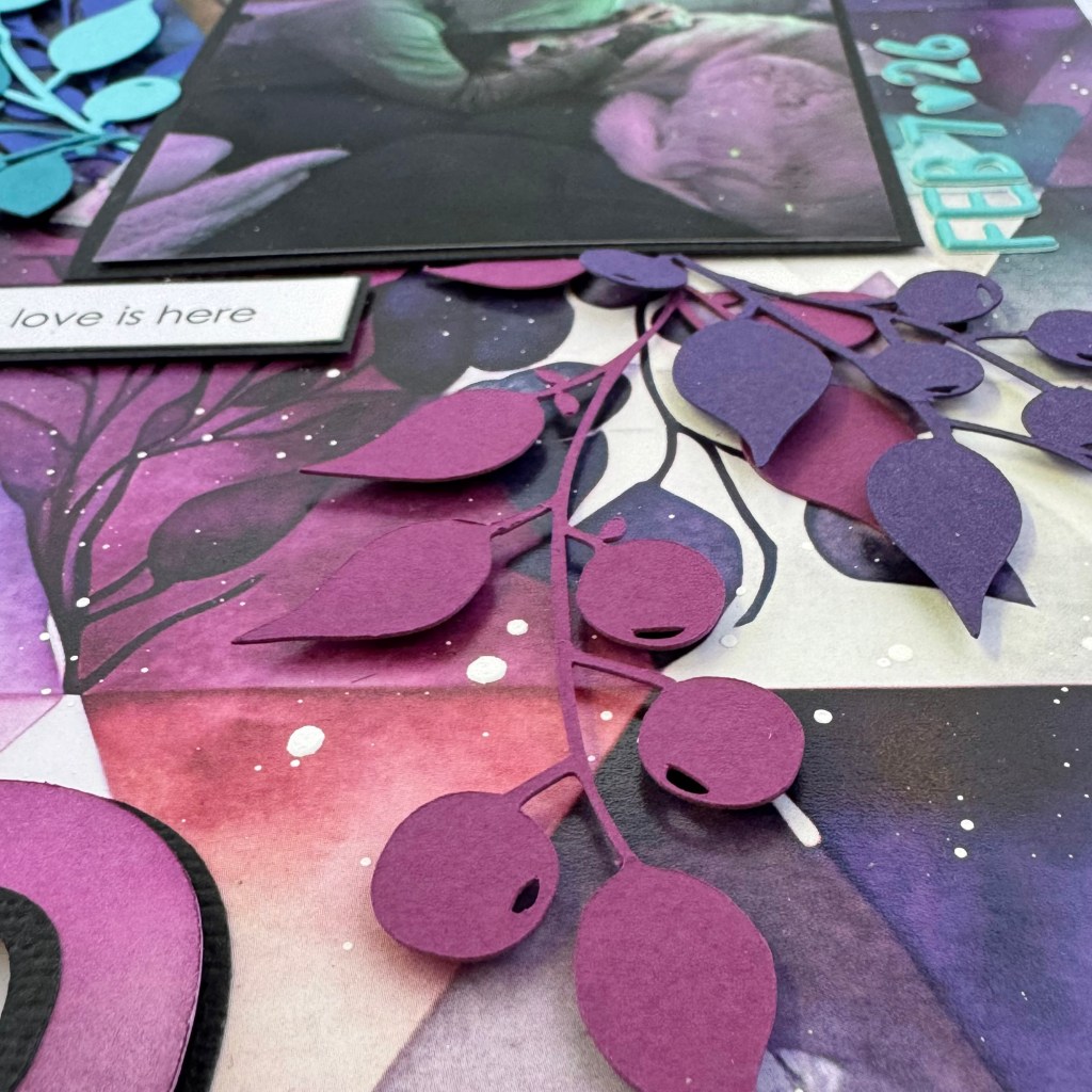
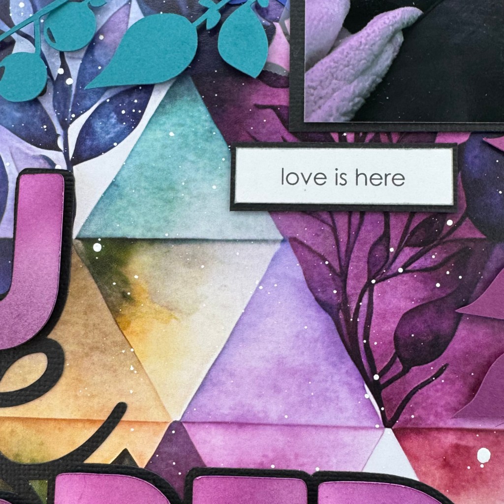
This picture was the driver for creating this layout. I deliberately used patterned paper that matched the photo’s colours and mood. Additionally, the triangular shapes in the paper were a perfect match for the background wall found in the picture. This stunning and colourful paper comes from Paper Rose Studio’sArtsy collection. Specifically, it is Print – B. To further mimic the photo, I splashed Hero ArtsWhite Acrylic Speckle across the page to replicate the light sparkles in the photo.
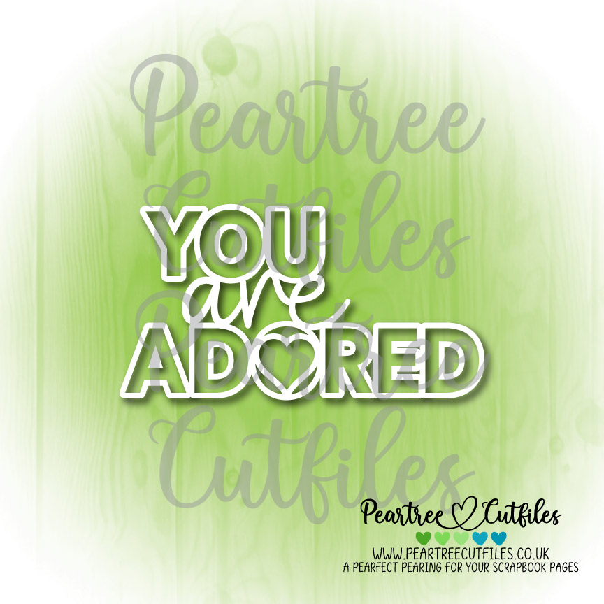
The “You are Adored” title for this page is a cut file from Peartree Cutfiles. It is available for purchase on their website. It was the freebie included in my February 2026 Pearscription. The Pearscription bundle is a unique set of cut files each month that are not available on the main website, but are available only by subscription. I have been a subscriber for over 4 years, and they are always a delight to receive and use. To create the title for this layout, I cut the file from black Precision Cardstock and glued the background to the layout, leaving the letters off. I used my Silhouette software to “ungroup” the file and create offset images of the letters. Once the letters were offset to make them slightly larger, they were cut from plain white cardstock. The letters were inked and blended with a combination of two Ranger/49 and Market inks – Doll Face and Sangria. This colour combination helped me achieve a close likeness to the purples in the picture and patterned paper. Once the ink blending was complete, I adhered the letters using Scrapbook Adhesives 3D Foam Strips to add additional dimension and texture to the layout.
The subtitle “love is here” is a Mintay Papers product. It comes from the Mintay Basics collection, specifically, the Words – Love & Marriage. I mounted the phrase on coordinating black cardstock and adhered it with the 3D Adhesive Strips. The final element was adding the date. I always add a date to my layouts for several reasons. When they finally make it into a book, I can sort them chronologically, and if you’re like me, after a couple of years, I draw a blank on the photo’s date if this marker isn’t included. I used Doodlebug DesignsPuffy Alpha Stickers in Swimming Pool to add the date to this layout.
And that’s a wrap on my design method and creation for this lovely layout. I hope this layout enhances the love I see and feel in this beautiful photo. To all my pet lovers out there, I hope I’ve encouraged you to scrapbook a moment like this for your scrapbook. I can assure you that as you go back and look at your layouts, a moment like this will warm your heart!
Thanks for stopping by today. Until next time, stay safe, stay well, and Happy Scrapping!
I love the family time we get during the Christmas season when everyone has a chance to slow down and have fun together. This year was an exceptionally fun Christmas, as our entire family was together for the first time in 3.5 years. We made the most of every moment together. Game playing was the main activity, followed very closely by eating! Every day was full of laughter and love, and I am still smiling from the great memories we had together. It was important to me to document these fun days and the traditions that we carry on.
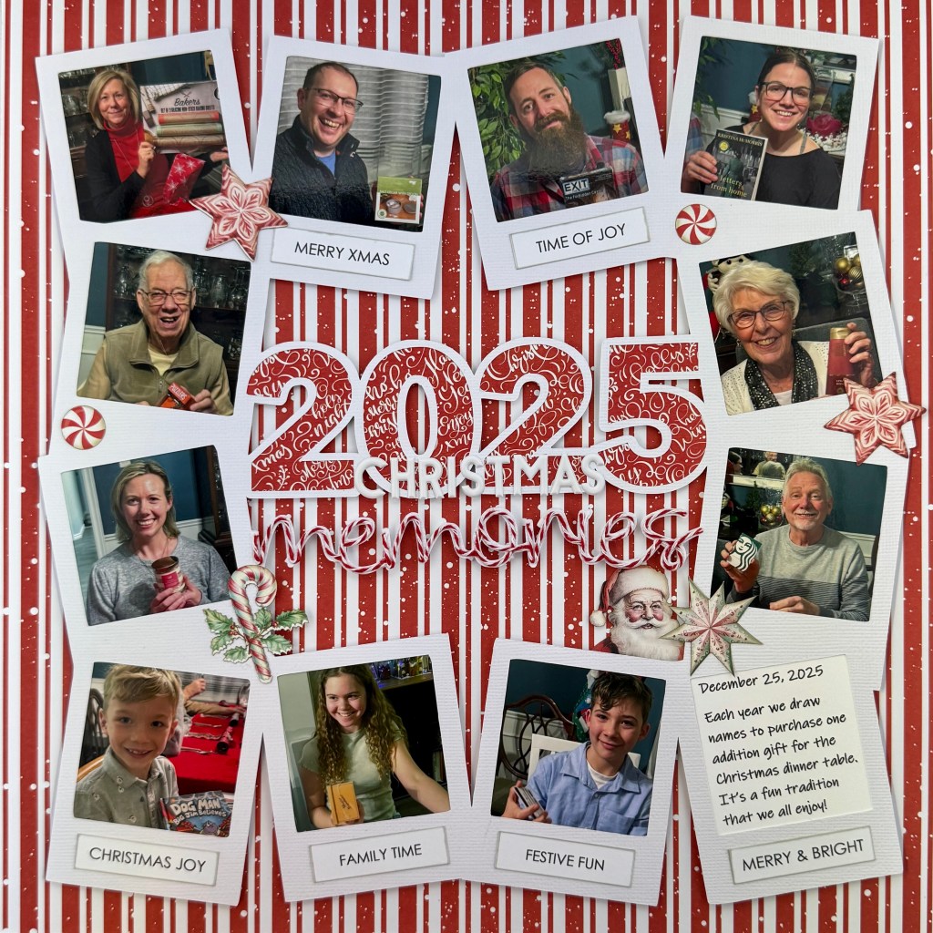
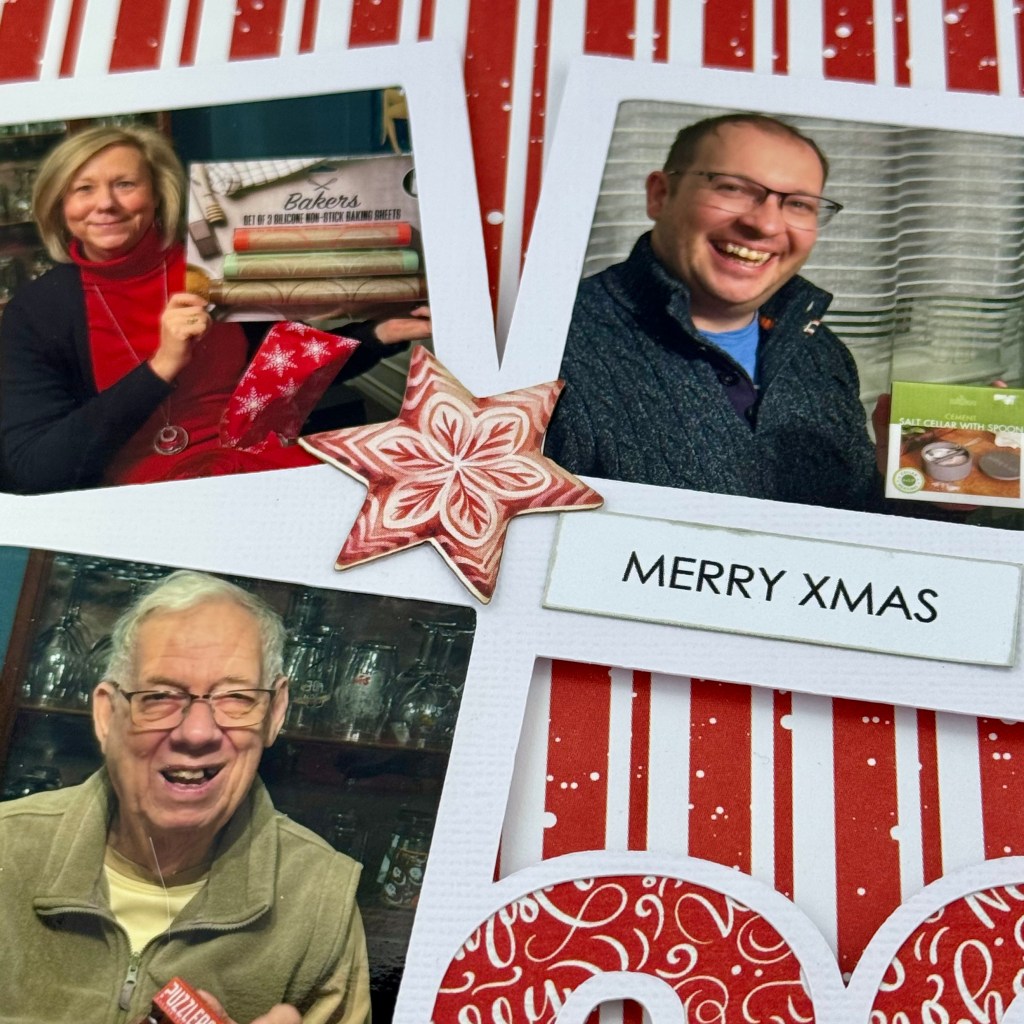
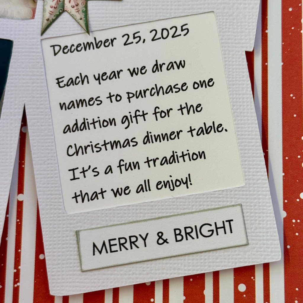
One tradition everyone loves is our small gift exchange just before we eat our Christmas dinner. We draw names for these gifts ahead of time and purchase gifts no higher than $20 for this exchange. The recipient has no idea who purchased their gift, and to complicate it further, we wound ribbons from the packages to each designated seat at the Christmas table. This way, you can’t easily identify your gift when you sit down. We take turns, one by one, pulling our ribbons to find out which gift is ours. It is fun to watch everyone open their small gifts individually. This year, I documented this fun tradition. I think my grandchildren will get a kick looking back at this page as the years go by!
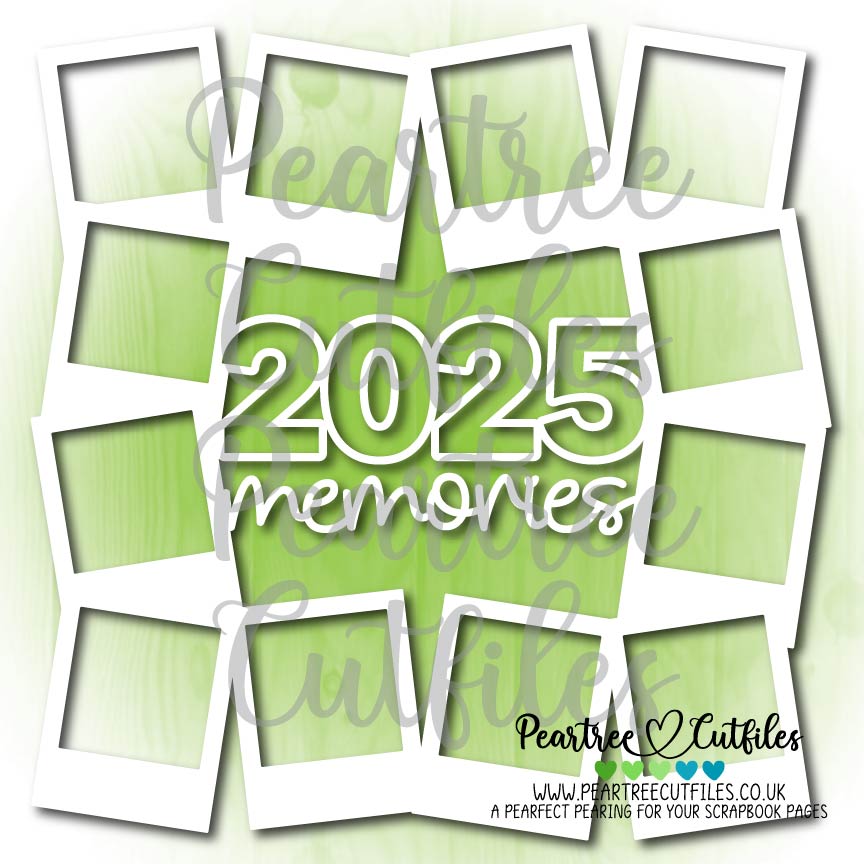
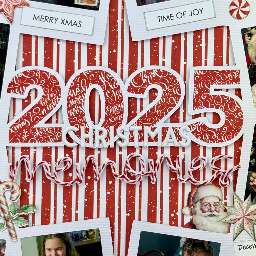
Peartree Cutfiles had an excellent cut file to help me document this tradition. It is called the 2025 Memories Frame. The photo frames around the title were precisely what I needed to capture a picture of everyone around the table, leaving one frame for my journaling. After choosing the pictures to include, I cropped each to fit the photo frames. These frames remind me of the years my parents took pictures at Christmas with the older Polaroid cameras!
I chose coordinating paper from Mintay PapersMerry & Joy collection for the background and to back the title numbers. To enhance the red-and-white theme, I added Recollections red-and-white twine to the word ‘memories‘. The process to add the twine is easier than it looks. I used liquid glue and worked in sections, moving across the word until it was complete. The twine sticks very well to the cardstock using this method. After completing these steps, I decided I wasn’t happy with the cut file lying directly on the background paper. So I took the time to add dimensional fun foam to the back of the cut file. I used Foam Sticky Strips from Taylored Expressions to add the dimension to the back of the scripted word memories. This process did take some time, as I cut each strip in half lengthwise to keep it hidden from the viewer. Once the entire cut file was adhered to the background paper, I applied the word Christmas to the bottom of the 2025 numbers using PinkFresh Studios white Simple & Sweet puffy alpha stickers.
The final touches to this layout included adding bits and pieces of ephemera from the Merry & Joy Die Cuts package, and adhering phrases cut from Mintay’s Christmas phrase sheet. My favourite ephemera is Santa peaking out of the inside corner of the cut file, just above the journaling!
Thanks for stopping in once again. I hope you’ve found some inspiration in my design today. Until next time, stay safe, stay well, and Happy Scrapping!
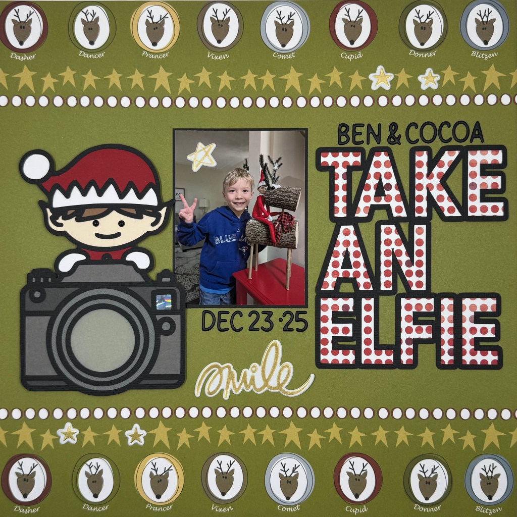
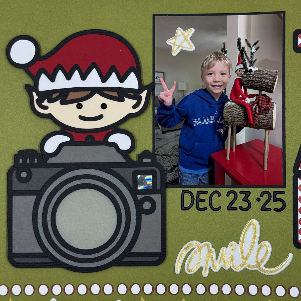
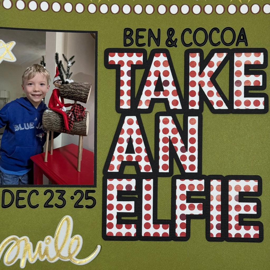
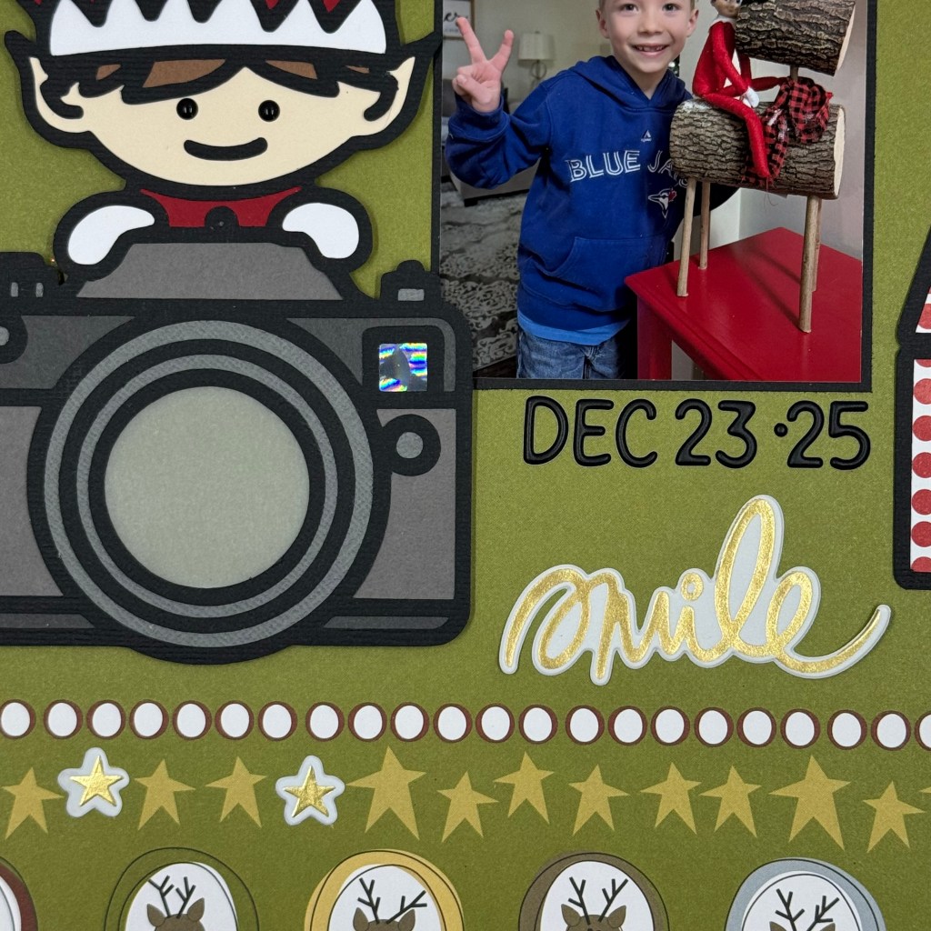
Happy New Year, my scrappy friends! I hope your Christmas was full of love, laughter, and wonderful memories. We were very fortunate to have our entire family home for the holidays this year! A rare treat, and we enjoyed every moment together. Christmas is extra special when you have a family member who still believes in Santa. It makes every day special and Christmas Eve and Christmas Day magical! Our youngest Grandson still believes in Santa Claus and the magic of his Elf on a Shelf, Cocoa. This year, my daughter took a cute picture of the two just before Christmas. Ben was so excited to count down the days as Christmas approached.
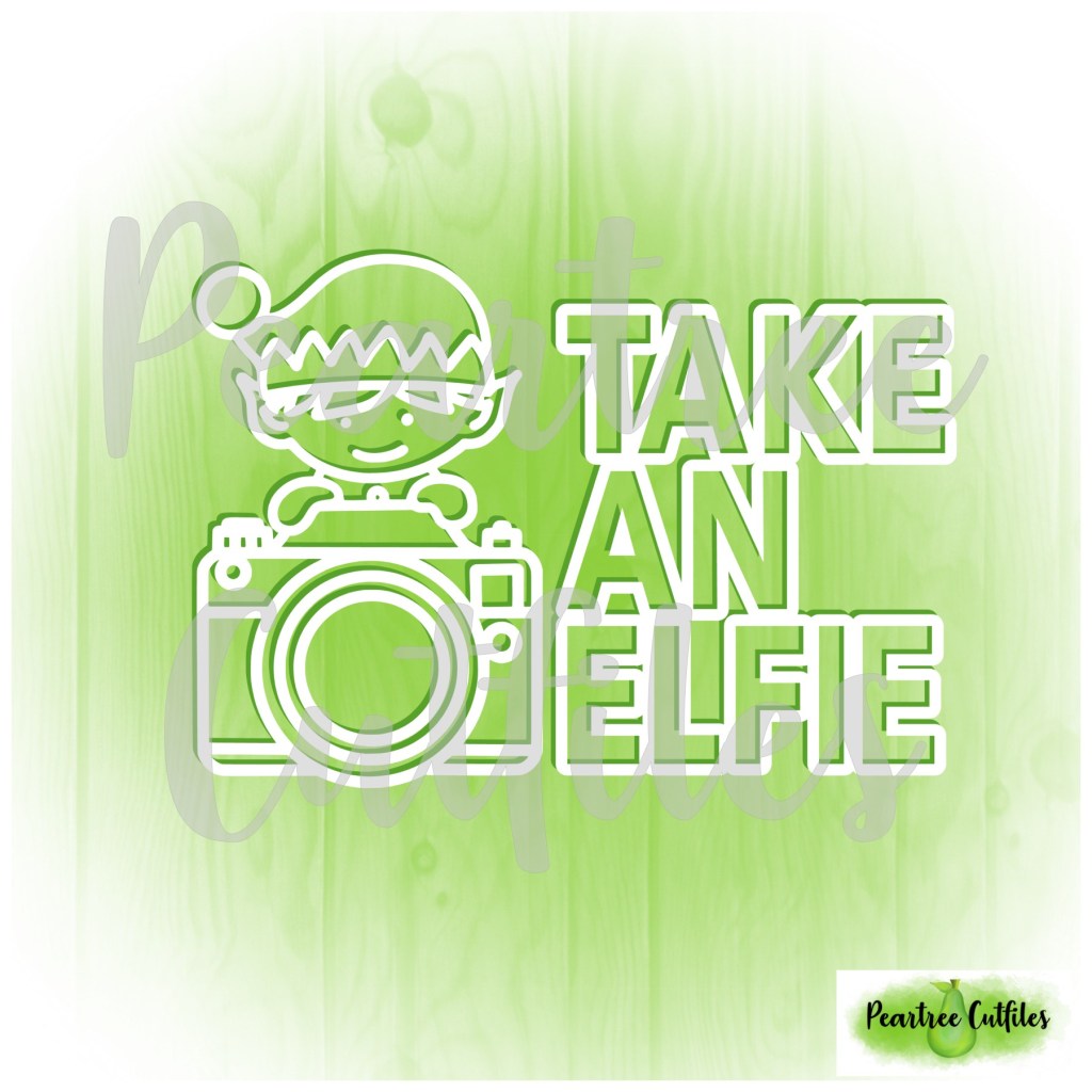
I dug deep into my patterned paper stash to find this background paper from 3bugsinarug, entitled Reindeer Games. Peartree Cutfiles had the perfect cut file to document this special picture. The Take An Elfie cut file contains two cut files: the title and the elf with a camera. I chose to back the elf and the camera with multiple coloured cardstock pieces, used vellum for the camera lens, and the Holographic 2.0 paper from Lawn Fawn for the camera’s flash. I find working with small paper pieces like the eyes in the elf quite tedious, so I opted to use Concord & 9th’sblack enamel dots instead. Next, I backed the Take An Elfie title with patterned paper from BoBunny entitled Mistletoe. This patterned paper has also been in my Christmas collection for several years.
To complete the layout, I adhered the two cut files on either side of the picture. The elf and the camera were adhered using double-sided adhesive foam tape. I did not adhere the foam tape to the back of the vellum lens. I used Doodlebug Designs Black Alphabet Soup Puffy Stickers to add the names and date to the layout. And finally, I added some gold accents to the page using Vicki Boutin’sThickers from her Print Shop and Warm Wishes collections.
And that’s a wrap on my first Christmas layout for 2025. Thanks for popping in today. Until next time, stay safe, stay well, and Happy Scrapping!
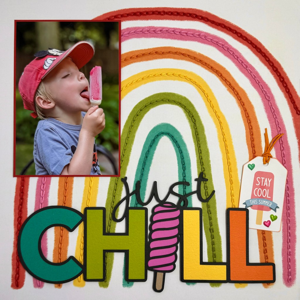
I’m not sure about you, but I’m not ready to let go of summer just yet! We’ve had a wonderful summer and made countless memories that will surely warm our hearts during the cold winter months ahead. What’s better on a hot summer day than a refreshing popsicle? This layout will instantly bring back the feel of summer every time I look at it.
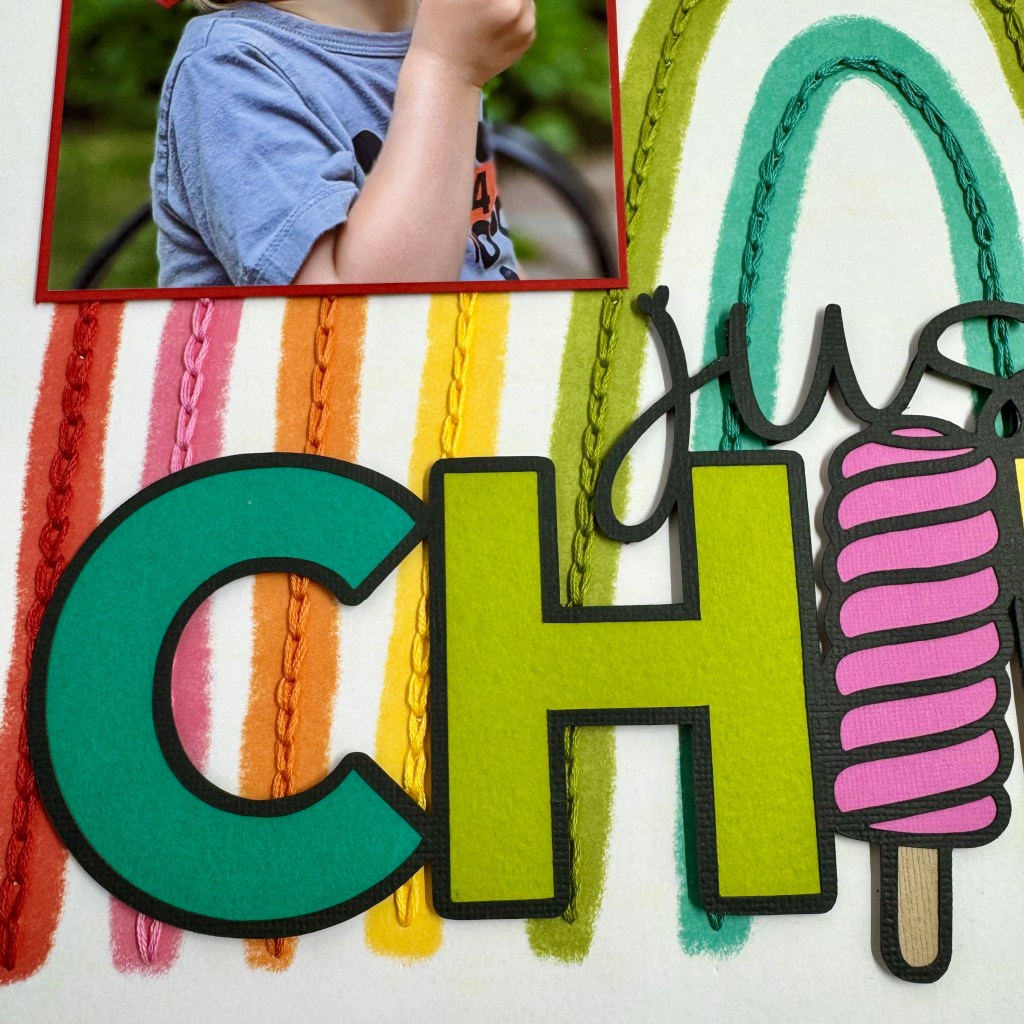
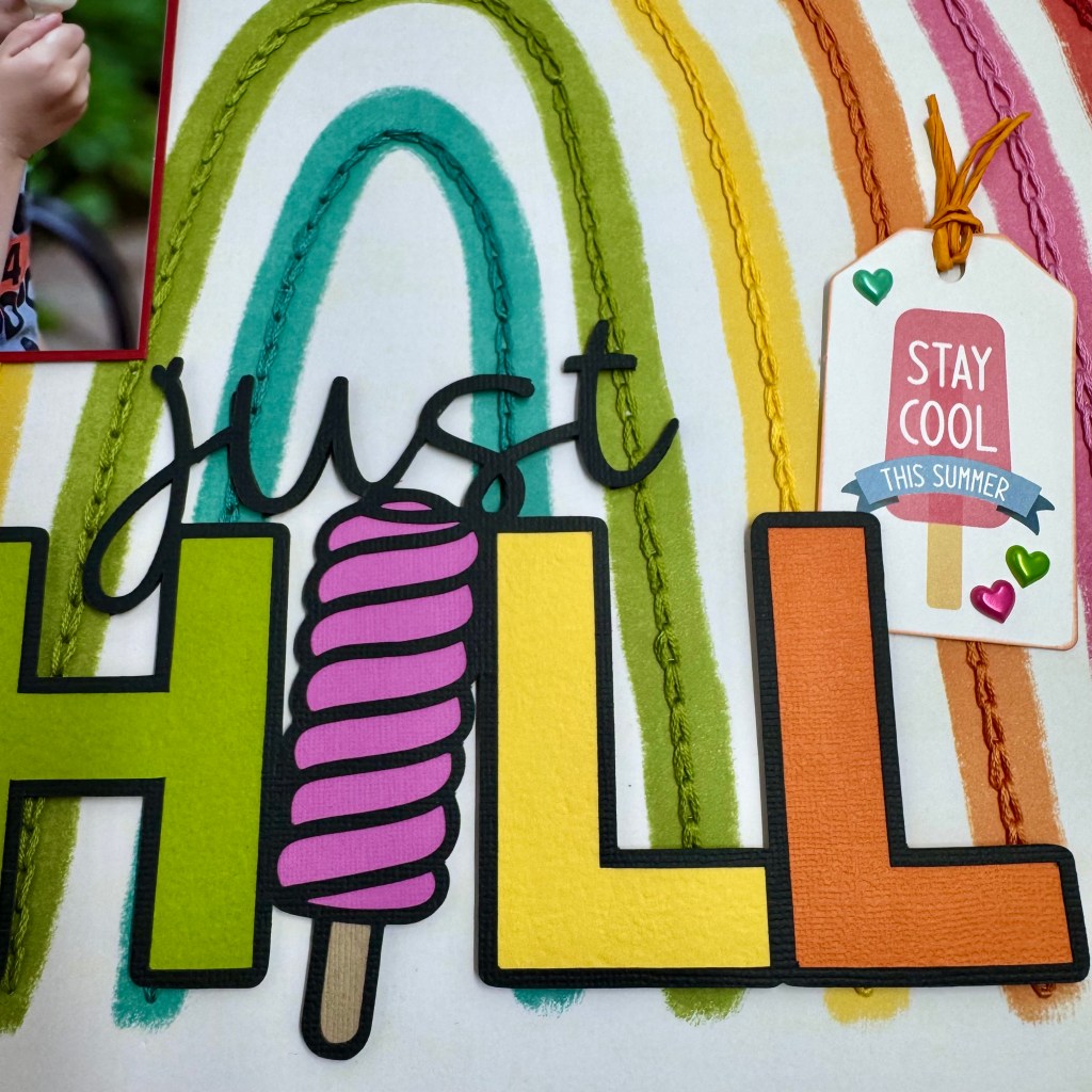
I used a Peartree cut file “Just Chill“, from the June 2025Pearscriptions files, as the inspiration to document this fun picture of my youngest grandson. I paired the cut file with patterned paper (Bright Side) from Cocoa Vanilla Studio’sSunkissed collection.
To accentuate the colours of the rainbow, I spent several hours stitching each colour with coordinating embroidery floss from DMC (347, 470, 743, 922 and 3848) and Anchor (066). I love the texture and layering it brought to the final product. Once the stitching was complete, the picture was adhered to the top left side of the layout.
I was looking for a bright and whimsical feel to this layout, so I backed the letters and shape in the cut file with coordinating colours of Bazzill cardstock to mimic the colours of the rainbow. To create additional dimension and texture, it was adhered to the layout using double-sided fun foam. The final element of interest was the addition of the ‘Stay Cool This Summer” tag. This tag is from Echo Park’s “Here Comes The Sun” Frames & Tags set of ephemera. It was a generous donation from Scrap ‘N Stamp to our crop bags at ScrapFest in Kitchener this past April. The orange twine at the top of the tag is Marigold Twistel. It comes from Making Memories and has been in my stash for at least 20 years. The cute colour-coordinated hearts on the tag come from a sticker sheet by Reflections, purchased at Michaels.
This layout was quite simple to create. It just took time and patience (6 hours) to complete the chain stitching on the background layout. Overall, I’m delighted with the final result. It’s just one of those layouts that is sure to make you smile every time you look at it.
Thanks again for stopping in. Until next time, stay safe, stay well, and Happy Scrapping!
Happy iNSD! For those not in the know, Happy International Scrapbooking Day! Yes, it’s a thing, and crafters are celebrating worldwide! Today, I’m sharing a page that came together quite simply. For me, scrapbooking is about sharing memories and events for my family to share and revisit. This photo is one that I can’t stop staring at. My daughter-in-law, Tanis, captured this amazing moment in time atop Roche Miette in Jasper National Park. Roche Miette is a 7,598-foot high mountain.
Imagine my heart when I saw my son running to the mountaintop edge! You can see their dog, Lillie, in the bottom right, keeping a keen eye on him too. But I must admit, who can blame him for wanting to get a better viewpoint? This view is spectacular and part of our exceptional Canadian landscape! With the enormous view, I chose to print the picture extra large (12″ x 9″) and let the picture tell the story on this layout.
I did not want to distract from this gorgeous photo, so I chose only a title to embellish this layout. Once again, I turned to Peartree Cutfiles to find the perfect title. The Exploring Nature title was just what I was looking for. After resizing the title to my page, I cut it on my Silhouette using white cardstock.
I searched through my patterned paper stash to find a paper that would complement the photo and support the word “nature” in the cut file. I found the match in paper F from Paper Rose Studio’sForest Trip collection. After manipulating the cut file and offsetting the letters in the word Nature to create the background, I positioned the new file on the patterned paper to cut along the colourful tree line.
I’m very pleased with how this paper complements the photo.
I added the location and date to complete this layout using Doodlebug Designs White Alphabet Soup Puffy Stickers. And there you have it—a simple yet visually effective layout that uses an oversized picture to tell the story.
Thanks for popping in today. If you’re a paper crafter, I hope you’ve found time today to enjoy our passion for creating. Until next time, stay safe, stay well, and Happy Scrapping!
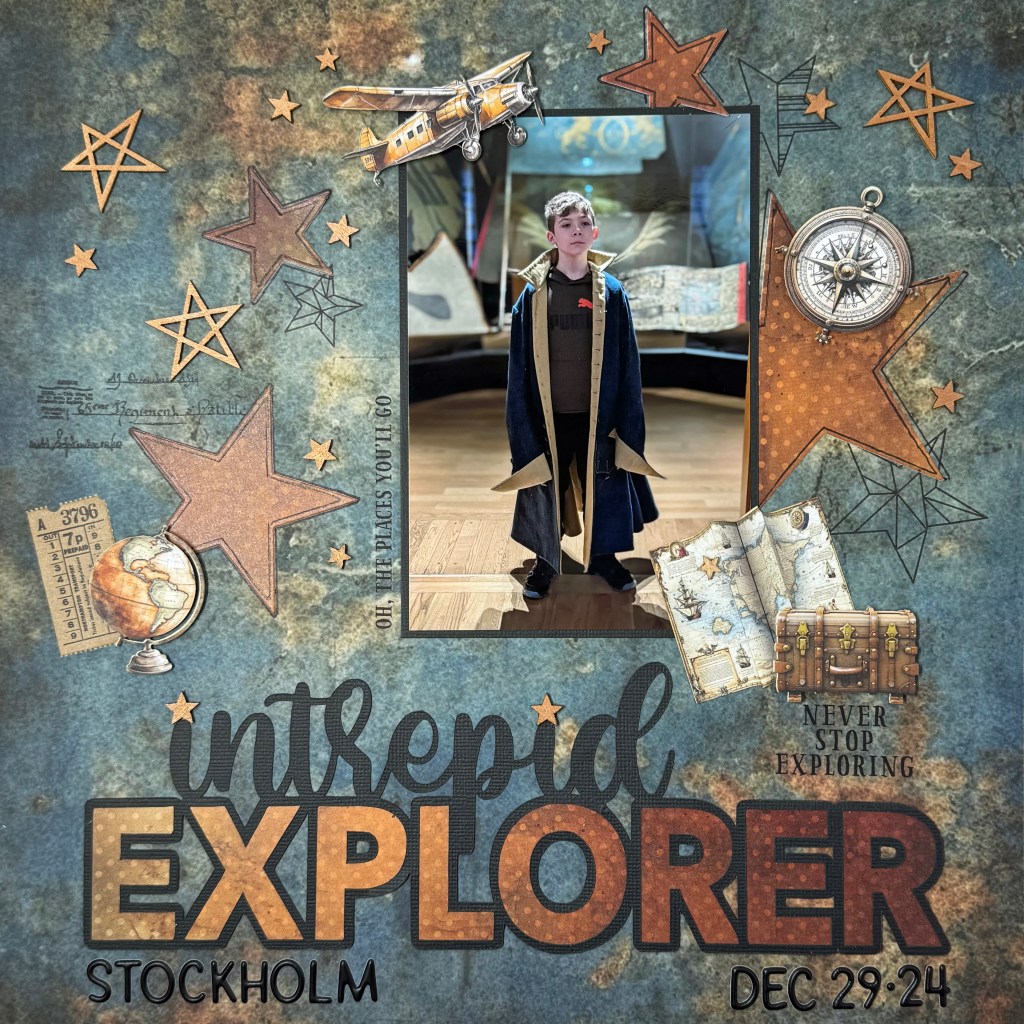
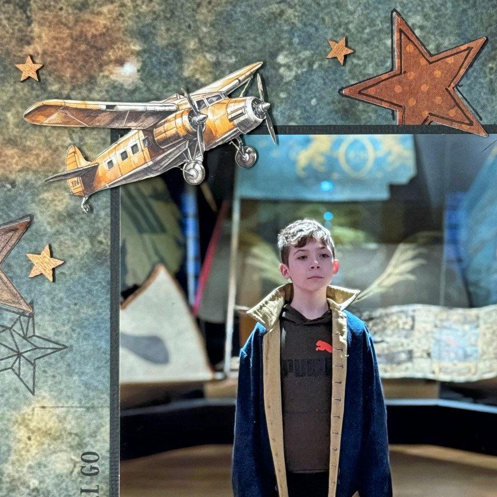
My oldest grandson, Owen, has a keen interest in history. During the Christmas holidays, his family traveled to Stockholm, Sweden, and visited the exhibits at the Armémuseum (Swedish Army Museum). Owen enjoys getting immersed in the events he’s learning about. I love this picture of him wearing an old army coat from the exhibit. This picture inspired me to create a layout to celebrate his love of history and discovery.
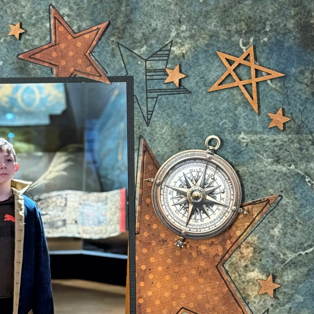
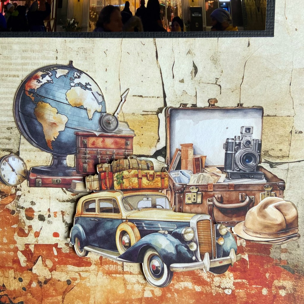
I enjoyed creating this layout and drew on ten brands for the final product. Unfortunately, some of the products used have been in my scrapbook stash for years and are no longer available for purchase. The Intrepid Explorer cut file for this layout came from Peartree Cutfiles. I cut it from black Bazzill cardstock and partnered it with rusty patterned paper from 49 and Market’sRust and Revs collection. The beautiful rusty patterned paper helped highlight the rust in the base paper. This background paper belongs to Mintay Paper’sTraveller collection. When I buy a collection, I often purchase the smaller add-on paper packs, which are handy for backing cut files or cutting additional items without wasting the large 12″ x 12″ designs. In this case, the rusty, dotted patterned paper had a slightly smaller and more variegated pattern. I loved the effect it brought to the layout. I also used a nested star die set from Sizzix to cut several star shapes from this patterned paper. The stars had slightly beveled edges, which I highlighted with a thin black Sharpie marker.
I stamped several different star images from the My Favorite Things, Stars Above stamp set to give the layout more depth and texture. This stamp set is an older release and is no longer available. The script stamp came from a 7 Gypsies stamp set called Avignon and is also no longer available. The wood veneer stars are also vintage and came from Studio Calico. I sprayed them with Tim Holtz’s Rusty Hinge Distress SPRITZ to highlight the background paper’s rusty tones. As seen behind the globe, the ticket came from 49 and Market’sTicket Essentials pack (Color Swatch Toast).
The phrases on the layout, “Never Stop Exploring” and “Oh, The Places You Will Go,” are rub-ons from the 49 and MarketWherever Ride Rub-on Transfer set. The detailed travel theme ephemera belongs to the coordinating Traveller paper die-cut package by Mintay Papers. I placed fun foam and pop dots behind some of the ephemera pieces to give the layout additional dimension. I added the location and date below the title to complete the design using Doodlebug Designs Alphabet Soup Puffy Stickers in beetle black.
I am happy with the final layout and its overall look and feel. I hope my grandson’s interest in history grows and he continues to learn and discover more about those who paved the way for us today. Thanks for stopping in today, and until next time, stay safe, stay well, and Happy Scrapping!
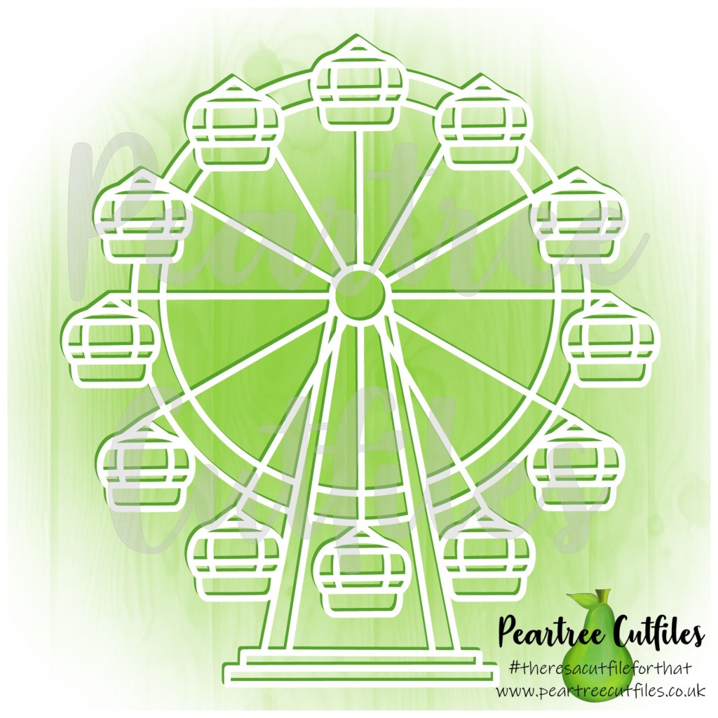
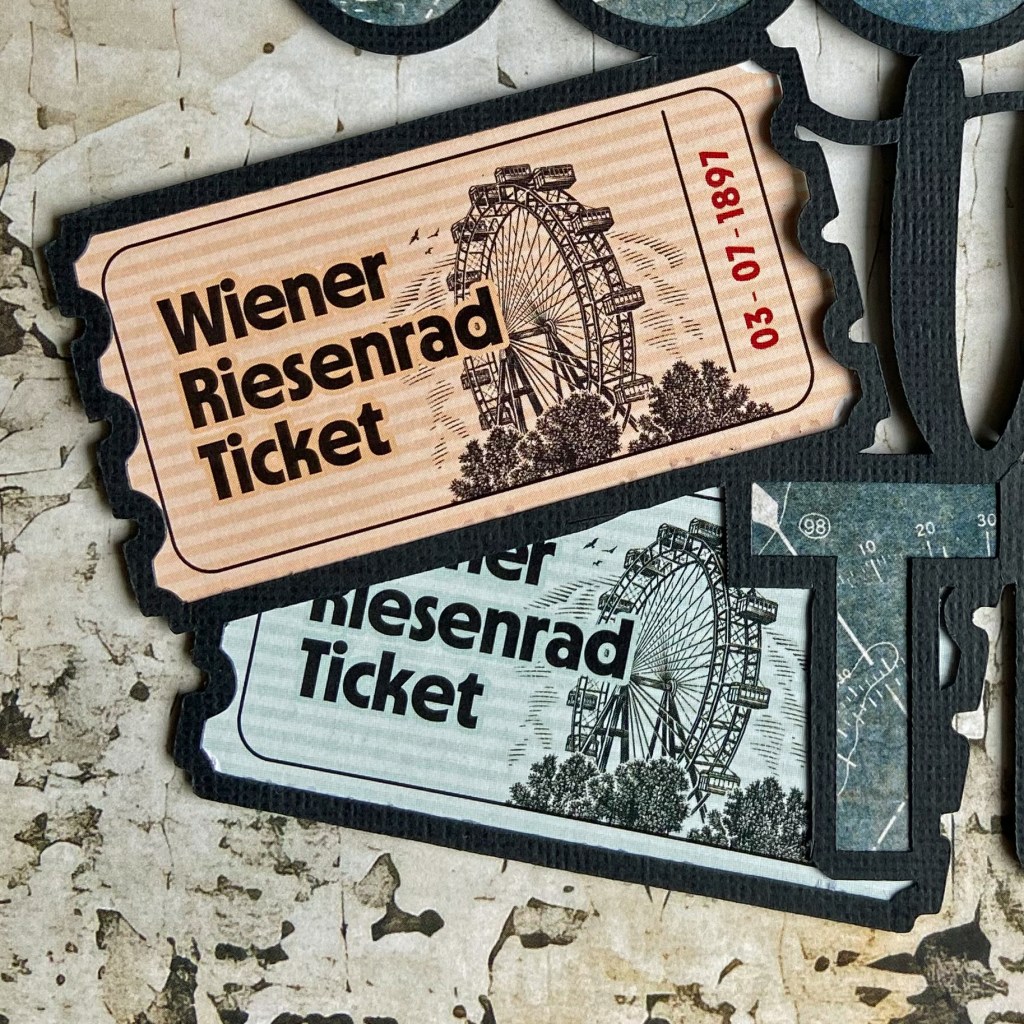
This trip to the iconic Prater Amusement Park was on my husband’s bucket list. A long-time fan of Orson Welles’ film The Third Man, this was a must-see item on his wish list. Fortunately for us, this gigantic Ferris Wheel resides in Vienna, Austria, and is only a quick trip from our daughter’s home. While we have visited the Prater more than once, these pages document Bill’s first trip to the incredible Riesenrad.
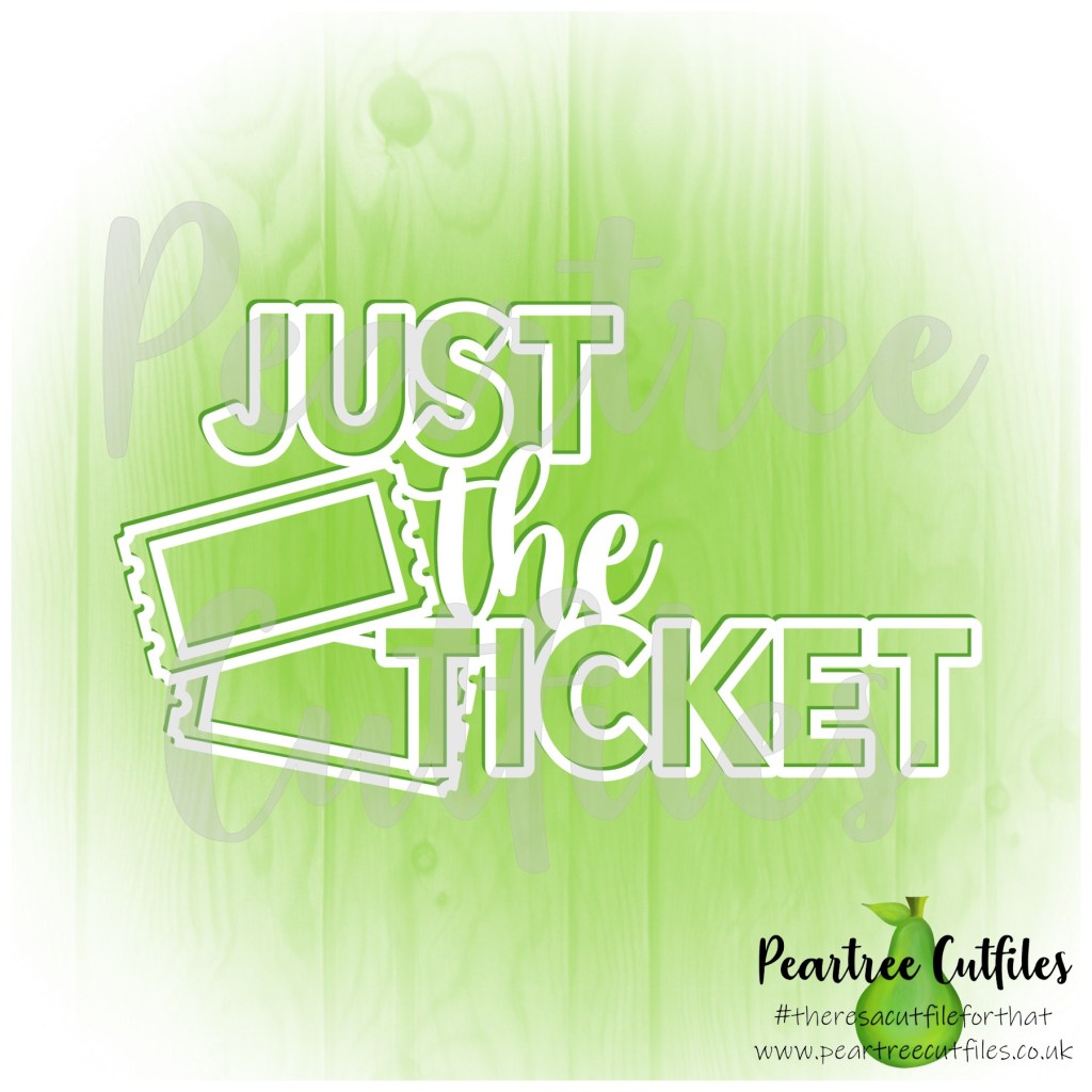
I resized and slightly manipulated the Just the Ticket cut file to fit our tickets from our ride on the Riesenrad, and I backed the Ferris Wheel cut file to mimic the ride’s look. The Ferris Wheel was positioned slightly off the page to accommodate the picture, and I carefully trimmed the excess away. Once I completed both cut files, I adhered them to the background paper using double-sided fun foam.
The beautiful papers in this double-page layout belong to Mintay Paper’s Traveller Collection. Specifically, the background paper is the back side of sheet 02. I purchased two collection packs to accomplish this. I backed the title, Just the Ticket, using the back side of sheet 04. I typically buy a coordinating pack of 6″ x 6″ or 6″ x 8″ patterned paper in a collection to use for backing cut files. I then use these papers to back my cut files, saving my 12′ x 12″ patterned papers for additional layouts.
Before I adhered my picture and cut file on the left-hand page, I wrote the journalling for this layout in Word. I wanted to print the story directly onto the patterned paper. I did a test run on a piece of vellum to ensure my positioning was correct before sending it to print. This test allowed me to overlay the vellum onto the patterned paper and make any adjustments necessary before printing directly on the layout.
For the final touches on this layout, I added some ephemera from the coordinating Traveller’s collection. This die-cut package contains sixty elements and will provide plenty of finishing touches to several future layouts.
That’s a wrap on my design process for this double-page layout. It is a special memory for me, as this experience meant so much to my husband. Thanks for stopping by today, and until next time, stay safe and well. Happy Scrapping!
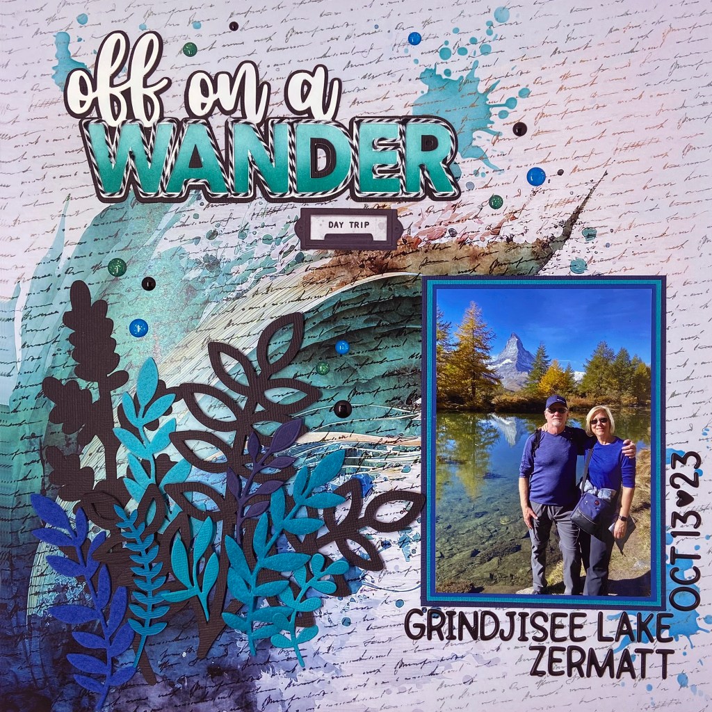
Happy Valentine’s Day to one and all! This scrapbook page is my 2024 Valentine’s tribute to my loving husband and partner of 43 years! Thank you for making me stretch my skills and push through barriers I never thought possible. I will treasure this travel memory for the rest of my life, and I couldn’t have done it without you….
We’ve had the good fortune to travel quite a bit in 2023. Of all our adventures, this five-and-a-half-hour hike in Zermatt, Switzerland, is now considered epic in our memories. We planned a day to complete the Five Lake Trail, offering unforgettable views of the Matterhorn. Our original plans, as laid out by our hotel concierge, were to take the underground funicular to Sunnegga and then switch to a gondola to Blauherd. From Blauherd, we were to follow the hiking trails down the mountain, visiting the five beautiful lakes.
But all good travel plans can quickly go awry, and this day was no exception! The underground funicular was a quick and easy ride to Sunnegga. The gondola, however, had been shut down for the season just two days before our arrival. Not being travellers to be easily discouraged, we quickly rearranged our plans and decided that if we couldn’t hike down, we would hike UP! It seemed like a sensible decision at the time! With the original hiking time estimated at two-and-a-half hours going down the mountain, we estimated it would likely take us three hours to go up and around the trail. Amateurs! Ha! If we only knew, would we have started at all?
We did not plan nor pack a lunch for our hike. Armed with water bottles and a small bag of peanuts, we hit the trail confident that we would complete the journey as planned. My husband, who moves like a gazelle on the slopes, thoroughly enjoyed his day. I, on the other hand, have a severe fear of heights. The literature describing this hike identified the hike as “easy – with a few moderately difficult sections”. Hmmm, while there were some manageable sections, there were times we had to follow the “Alpine Trail”, with very narrow dirt paths, more switchbacks than Italy, and protruding boulders that made the path extremely narrow. Thank goodness for my husband and his patience and humour that kept me going step after step! I won’t lie; we did have moments when we wondered if we would ever find our way back.
Thank goodness for Google Maps and faith that the Sunnegga station would come into view eventually. As we got closer to the station, in quite a challenging section of the trail, we came across an elderly (80+ years old) gentleman and his daughter sitting on a lookout bench. The only way these two arrived at the lookout was to climb. How he managed it, I will never know. But I was so thankful to see him there. I knew then that I, too, would make it back! Our reward on arriving at Sunnegga (aside from the fantastic pictures we took along the way) was a fabulous bowl of pasta for lunch. Add in two Gaterades and two coffees, and it only cost us the equivalent of over $100 Canadian. Nothing in Switzerland is cheap! Quite frankly, I was starved and so relieved to be back that I didn’t care what it cost then!
For those interested in my design process, I turned to Paper Rose Studio’sArtsy Print collection for the layout’s background. This paper collection is stunning! I chose the title Off on a Wander from Peartree Cutfiles. It was a phrase that assisted me in poking a little fun at our lengthy hike!
After cutting the title in white cardstock, I created another in black cardstock, offsetting it slightly to help it stand out on the page. The letters in the title were ink blended with two shades of ink from Papertrey Ink (Tropical Teal and Hawaiian Shores). I was looking for a very bold title effect on this layout and chose to outline each letter with white and black twine to achieve this effect.
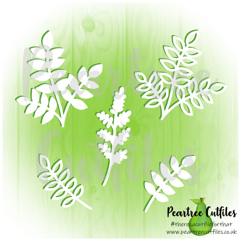
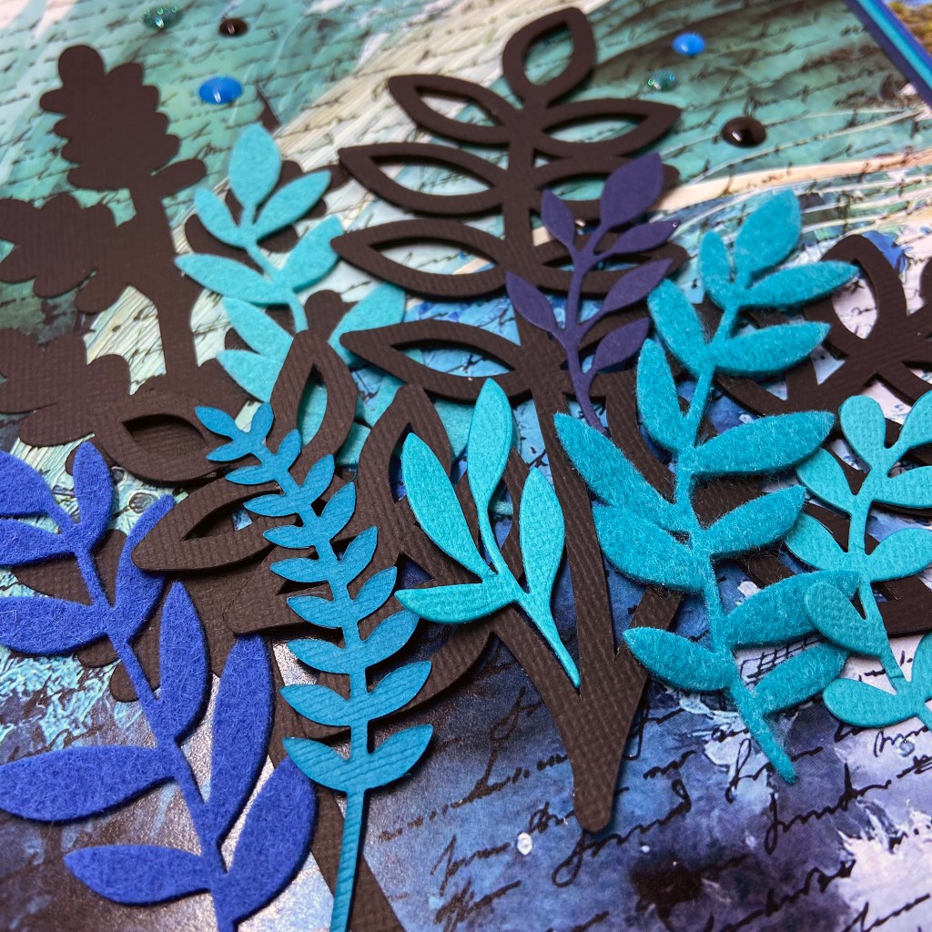
I triple-matted my photo to coordinate the colours in the image and the background paper. I utilized another cut file from Peartree Cutfiles, entitled Leaves Buildable 2. Two of the leaves in this cut file became the black anchor for the cluster of colourful leaves on the bottom left-hand side of the design.
I die-cut additional leaves using Die-Namics from My Favorite Things (Grand Greenery and Grande Greenery). I cut three leaves from felt to add visual texture and interest and die-cut the remaining leaves from coloured cardstock. Once the leaves were all cut and ready to assemble, I backed one of the larger black leaves with black foam from Scrapbook Adhesives. The leaves were then layered and adhered to the background paper.
I added some paint splatters using a Tim Holtz stencil entitled Splatters using Mermaid Lagoon and Peacock Feather Distress Inks. For the final touches, I included the Day Trip ephemera from 49 and Market’s Everywhere Laser Cut Elements and the enamel dots from a mixture of Carta Bella, Your Next Stamp Gumdrops and Doodlebug Designs Winter Assortment Sprinkles.
And that’s a wrap on how I’ve memorialized this epic vacation adventure! I have no regrets about taking on this challenging and fulfilling hike. I will be forever grateful for my husband’s patience, perseverance and love that helped me overcome my fears that day. Would I do it again? Not likely! My mountain climbing days are over until the next great adventure presents itself!
I wish you all the very best this Valentine’s and thank you for stopping by to read about our travel shenanigans. Until next time, stay safe, stay well, and Happy Scrapping!
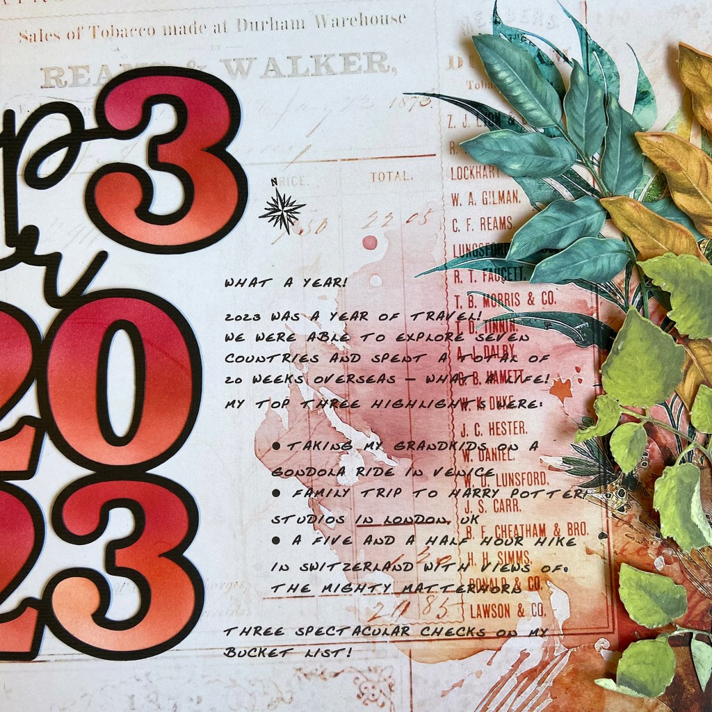
2023 was an incredible year for us. I could sum the whole year up in one simple word – TRAVEL! With my daughter and her family currently living in Austria, we can come and go as we please, and we get to travel all over Europe. It’s the sweetest deal going! We couldn’t be thankful enough for Lindsay and Jeff’s hospitality and generosity! We spent 20 weeks in Europe last year and visited eight countries. The memories we’ve made are precious, and we loved everywhere we travelled.
Two of my three top choices centred around family trips. In June, we travelled to Venice, Italy together. Taking a ride in a gondola was at the top of my bucket list in Venice, so you can imagine my excitement at bringing my daughter and grandchildren on the ride! They all loved it as much as I did, and I’d have to say, it was one of my BEST memories for 2023. In late October, we travelled as a family to London, UK. Our focus was a visit to Warner Bros Studios to see the Making of Harry Potter. I read each of the Harry Potter books to my two oldest grandchildren before they moved overseas. Having the opportunity to tour this remarkable location with them was MAGICAL! My final highlight was the five-and-a-half-hour hike my husband and I made in Switzerland. It was a gorgeous fall day with incredible views of the Matterhorn throughout the hike. It was breathtaking every step of the way!
The creation of the title was quite simple for this project. After resizing it to fit my layout, I cut it in black textured cardstock. To back the numbers in the title, I used smooth white cardstock. Each number was ink blended using three Altenew dye inks (Rouge, Velvet and Ruby Red) and adhered to the back of the main cut file. Once completed, I set it aside to work on the journalling for the layout.
I turned to my computer and printer to add the journalling to this page. To ensure the correct placement and to protect the beautiful background paper, I placed a 12″ x 12″ piece of vellum over the patterned paper and traced out the area I wanted the journalling in. Next, I typed out my story on the computer, positioning it as close to the coordinates as possible. I then printed the text on the vellum sheet to see how close I came to my coordinates. With a few little tweaks and a second test run with the vellum, I was ready to print directly on my patterned paper. As you can see from the finished project, the text placement went beautifully!
The next stage involved adhering the title and the pictures to the layout. I then moved to stamping some travel words and images onto the page. I used travel stamps from Jennifer Edwardson Creative Inc. and Recollections.
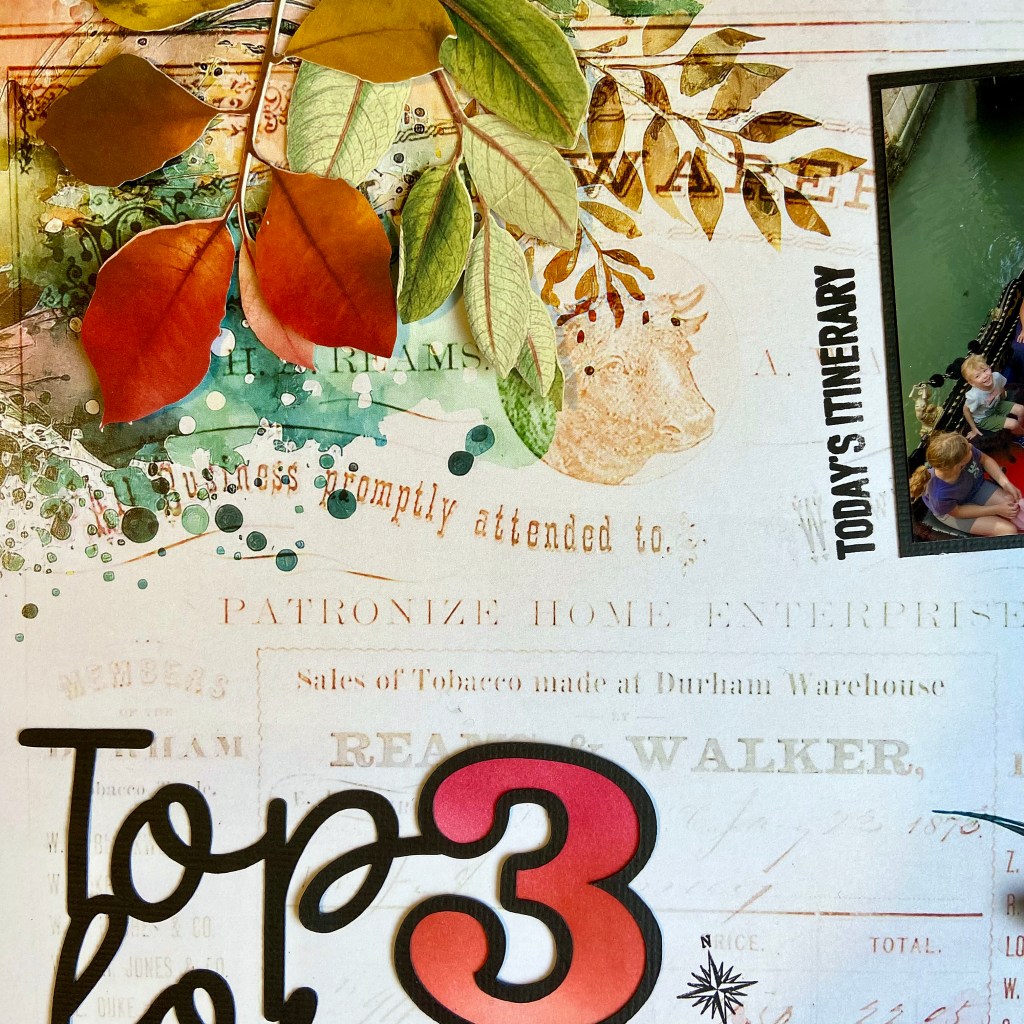
The final step to completing my layout was adding the laser-cut leaves from 49 & Market’s Spectrum Sherbert collection. I used coorinating leaves from both the Tidal Wave and Strawberry Lemonade packages. To create dimension with these leaves, I glued the centre stems down and popped up some of the leaves with 3D foam squares to create some dimension for the final product.
Thanks for taking the time to be with me today. I hope I’ve provided some inspiration to document your favourite memories of the past year. May the coming year be good for you and yours! Until next time, stay safe, stay well, and Happy Scrapping!