Happy Happy Day

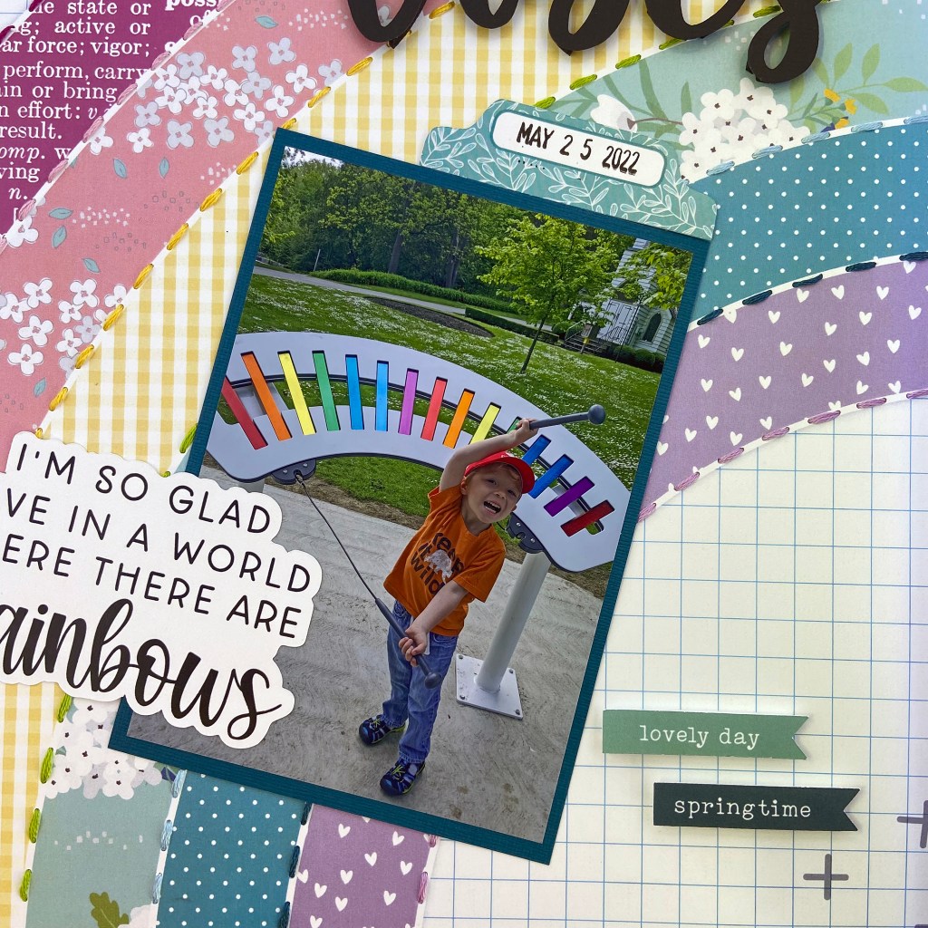
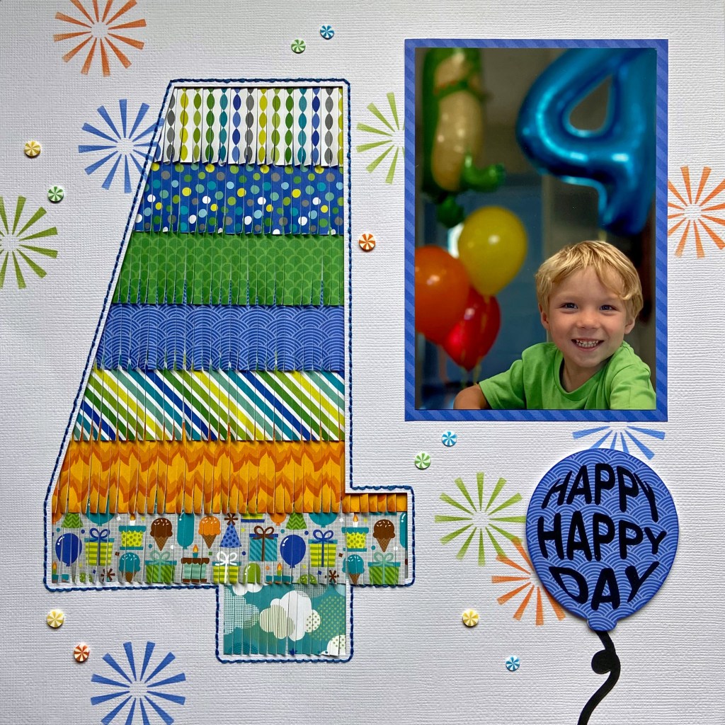
Oh, the excitement of turning 4! Ben waited in anticipation of his 4th birthday for many weeks. When the day finally arrived, it did not disappoint! You can see his excitement in all these pictures. In fact, it was quite contagious! It’s funny how we don’t get quite this excited about our birthdays as we get older. We truly should take a lesson from these younger folk, and get the most out of every special occasion. Carpe Diem, friends!

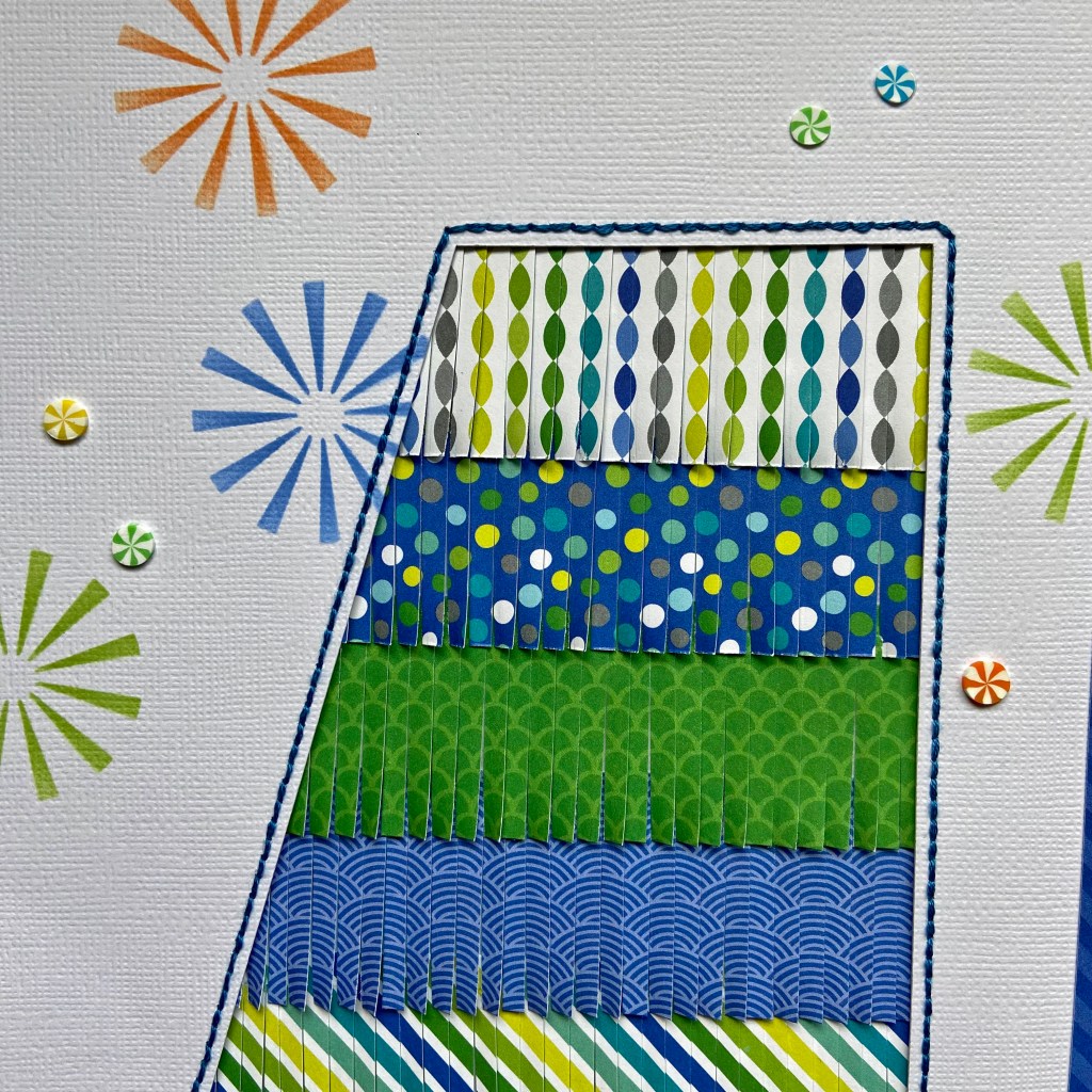
As I began to design this double-page layout, I knew I wanted something bold, bright and reflective of Ben’s excitement. Ben was wearing a T-shirt I made for his big day. Green is his favourite colour, hence the bright lime green T-shirt! I turned to an older Doodlebug Designs paper and embellishment collection called Dragon Tails to coordinate with his T-shirt. In addition to the patterned paper, I chose to add stencilling as one technique to help offset some of the white space and also to help create the mood of the layout. I chose 3 ink colours that coordinated perfectly with the paper to achieve this look. Using one of Vicki Boutin’s Radiate Stencils, from the Color Study collection, I randomly placed these colourful images across both pages.

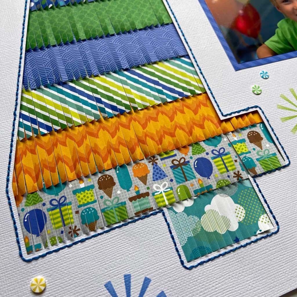
I created my own cut file in Silhouette Studio for the number 4 and enlarged the cut file to fit within the borders of a 12′ x 12′ piece of white cardstock. Before cutting out the number, I used the offset function to highlight the outline of the number. This outline was then turned into a stitching file. You will find an excellent tutorial on turning your cut files into stitching files here. Once the cut file was completed, I stitched the bright blue border around the number 4 using DMC thread. I then selected 8 coordinating patterned papers from the Dragon Tails collection and cut them into 1/2″ strips. Using fringe scissors, I cut across the strips leaving a 1/4″ border free at the top. Double-sided tape was added to the back of each fringed piece along the 1/4″ top border. I cut a spare piece of plain paper slightly larger than the number 4 and began adding the strips to the spare paper, overlapping them to hide the plain 1/4″ border. The completed piece was then positioned and secured to the back of the cut file. I love the dimension this resulted in!

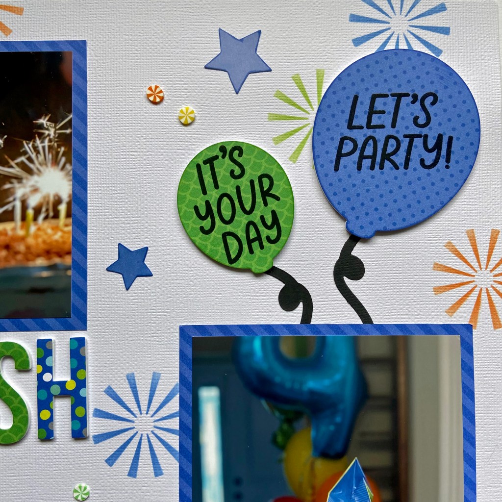
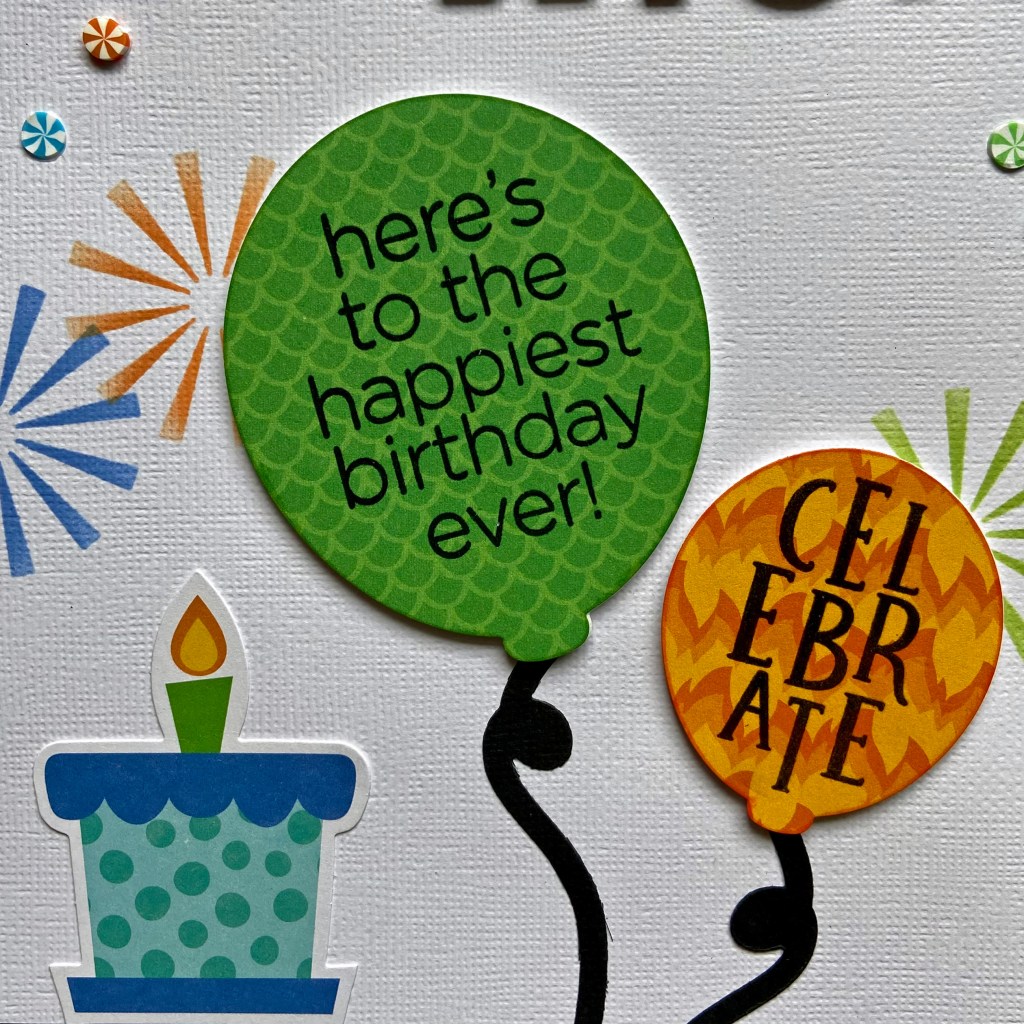
In addition to scrapbooking, I also make approximately 150 cards a year for family and friends. Nothing makes me happier than maximizing the use of my supplies across both these paper crafting passions. This layout is an excellent example, as I utilized several stamps and die sets to complete this design. These fun balloons belong to a Simon Says Stamp! collection created by Cathy Zielske called Balloon Greetings. All of the sentiments on the balloons belong to this set with the exception of the CELEBRATE sentiment. This sentiment belongs to a Concord & 9th stamp set called POP-UP PAR-TAY. Each balloon was then inked around its edges with coordinating ink.

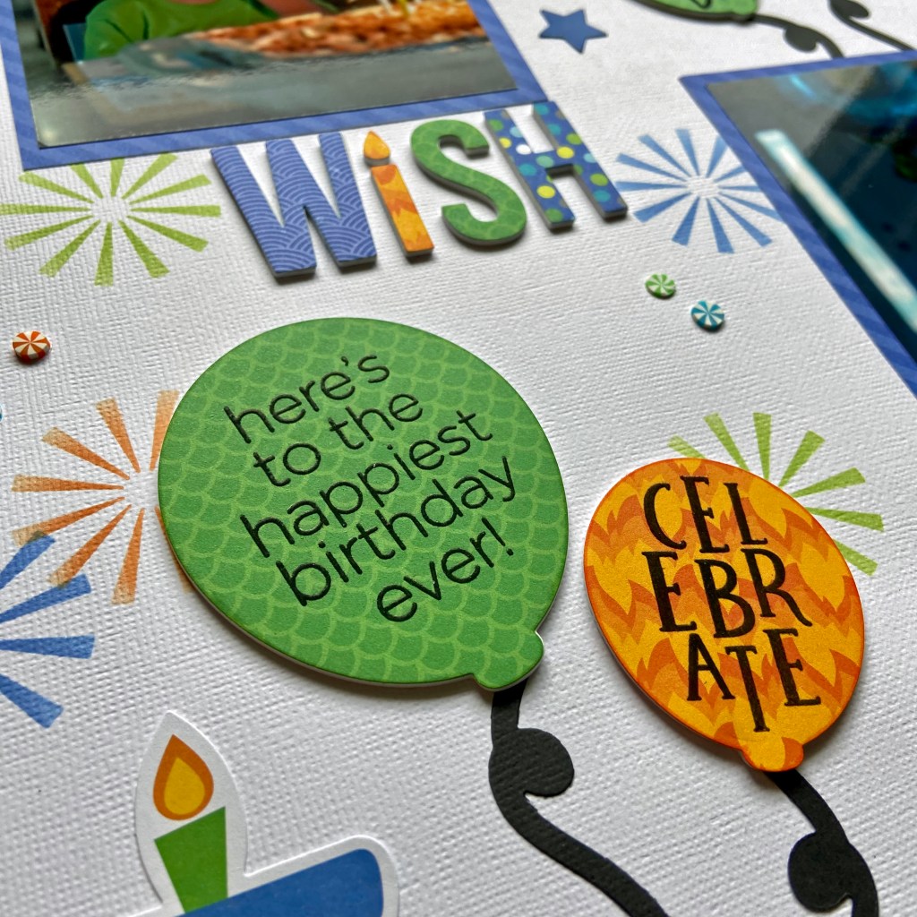
The word WISH was created using a die cut from My Favourite Things. This die was also part of my card-making supplies. I chose 4 coordinating patterned papers from the Dragon Tails line to create this. Craft foam was glued to the back of each of the letters in WISH and all of the balloons to create more dimension in the layout. The final touches included adhering the small colourful Sprinkletz Embellishments (called Beach Balls) from Buttons Galore & More over both pages, and adding the present to the bottom of the page. The small Beach Balls were a perfect fit to coordinate with the stencilled images. The present came from the Dragon Tails coordinating odds & ends ephemera package.

Well, that’s a wrap on my design process for this layout. I hope I’ve inspired you to try a few new techniques on your next layout. May all your celebrations be as much fun as this one was! Until next time, stay safe, stay well, and Happy Scrapping!

Hit the Reset Button

I am so honoured to have a couple of layouts published in the Summer 2023 edition of Creative Scrapbooker Magazine! If you don’t subscribe, be sure to get a copy. This magazine is chock full of inspiration! This layout (found on page 122) is very special to me. It marked the official beginning of my son’s and his wife’s honeymoon last summer. They are avid campers and they headed to the mountains to decompress following their wedding. This little cabin in the woods was a perfect getaway for their first few nights away.

Peartree Cutfiles had the perfect cut file to complement this photo. The Hit the Reset Button was an excellent fit for the mood and feel of this layout.

I turned to Paper Rose’s Mountain Trek collection, once again, to create this layout. The background paper, Mountain Trek – B, provided the backdrop for this design. The cut file was backed with sections of Mountain Trek – D patterned paper. I love to incorporate stamping into my scrapbook pages and I turned to an older stamp set from Technique Tuesday, called Words We Love, to stamp the words EXPLORE and Adventure around the title. The Memory Misti is a perfect tool for stamping on your scrapbook pages. If you’re like me, you need a tool that allows you to stamp in the same place more than once!

I found some tri-coloured skeleton leaves in my scrapbooking supplies from at least a decade ago. I added a few of these leaves around the picture to help enhance the colours of the layout, provide a woodsy feel, and add some texture.

The final touches included fussy cutting the cabin and trees found on the coordinating Mountain Trek – C paper. They were simply glued directly onto the page. The date was added using Doodlebug Designs stickers.

I hope you’ve enjoyed learning about my process to create this layout. I am so grateful to have it included in the Summer 2023 edition of Creative Scrapbooker Magazine! Until next time, stay safe, stay well and Happy Scrapping!

Life is a Beautiful Ride

When Canadian cousins get the opportunity to meet up in Austria, a good time is guaranteed! As the Nana to Ben, and the Aunt to Raquel, I have to tell you this picture gives me all the feels! It is so difficult being so far away from your family, but when you see them get together on another continent, and see the love and joy on their faces, it makes one’s heart burst! It certainly makes me count my blessings to be part of such a loving family.

If you are familiar with Peartree Cutfiles, you’ll know their tagline is “There’s a Cut File for That”. I can’t think of a better cut file for this photo than Life is a Beautiful Ride. This picture of Ben and Raquel was taken at the historic Prater Amusement Park in Vienna, Austria. (Photo credit to my talented daughter, Lindsay!) I cut the file in black using American Crafts Precision Cardstock. It was backed with gorgeous papers from Craft Consortium’s Ink Drops – Ocean collection. I loved how the hues and tones of this paper blended with the blue watercoloured background foundation page from Vicki Boutin’s Color Study Ready-to-Use Mixed Media Paper collection.

The rest of this layout came together quite easily. After adding a bit of journalling to describe the photo, I used Thickers from 3 of Vicki’s collections to embellish the layout. I pulled hearts, words, phrases, stars and an arrow from the Loving This, Stories of US, and Perfect Day Thicker collections.

Every time I look at this layout my heart, and maybe even my eyes, fill up! So much love, so much fun, so much to experience and share together. I am so thankful these two had the opportunity to make such great memories together!

Thanks for stopping in today. Until next time, stay safe, stay well, and Happy Scrapping!

Tour – Salzburg

I’ve been having so much fun creating these past two months! Today’s layout focuses on a photo my husband took in Salzburg, Austria. Although it wasn’t one of the best weather days on our trip, the colours and perspective in this photo instantly take me back to that moment every time I look at it. Most of you would know Salzburg from the musical “The Sound of Music”. This magical city is full of breathtaking discoveries around every corner.

Before I describe the details of creating this layout, I must give a shout-out to Lisa Furtney, owner of ScrapFest. Lisa owns and operates this event-based business and hosts large and small face-to-face and virtual events throughout the year with her wonderful team. I am a member of ScrapFest Connect – a virtual membership group of fellow crafters on Facebook. ScrapFest Connect offers members several virtual events a year, plus they run a monthly challenge open to all members. I was honoured to be the March Challenge Winner this year, and I used products from my prize package to create this layout. I have plenty of leftover products from my prize package, so you can expect more designs using them. Thank you Lisa and Team for this beautiful prize package!

My prize pack included the 49 and Market 12′ x 12′ Paper Collection Pack of Vintage Artistry Everywhere and several coordinating embellishments, including the Chipboard Set, Laser Cut Elements, Epoxy Coat Sticker Embellishments and Tag Set. Absolutely perfect for all the pictures we took on our recent travels overseas! I chose the back side of the Great Big World patterned paper for the background of this layout. Each patterned paper comes with a strip at the bottom that provides details on the brand and name of the paper. In this case, the back side of this strip had a coordinating row of tickets. I decided to keep this element in my layout and therefore trimmed off the top part of the patterned paper to fit the 12″ x 12″ layout.

I used two cut files to create this layout. The first cut file comes from Peartree Cutfiles and is entitled Travel Words. I find it very helpful to use the software in Silhouette Studio to size all my files and pictures before cutting or printing. For this layout, the cut file was reduced considerably to fit the space. I backed each word with a coordinating piece of cardstock to complete the title.

The second cut file comes from Bea Valint at My Shiny Studio and is appropriately titled World Map. Bea’s file is a free download from her blog. To replicate a perfect alignment of the cut file on my page, I cut the outline of the cut file from a 12″ x 12″ piece of vellum. The vellum was then positioned over the patterned paper and used as a template to secure the cut file in place.

To complete the design, I added some epoxy coat sticker embellishments on either side of the photo, and the geotag with the “Right Here” bauble to the world map to indicate Austria. Two rubons were added to the centre of the layout for added depth and texture. The large blue geotag, “On the Bucket List” and “A Perfect Day” banners were utilized from the Chipboard Set. The final embellishment is the set of binoculars that hang off the end of the word Adventure. These were found in the Laser Cut Elements package. The location of the photo was added using Thickers “Happy Life” foam stickers. And last, but not least, I included the date by writing it on the inside of one of the date stamps on the patterned paper. It can be found to the left of the photo.

Thanks for stopping by, and I hope I’ve inspired you to scrapbook a few of your own travel pictures. Until next time, stay safe, stay well, and Happy Scrapping!

Corn Maze

Last fall Lindsay, Bill and I had the opportunity to take Ben to the Apple Land Station Corn Maze. This outing was a big deal – Covid restrictions meant this sweet boy had missed out on many fun activities in his early years. It was a perfect autumn day to experience this with him, and Ben loved it! It didn’t take Ben long to figure out the maze, but he had fun pretending that he was confused and didn’t know the way back out. I love how this layout captures the sheer joy of being a child and the precious memories we shared that we will cherish for a lifetime.

To create this double-page layout I combined two cut files from the Silhouette Design Store. I started with the Fun Maze Game, Design ID #8489 and used my Silhouette design space to blow it up as large as possible to fit on this layout. The end result was a cut file approximately 11″ x 13 “. I then laid the maze on the white cardstock to determine the best positioning to cut it vertically. Once the maze was secured to the background of both pages, I used sticky notes to map out the path of the machine stitching to mimic physically walking through the maze. 

Next, I cut two corn stalks from three coordinating pieces of beige cardstock to create a frame for the layout. This cut file is called Corn Stalk and is Design ID #12866. Each completed corn stalk was firmly secured at the bottom, but the tops were left free to provide texture and the illusion of depth and movement. 

To put the finishing touches on this layout I used Cork Chipboard Thickers to add the Corn Maze title. I utilized my 12″ x 12″ Memory Misti to add some stamping to the design. Using an older My Favorite Things (MFT) stamp collection entitled You’re Amazing, I stamped the START, FINISH and the You’re A-maze-ing sub-title directly on the white cardstock. I had several pictures to add to this layout and still wanted to add some journalling for Ben to reflect on in the coming years. Because I didn’t want to distract from the overall design at this stage, I included hidden journaling by sliding a tag behind one of the pictures (pictured on the left-hand side of the double page). I used another MFT product entitled Scallop X-Stitch Tag to make this tag. A gold ribbon was secured to the top of the tag for easy access to the journaling card. 

These moments will be cherished for years to come. Fast forward to a year later, and this sweet boy and his family are now living in Austria. Rather than be sad about it, we’ll look for new ways to make memories when we are together!

Thanks for stopping by today, and until next time, stay safe, stay well, and Happy Scrapping!

Roarsome

In late June, we travelled out west for our son’s wedding. My daughter and her family planned a few side trips while we were there, and Drumheller was their first destination. Drumheller, Alberta, is located northeast of Calgary. It is known as the dinosaur capital of the world, and it was a huge hit with our grandchildren!

I chose the Roarsome title from Peartree Cutfiles to showcase a picture from their trip. I loved the addition of the dinosaur on top and wanted to make it a bit whimsical as I designed the layout. The patterned papers in the title come from an older Carta Bella Paper Co collection aptly entitled Dinosaurs.

While I backed the words in the title, I chose to lift the pieces of the dinosaur by securing a piece of black fun foam underneath each piece to create dimension and the illusion of flight. I added green googly eyes to the dinosaur to enhance the whimsical feel of the layout. Once the title was complete, both the picture and title adhered to the fun background paper 12″ Life in Color Bricks. This background page also belongs to an older BoBunny collection called Life in Color.

The final elements of the layout came together quite quickly. The “vacay” puffy phrase and accent stickers came from a Vicki Boutin collection of Thickers called Loving This. The date and location of the picture were documented with Doodlebug Design Inc.’s teensy-type stickers.

And there you have it, a simple and whimsical page that focuses the attention on the picture and title. Thanks for stopping by today, and until next time, stay safe, stay well and Happy Scrapping!

Hey Bestie

This layout is very special to me. I designed it as a birthday gift for one of my life-long friends, Gail, who was celebrating a milestone birthday. We’ve been through decades together, and she’s been there for me through thick and thin. While there may be a few years difference in ages, we’ve had fun together as if we were classmates growing up together. It turned out that we both married the man of our dreams the same year. Coincidently, our husbands share the same first name. The picture in this layout comes from our mutually celebrated 25th wedding anniversary trip to Italy. A dream come true for all four of us!

I used the Hey Bestie cut file from Cut to You as the centrepiece for this design. The cut file was cut from white cardstock and then pierced with a paper piercer to allow a stitched border.

The letters were stitched with pale peach embroidery floss and the heart with pale blue. Cocoa Vanilla Studio’s, These Days, coordinating patterned paper, was used to backfill the letters in the title.

I created a shaker pocket for the heart and added some sequin mix from Cocoa Vanilla’s Daydream collection. These sequins coordinated with this collection beautifully. At this stage, the title was set aside. The background paper for this design came from a Vicki Boutin collection of Ready-to-Use Mixed Media Paper pads. The gold, pink, and peach background was a stunning backdrop for this completed title. In preparation for securing the title to the page, it was backed with Foam Sticky Strips from Taylored Expressions. The photo was placed on a coordinating patterned paper used in backing the title. Once I was happy with the positioning of each, they were both secured to the page.

The page was completed by adding various coordinating embellishments from the These Days collection. The flower cluster, seen at the top left of the photo, was created using various elements from the Floral Ephemera pack. The yellow butterfly was used from the Die Cut Ephemera pack and the small colour-coordinated hearts came from the Puffy Stickers collection. The final embellishments added were the gold heart and the YOU ARE SO LOVED phrase to the bottom right of the title.

When the layout was complete, it was placed in a white shadow box before it was gifted to Gail. She loved her gift and the beautiful reminder of our special friendship. I hope you have at least one friend this special. Here’s to girlfriends everywhere!

Until next time, stay safe, stay well, and Happy Scrapping!

Rainbow Vibes

Well, life derailed me these past three months, but I’m happy to say I’m back in my craft room and starting to get creative again! After a few false starts, I’m pleased with the results of this layout. It seemed fitting to work on a layout about rainbows after the ups and downs we’ve been through lately. This fun picture of our youngest grandson, Ben, captures the joy he was feeling at that moment. And let’s admit it, who wouldn’t want to play on that rainbow xylophone?!

I was excited to use Pretty Little Studio’s Wildflowers collection to create this layout. The background paper is called Color Palette. I paired it with a cut file from Peartree Cutfiles called Rainbow Vibes. I used black American Crafts Precision Cardstock to cut the main title and backed it with coordinating cardstock colours matching the page’s rainbow. I took the liberty of adding a soft green to mirror the colours found in a rainbow. Once I reached this stage with the title, I set it aside.

The next step was to add stitching to the rainbow on the patterned paper. A paper piercer was used to punch holes in the small white channels found between each colour of the rainbow. Each channel was stitched with a separate colour using a simple straight stitch. Seven colours were used overall, including a soft green to bring continuity to the layout. The following DMC embroidery threads were used, moving from left across the layout (718, 3689, 725, 907, 3761, 0851, 554). One exception is the teal embroidery floss; it is an Anchor product. I love the bit of texture these stitched channels add to the design. After the stitching was completed, I placed the title and photo in their respective positions. The title was elevated slightly by using Taylored Expressions Foam Sticky Strips. These strips are highly flexible and come in both black and white options.

The final steps included adding ephemera from the Wildflowers collection. Three hearts and the rainbow phrase were added from the Chocolate Bunny Word Die-Cuts package. The pink and yellow hearts were included in the package, but the third heart, teal in colour, came as a black and white image. I used a Copic marker to colour the centre to coordinate with the Rainbow Vibes title and the rainbow on the patterned paper. Doodlebug Designs “my type” stickers were used to add “Storybook Gardens”.

To complete the layout, I used more ephemera from the Wildflowers collection found in the Spring Mix Die-Cuts package. These elements include the tab above the picture where the date was stamped and the two small flag banners in the bottom right-hand corner of the completed design. Foam Sticky Stips were used to raise these two small elements.

And there you have it! Such a fun layout to design and work on as I try to get back in my creative groove! I hope it’s brought a smile to your face today. Thanks so much for checking in.

Until next time, stay safe, stay well, and Happy Scrapping!

Right Here Right Now

Do you remember the joy of Springtime and the welcome change of activities from winter? Owen wanted a basketball for his birthday and was thrilled when his wishes came true this year. I turned, once again, to Cocoa Vanilla Studio’s No Limits collection to document this special moment. I love how the colours in the photo work so well with the colours in this collection. The background patterned paper for this layout is called Spark.

The Right Here Right Now title came from Peartree Cutfiles. I chose several coordinating papers from the No Limits collection to complete this title.

I backed the words in the cut file with four coordinating patterned papers (Stardust, Latitude, Nebula and Orbit) while I popped up the orange arrows (Spark) using fun foam. By doing this, I helped draw emphasis to the picture below.

The Always be Your Awesome Self phrase was cut from the Universal patterned paper sheet. I chose a coordinating green ink and inked around the edges of this 3″ x 4″ phrase for further emphasis. It was also backed with fun foam for dimension. Next, I chose two coordinating phrase strips from the 3″ x 4″ rainbow phrase block as seen on the Universal patterned paper. The edges of these phrase strips were highlighted in coordinating inks.

Before adhering any of the phrase elements to the layout, I took time to plan out the remaining embellishments I would use from this collection. The blue star, rocket ship, and blue ticket were all chosen from the coordinating Die Cut Ephemera package. The edges of the star and ticket were inked with coordinating blue ink. At this stage, all of the phrases and ephemera were layered and adhered directly to the layout. The final touch was adding the date for prosperity. Doodlebug Designs Inc., Teensy Type alphabet stickers, were used to do this.

Thanks for joining me today, I hope you’ve enjoyed learning how this layout came together. This is a wonderful collection of papers and ephemera for all the boys and men in your life. I hope you have as much fun creating with it as I did!

Until next time, stay safe, stay well, and Happy Scrapping!

Hedgehugs

Who needs a hug today? I know I will take one anytime, especially from this sweet boy! Today’s post celebrates my youngest grandson’s love for hedgehogs. One of his favourite stuffed animals is a hedgehog fondly referred to as “Hedgie”. For Christmas, I made him a t-shirt with a hedgehog and the word Hedgehugs on it. It was an instant hit! You can see the t-shirt throughout the layout.

The cut file for the shirt came from the Silhouette Design Store. It is a creation from Planeta Silhouette and is Design ID #212569. It became the inspiration for this layout! I used this cut file to create the title on the left-hand page and repeated it on the right-hand side of the design.

The hedgehog on the left is a cut file from Confessions of a Paper Addict (COAPA). It was a perfect fit for this page. I used coordinating cardstocks to complete most of the cut file.

To give it a bit more punch I used coloured glitter papers to back the flowers, leaves, heart and ear of the hedgehog. Once it was secured to the layout, pearl beads were added to the flowers on its head. The final touch was adding a large googly eye for some dimension.

The patterned papers used in this layout come from PinkFresh Studio’s Let’s Stay Home collection. It was released early in the pandemic.

The adorable hedgehog wooden shapes, found on the right-hand page of the layout, came from Craft Consortium and from a collection called Over the Hedge.

The final touches for this two-page layout included adding a few foam stickers from the Simple Stories Good Stuff collection and then doodling the lines around each page with a fine sharpie. The date was added with Teensy Type cardstock stickers in Blue Jean from Doodlebug Design Inc.

I hope you’ve enjoyed this whimsical layout celebrating hedgehogs and the all-important HUG! This double page layout also shows you how you can mix and match many of the papers, ephemera and embellishments you have in your crafting stash. Thanks for dropping by today, and until next time, stay safe, stay well, and Happy Scrapping!