Do you ever use a sketch for inspiration? They are a wonderful tool, especially if you feel you’ve hit a crafting rut. Last month, I participated in the final crop for the VIP group of Creative Scrapbooking Magazine. It was bittersweet to say goodbye to such a fabulous group of creatives. But it was a fabulous crop, hosted by Simply Stated Design, a wonderful Canadian company! One challenge was to create a layout for the crop using the provided sketch.
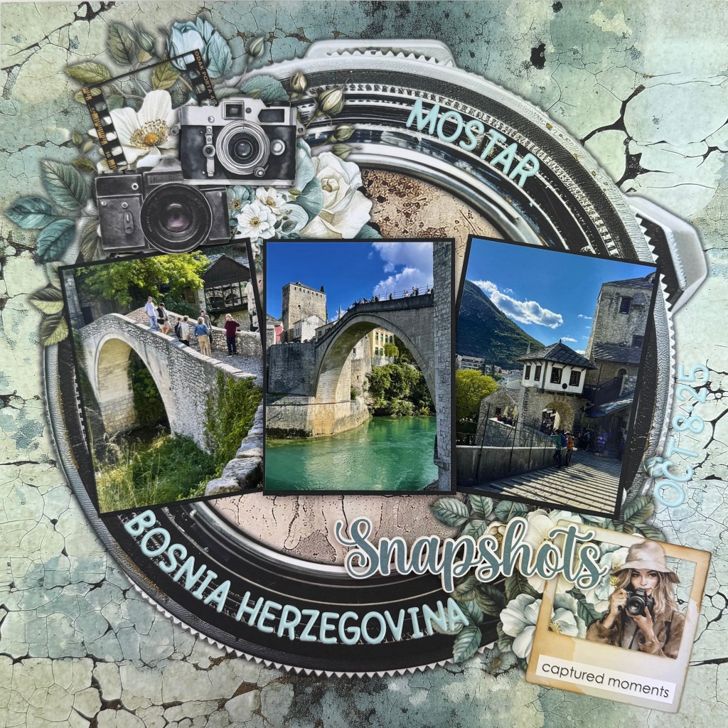
I immediately recognized that I owned patterned paper from Mintay Papers that would work perfectly with this sketch. This gorgeous camera lens paper is paper number 2 in the Photographer collection. It became the large circle found in the sketch. This paper really provided the heavy lifting for this layout. From there, I added three photos from our trip to Mostar last fall. Mostar, a UNESCO World Heritage site in Bosnia and Herzegovina, and its bridge, Stari Most, are popular tourist destinations. It is a rebuilt 16th-century Ottoman-era bridge. The photo of the bridge deserved to take a central place in my layout. It was added to the layout with a piece of fun foam to add dimension and focus.
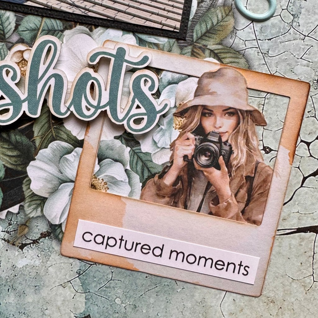
I used ephemera from the Photographer collection to complement the design. The female photographer and the slide frame were both inked around the edges using Altenew Ink for added dimension. Next, I slid the photographer behind the slide, making sure to keep her hat outside of the frame. I added the ‘captured moments’ phase to the bottom of the slide and sourced it from the paper stickers in the Photographer collection. Next, I added this grouping to the bottom-right portion of the lens.
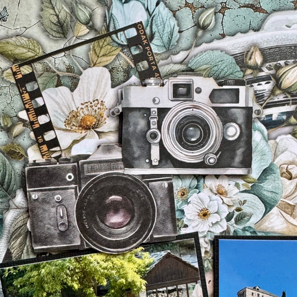
The cameras and slide cluster of ephemera are a mix of 2 Mintay Papers collections: Photographer and Mamarazzi. The cameras were placed on fun foam to add further dimension.This cluster of elements was placed in the top-left corner of the lens.
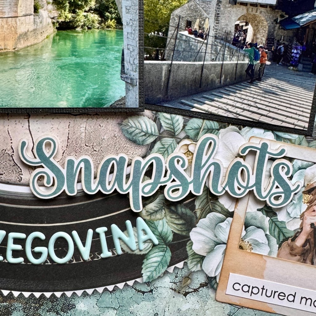
The title for the layout, Snapshots, came from the Mamarazzi Die-cuts collection. It was also adhered with small pop dots.

The final elements included adding the location and date to the layout. All of these elements were completed using Doodlebug Designs Puffy Alphabet Stickers in Mint. I adhered all of them in the layout using the curve of the camera lens as a guide.
This layout came together so quickly, thanks to the sketch as my guide. The camera lens really draws your attention to the beautiful pictures from our trip. I’m very pleased with the final result. Thanks for stopping by today. Until next time, stay safe, stay well, and Happy Scrapping!