’round Venice

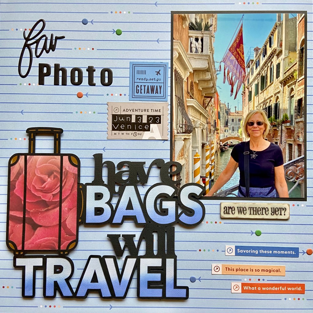
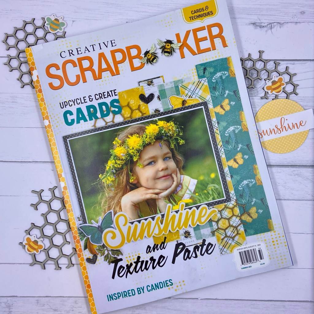
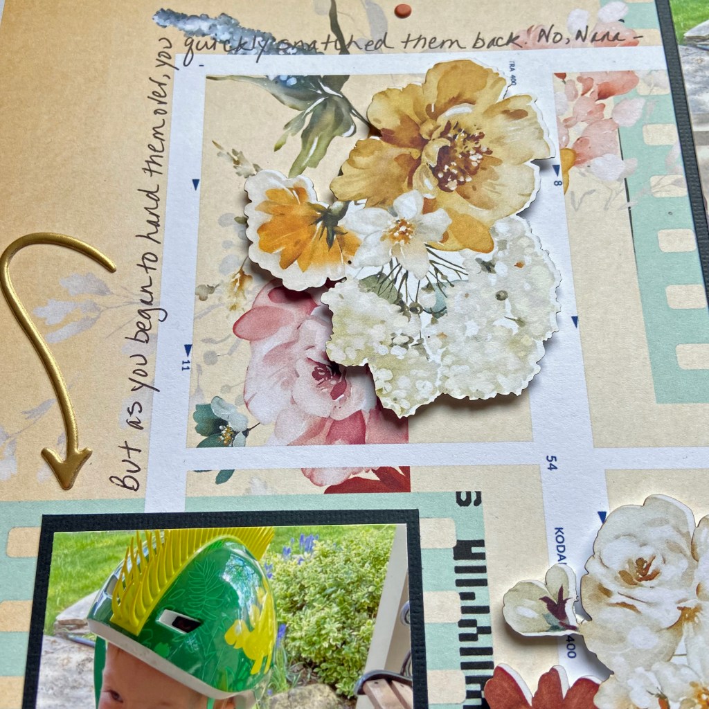
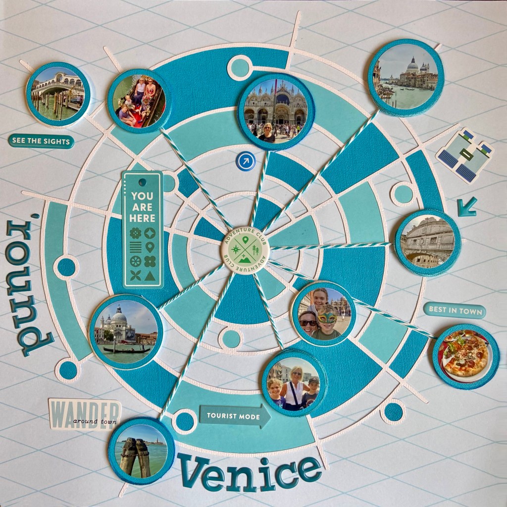
This past June, we experienced the delight of travelling to Venice with our daughter and family. To say that it was a magical time would be an understatement! We soaked in as much of the old city as possible in our time together. My highlight was a gondola ride with my daughter and three grandchildren. The beauty and mystique of this unique city really come to life when you ride a gondola down the winding canals. This layout was a way for me to capture the highlights of our incredible trip all on one page. I was honoured to have this layout published in Creative Scrapbooker Magazine’s Winter 2023/24 edition (page 96)!

Trying to fit ten photos on one page was no small task. When I saw the Circles Within Circles cut file from Peartree Cutfiles, I immediately visualized a way to make it happen. My first step was to cut the file from white cardstock. Next, I imported the pictures I planned on using into my Silhouette software and resized them to fit into the designated circles on the cut file. The easiest way to ensure success with this technique is to use the “Bring to Front” option in the Silhouette software. Right-click on your cut file and select “Bring to Front”. Your photo(s) are now behind the cut file. Now, you can easily resize them to fit the section of the cut file you chose. Once sized and printed, I cut each photo with a circular die to fit each corresponding position on the cut file.

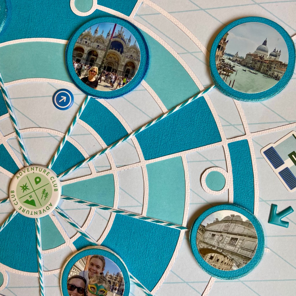
I turned to PinkFresh Studio’s Tourist Mode collection to design this layout. I focused on a monochromatic effect and chose blue to mirror the jewel tones of the water surrounding Venice. The next stage in creating this page involved backing parts of the larger cut file with blue-toned cardstock. I turned to the Silhouette software to assist in this task as well. By utilizing the “Fill” panel, I coloured sections in the cut file with corresponding shades of blue. Once I was happy with my selections, I copied, offset them, and cut them out using the Silhouette. Once all these pieces were adhered to the back of the cut file, the cut file was centred and secured to the background paper.

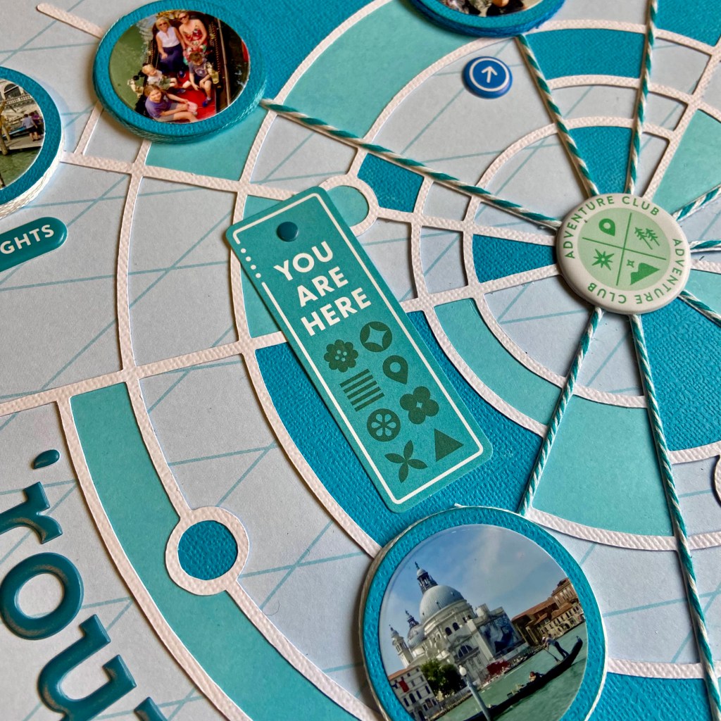
In preparation for completing the layout, I matted each photo on the page in blue cardstock with a slight offset for framing. Next, the strands of blue and white twine were secured to the layout, starting from the centre and ending at several pictures. This effect helps draw the eye to the photos and emphasizes the story of being all over the city. I secured each photograph to the page with a smaller piece of fun foam beneath. A small gap underneath the edge was filled by wrapping embroidery floss in coordinating colours.

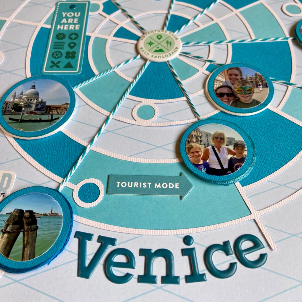
The rest of the layout came together quickly with additional elements from the Tourist Mode collection. The title was adhered with Puffy Alpha Stickers. Items from the Ephemera Pack, Chipboard Stickers and Puffy Stickers were all selected to coordinate with the monochrome effect.

I really stepped outside my box to create this layout. I traditionally focus on one or two photos per page when I scrapbook. I am really thrilled with the results and hope you agree. One scrapbook layout that sums up our activities in Venice! Thanks so much for stopping by today. Until next time, stay safe, stay well, and Happy Scrapping!

Have Bags Will Travel

One of my favourite post-Covid activities is travelling! We are truly blessed to have family living in Austria that allow us to visit and use their home as a base to travel from. We made several trips overseas during the last twelve months, and have additional adventures planned ahead. I keep pinching myself that I should be so lucky! The picture in this layout is from Venice, Italy, where we met our family for more exploration and to make unforgettable memories together!

I chose the Tourist Mode paper collection and ephemera pack from PinkFresh Studio to document this romantic picture of Venice. I love how the colours in this collection complemented the beautiful colours of the canal.

The title cut file, Have Bags Will Travel, comes from Peartree Cutfiles. It perfectly encompassed my feelings for these great adventures we’ve been taking.

I was also attracted to this cut file because it let me personalize the suitcase. Many friends know I travel with a pink and red rosed suitcase with gold fixtures. This beautiful cut file allowed me the ability to mimic this look. I used an older sheet of patterned paper in my stash from Creative Imaginations called Prom Paper to recreate this look. I turned to gold foil cardstock to create the gold accents. 

To achieve the blue ombre effect in the title, I offset the letters slightly and cut them from white textured cardstock. Using Altenew inks in Blueberry and Winter Lake, each letter was inked to create the overall effect. Once I was happy with the overall tone and gradation of each letter, they were adhered to the back of the title. The entire title was secured to the layout using black dimensional fun foam for added texture and visual impact.

The bottom three phrase strips came from the Tourist Mode ephemera pack. The wording perfectly captured my thoughts and feelings on this trip. The origin of the “Are we there yet?” chipboard accent is unknown, as I have had it in my collection for many years.

The foam “Fav Photo” phrase and all the coordinated foam dots on the layout belong to Vicki Boutin’sLoving This” thicker collection. The two additional pieces of ephemera belong to the Tourist Mode collection. Each piece of ephemera was inked along the edge with a colour-coordinated Altenew ink (Orange Sherbert, Orange Cream, Caribbean Sky, and Limestone). Doodlebug Designs teensy-type stickers were used to note the date and location.

I hope everyone finds an opportunity in their life to travel. For me, it is not only educational and enlightening, it is truly life-changing. Thanks for taking this trip with me today, and until next time, stay safe, stay well, and Happy Scrapping!

Happiness Right Here

Oh, the pure bliss of swimming! And what could be better than swimming in the South Aegean off Naxos, Greece?! My daughter, son-in-law, and family vacationed in Naxos this summer; as you can see from the picture, it was a huge hit! Madison has always been a water baby, so this vacation was right up her alley. When I saw this picture I knew it was the perfect match for the Happiness Right Here cut file from Peartree Cutfiles. Peartree is celebrating its third birthday this month, and this cut file is free for the month of August. You can find the free version here. Come play along with the birthday celebration!

After cutting the file from white cardstock, the letters in the title were inked using Altenew’s Blueberry and Winter Lake inks. The lighter shade (Blueberry) was applied to the top of each letter and the darker (Winter Lake) was applied to the bottom to mimic the colours in the sea and the differences you see as the light hits the water.

I chose the backside of the Seashore patterned paper from Paper House’s At the Beach Collection to document this special moment.

The soft jewel tones and gentle waves of the sea in the picture drew me to the Waves Border cut file to compliment this layout.

Rather than cut the file from coordinating paper with my Silhouette, I chose to stitch it. My first step was to flip the file horizontally and use a sketch pen to draw the design on the back of the patterned paper. I then used a paper piercer to hand pierce the pattern in preparation for stitching. I then gathered coordinating jew tone embroidery floss to mirror the colours of the sea in the picture and began stitching. A total of 8 colours were used to complete this design (Anchor Embroidery Floss: 130, 131, 160, 161, 185, 186, 187, 188). A chain stitch was used and I randomly changed threads as I worked my way through the design. I purposefully choose lighter tones for the top of the wave, and darker tones for those below. This process took several hours, but the results were well worth it!

The final touches to complete the layout were adding the date and the location of the picture. These were done by using the Swimming Pool Doodlebug Designs Alphabet Sout Puffy Stickers.

I’m so happy to share in the celebration of Peartree Cutfiles 3rd Birthday. Their birthday challenge was a lot of fun and made me think outside of the box. Thanks for joining me today, and until next time, stay safe, stay well, and Happy Scrapping!

Rollercoaster

Who’s in for a good roller coaster ride this summer? While visiting our family in Austria, we took another trip to the Prater, Vienna’s renowned amusement park. Emperor Joseph II opened the park to the public in 1766. It has been serving up smiles ever since! Our 10-year-old grandson somehow convinced his Mom to ride this wicked (lying down) roller coaster. I’m the one safely on the ground, filming for prosperity! This picture captures them as they pause before being loaded into a corkscrew lift to start their ride.

The paper selected for this layout is from Webster’s Pages and it is called Dream in Color – Drifting. It fits beautifully with my design when I rotate it upside down. I chose Peartree Cutfiles Rollercoaster cut file to document this fun event. I wanted my layout to provide the illusion of a roller coaster. To achieve this effect, I took several steps. 

First, the cut file was cut out in black to help the title stand out. Next, the letters of the title were cut in blue to match the sky in the photo. The third step included cutting the file once again in red to imitate the red steel girders of the actual roller coaster. The cut file was cut once again in yellow to mimic the yellow rails the roller coaster cars travelled on. Once all 4 colours were cut, I carefully cut the elements away that I didn’t need and glued each section into place to recreate the coaster my family was riding.

To further the illusion of the actual roller coaster, I used Taylored Expressions Black Foam Sticky Strips to back the cut file and provide dimension. Each sticky strip was cut in half lengthwise and then carefully adhered to the back of the cut file to achieve this look. While somewhat tricky and time-consuming, I am very happy with the result.

The sticker phrases and journalling box came from an older Echo Park paper collection called hello Summer. The large colour-coordinated FUN sticker is from Photoplay’s Those Summer Days paper collection. The final design element was adding brightly coloured stars in the sky. These stars are Puffy Stickers from Cocoa Vanilla Studio’s No Limits collection.

I may not be a roller coaster enthusiast myself, but I certainly had a blast documenting this ride for my family. My grandson is very excited this layout will be included in one of his scrapbooks!

Have I convinced you to get out to the amusement park this summer? Be sure to take every opportunity to enjoy this glorious summer and all the opportunities it offers! Until next time, stay safe, stay well, and Happy Scrapping!

Soak Up The Sun

My granddaughter, Madison, had a wish for her birthday. She wanted to be in the sun, in shorts, on her birthday. Now that her family lives overseas, a quick trip to Spain was quite doable. As you can see from the picture, she got her birthday wish! Now I won’t lead you to believe that the water was warm at the time, but nothing was stopping this girl from thoroughly enjoying the sun, sand and surf!

I used the Summer Lights patterned paper from Cocoa Vanilla Sudio’s Sunkissed collection for the background of this layout. It reminded me of the bright sunny days and beautiful sunsets on the Costa Del Sol. The title cut file, Soak Up the Sun, comes from Just Nick and is now, sadly, unavailable as she has shut down her shop on Shopify. Fingers crossed she will bring it back one day! I backed this cut file with coordinating patterned papers from Lawn Fawn’s Watercolor Wishes Rainbow collection. I liked how it mirrored the changing hues in the background paper.

Just Nick also created the cut file for the Layered Waves at the bottom of the layout. I wanted these waves to look as realistic as possible. I used the backside of the Tropical Paradise patterned paper from Reminisce’s Caribbean Cruise Kit to achieve this look. To add more depth to the waves, they were each outlined in coordinating blue ink. I adhered the bottom wave directly to the page and backed the top two layers with foam to replicate wave action. The tri-coloured small crystals of water droplets were splattered around the waves to enhance the feel of the waves even further. They are a product called Baby Tear Drops from The Robin’s Nest Creative team.

Some final details to complete this layout included adding beautiful crystals to the sun in the cut file. They are from an older set of embellishments from Prima Marketing called Say it in Crystals. The Happy Life, foam letter stickers, were used to identify the location of the picture and the date.

Warmer days are just around the corner for us now. It’s time for all of us to get ready to play in the sun! Thanks for stopping by today, and until next time, stay safe, stay well, and Happy Scrapping!

Happy Happy Day

Oh, the excitement of turning 4! Ben waited in anticipation of his 4th birthday for many weeks. When the day finally arrived, it did not disappoint! You can see his excitement in all these pictures. In fact, it was quite contagious! It’s funny how we don’t get quite this excited about our birthdays as we get older. We truly should take a lesson from these younger folk, and get the most out of every special occasion. Carpe Diem, friends!

As I began to design this double-page layout, I knew I wanted something bold, bright and reflective of Ben’s excitement. Ben was wearing a T-shirt I made for his big day. Green is his favourite colour, hence the bright lime green T-shirt! I turned to an older Doodlebug Designs paper and embellishment collection called Dragon Tails to coordinate with his T-shirt. In addition to the patterned paper, I chose to add stencilling as one technique to help offset some of the white space and also to help create the mood of the layout. I chose 3 ink colours that coordinated perfectly with the paper to achieve this look. Using one of Vicki Boutin’s Radiate Stencils, from the Color Study collection, I randomly placed these colourful images across both pages.

I created my own cut file in Silhouette Studio for the number 4 and enlarged the cut file to fit within the borders of a 12′ x 12′ piece of white cardstock. Before cutting out the number, I used the offset function to highlight the outline of the number. This outline was then turned into a stitching file. You will find an excellent tutorial on turning your cut files into stitching files here. Once the cut file was completed, I stitched the bright blue border around the number 4 using DMC thread. I then selected 8 coordinating patterned papers from the Dragon Tails collection and cut them into 1/2″ strips. Using fringe scissors, I cut across the strips leaving a 1/4″ border free at the top. Double-sided tape was added to the back of each fringed piece along the 1/4″ top border. I cut a spare piece of plain paper slightly larger than the number 4 and began adding the strips to the spare paper, overlapping them to hide the plain 1/4″ border. The completed piece was then positioned and secured to the back of the cut file. I love the dimension this resulted in!

In addition to scrapbooking, I also make approximately 150 cards a year for family and friends. Nothing makes me happier than maximizing the use of my supplies across both these paper crafting passions. This layout is an excellent example, as I utilized several stamps and die sets to complete this design. These fun balloons belong to a Simon Says Stamp! collection created by Cathy Zielske called Balloon Greetings. All of the sentiments on the balloons belong to this set with the exception of the CELEBRATE sentiment. This sentiment belongs to a Concord & 9th stamp set called POP-UP PAR-TAY. Each balloon was then inked around its edges with coordinating ink.

The word WISH was created using a die cut from My Favourite Things. This die was also part of my card-making supplies. I chose 4 coordinating patterned papers from the Dragon Tails line to create this. Craft foam was glued to the back of each of the letters in WISH and all of the balloons to create more dimension in the layout. The final touches included adhering the small colourful Sprinkletz Embellishments (called Beach Balls) from Buttons Galore & More over both pages, and adding the present to the bottom of the page. The small Beach Balls were a perfect fit to coordinate with the stencilled images. The present came from the Dragon Tails coordinating odds & ends ephemera package.

Well, that’s a wrap on my design process for this layout. I hope I’ve inspired you to try a few new techniques on your next layout. May all your celebrations be as much fun as this one was! Until next time, stay safe, stay well, and Happy Scrapping!

Explore Dublin

Last Fall we had the good luck to travel to Ireland. We spent 4 wonderful days exploring Dublin. The history of this beautiful city is simply outstanding. This double-page layout focuses on Christ Church Cathedral, just one of many treasures in this gem of a town!

Those of you that regularly follow me, know I have an addiction to designing with Peartree Cutfiles! Therefore, this layout is no exception, as I have used two Peartree cut files to complete this design. I love the versatility of these cut files, as you can use them over and over. This is not the first layout that I’ve used the Explore cut file with, and likely not the last time either. This cut file was also an excellent fit with the paper collection used in this layout. I used Echo Park’s Getaway collection and found the backside of the Adventure patterned paper worked perfectly. The black and white compasses tied in nicely with the compass in the cut file. I used the Adventure paper to back the cut file with the exception of the compass itself. I used the backside of the Planes patterned paper for this element. A small black brad was used to complete the compass.

Drawing on the circle theme of the compass, I used one of the Radiate Stencils from Vicki Boutin’s StoryTELLER collection to stencil a random background on the right-hand side of this page. I was looking for a very subtle background for the Walnut Cream cardstock from Bazzill, and I turned to Tim Holtz’s Pumice Stone Distress Ink to achieve this overall look.

The right-hand page of this double-page layout uses the Film Strips Background cut file. It was part of the March 2023 Pearscription package. I highly recommend you investigate the Pearscription packages. You receive 5 exclusive cut files each month, and I can honestly say that I’ve never been disappointed! This cut file was the perfect way to add multiple photos with lots of detail from our visit to the Cathedral.

To balance the film strip, and draw your eye to the multiple pictures, I filled 3 separate frames with embellishments. The compass and word travel were stickers in the Getaway paper collection. The rustic star-shaped element comes from a package of Mechanicals by Finnabair and is called Steampunk Blades. I secured it to the layout with a small bronze brad. The third embellishment, Road Trip, is a glazed chipboard piece that’s been in my supplies for years. To complete the layout, I added the date with small round Doodlebug Stickers.

Thanks for stopping in today, I hope you’ve enjoyed a quick tour of Christ Church Cathedral in Dublin. Until next time, stay safe, stay well, and Happy Scrapping!

Hit the Reset Button

I am so honoured to have a couple of layouts published in the Summer 2023 edition of Creative Scrapbooker Magazine! If you don’t subscribe, be sure to get a copy. This magazine is chock full of inspiration! This layout (found on page 122) is very special to me. It marked the official beginning of my son’s and his wife’s honeymoon last summer. They are avid campers and they headed to the mountains to decompress following their wedding. This little cabin in the woods was a perfect getaway for their first few nights away.

Peartree Cutfiles had the perfect cut file to complement this photo. The Hit the Reset Button was an excellent fit for the mood and feel of this layout.

I turned to Paper Rose’s Mountain Trek collection, once again, to create this layout. The background paper, Mountain Trek – B, provided the backdrop for this design. The cut file was backed with sections of Mountain Trek – D patterned paper. I love to incorporate stamping into my scrapbook pages and I turned to an older stamp set from Technique Tuesday, called Words We Love, to stamp the words EXPLORE and Adventure around the title. The Memory Misti is a perfect tool for stamping on your scrapbook pages. If you’re like me, you need a tool that allows you to stamp in the same place more than once!

I found some tri-coloured skeleton leaves in my scrapbooking supplies from at least a decade ago. I added a few of these leaves around the picture to help enhance the colours of the layout, provide a woodsy feel, and add some texture.

The final touches included fussy cutting the cabin and trees found on the coordinating Mountain Trek – C paper. They were simply glued directly onto the page. The date was added using Doodlebug Designs stickers.

I hope you’ve enjoyed learning about my process to create this layout. I am so grateful to have it included in the Summer 2023 edition of Creative Scrapbooker Magazine! Until next time, stay safe, stay well and Happy Scrapping!

Life is a Beautiful Ride

When Canadian cousins get the opportunity to meet up in Austria, a good time is guaranteed! As the Nana to Ben, and the Aunt to Raquel, I have to tell you this picture gives me all the feels! It is so difficult being so far away from your family, but when you see them get together on another continent, and see the love and joy on their faces, it makes one’s heart burst! It certainly makes me count my blessings to be part of such a loving family.

If you are familiar with Peartree Cutfiles, you’ll know their tagline is “There’s a Cut File for That”. I can’t think of a better cut file for this photo than Life is a Beautiful Ride. This picture of Ben and Raquel was taken at the historic Prater Amusement Park in Vienna, Austria. (Photo credit to my talented daughter, Lindsay!) I cut the file in black using American Crafts Precision Cardstock. It was backed with gorgeous papers from Craft Consortium’s Ink Drops – Ocean collection. I loved how the hues and tones of this paper blended with the blue watercoloured background foundation page from Vicki Boutin’s Color Study Ready-to-Use Mixed Media Paper collection.

The rest of this layout came together quite easily. After adding a bit of journalling to describe the photo, I used Thickers from 3 of Vicki’s collections to embellish the layout. I pulled hearts, words, phrases, stars and an arrow from the Loving This, Stories of US, and Perfect Day Thicker collections.

Every time I look at this layout my heart, and maybe even my eyes, fill up! So much love, so much fun, so much to experience and share together. I am so thankful these two had the opportunity to make such great memories together!

Thanks for stopping in today. Until next time, stay safe, stay well, and Happy Scrapping!

This Life

With Spring finally arriving it seemed an appropriate time to share this double-page layout. We have had cool and rainy days in our neck of the woods for weeks. The grass is finally growing again, and so are the dandelions! Every time I look out the window, and see the dandelions growing, I am reminded of this very special day in my life. My sweet grandson Ben, just 2 at the time, rang my doorbell holding a bouquet of dandelions. Imagine my delight, a special bouquet picked just for me! But as life would have it, that isn’t quite how the story ended.

Here’s the story I journaled on this layout: “Ben – today you showed up with some beautiful flowers you had picked in the park. Nana, these are for you!!! But as you began to hand them over, you quickly snatched them back. No, Nana – I’m going to take these home!!!” Well, either way, you made my day! I knew this precious memory needed to be documented for prosperity.

I chose the gorgeous Mamarazzi paper, cardboard stickers and paper die-cuts from Mintay Papers to document this memory. The specific papers used in this collection were numbers 02 and 04. The combination of the yellow florals and cameras made it an instant hit with me. I was attracted to the frames used in these papers and utilized them to highlight my pictures. Several elements from the paper die-cut package were added, some with a layer of fun foam to add dimension and texture.

I kept all the embellishments to a minimum. I did not want to distract from this beautiful background paper. A couple of floral clusters were added to enhance the right-hand page. Phrases from the cardboard stickers were included on both pages of the layout. And the title “This Life” and all remaining embellishments were added using Vicki Boutin’s Stories of US” Thickers from her Fernwood collection. The date was added using Paige Evan’s “Happy Life” Thickers.

The Mamarazzi paper collection is highly versatile. I have used other papers in the collection to document some of our travel pictures and will share them with you at a future date.

Thanks for stopping in today, I hope my precious memory has provided you with a little laugh and made you smile. Until next time, stay safe, stay well, and Happy Scrapping!