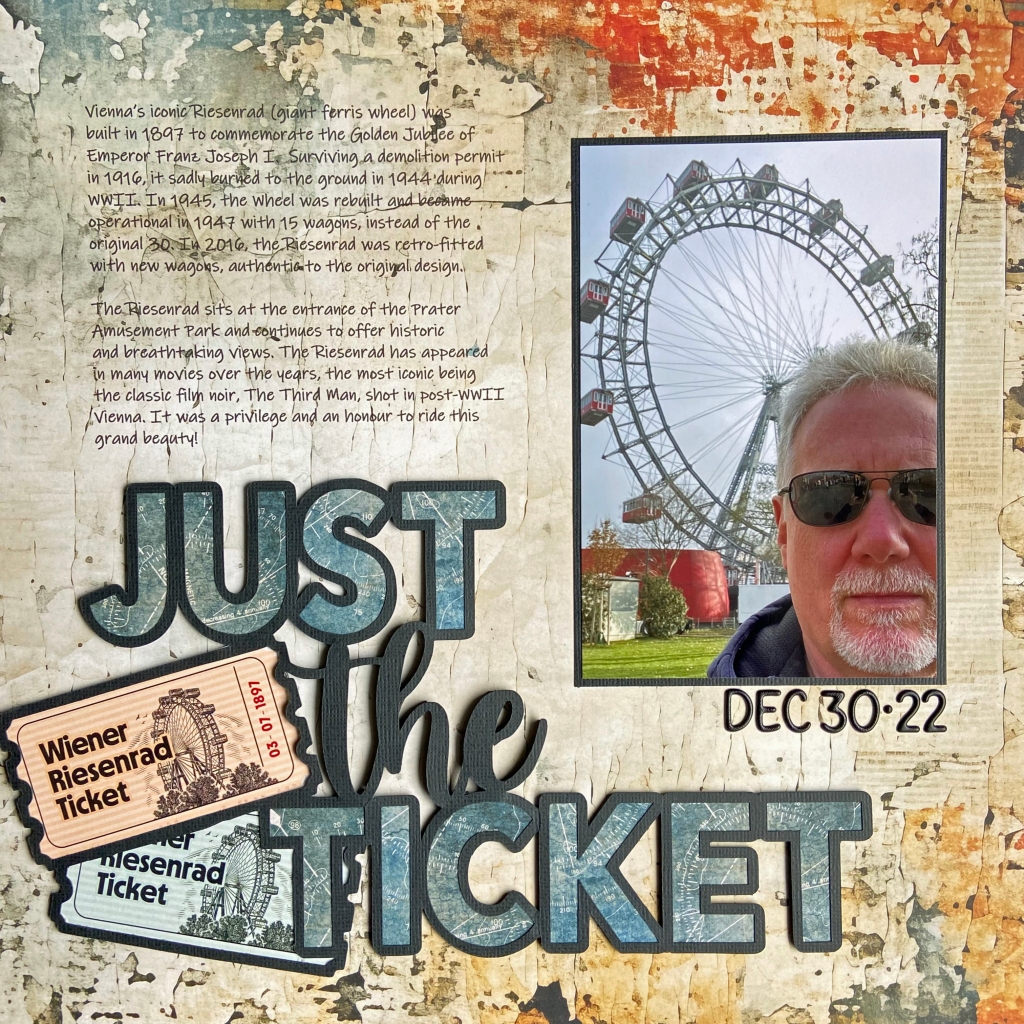
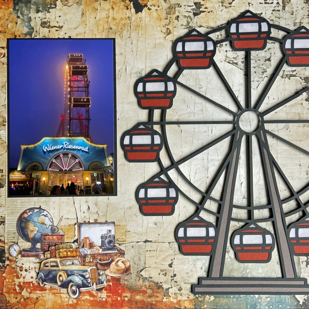
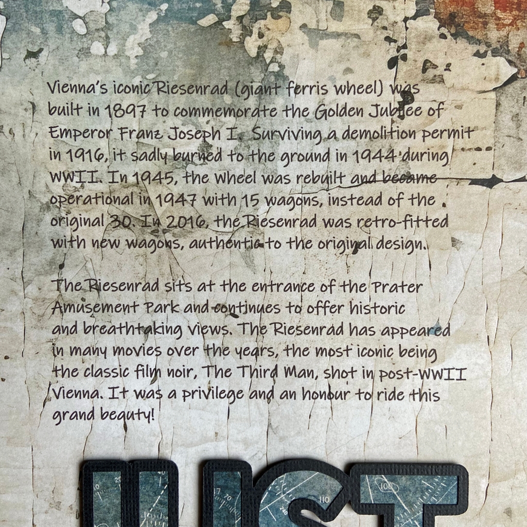
This trip to the iconic Prater Amusement Park was on my husband’s bucket list. A long-time fan of Orson Welles’ film The Third Man, this was a must-see item on his wish list. Fortunately for us, this gigantic Ferris Wheel resides in Vienna, Austria, and is only a quick trip from our daughter’s home. While we have visited the Prater more than once, these pages document Bill’s first trip to the incredible Riesenrad.
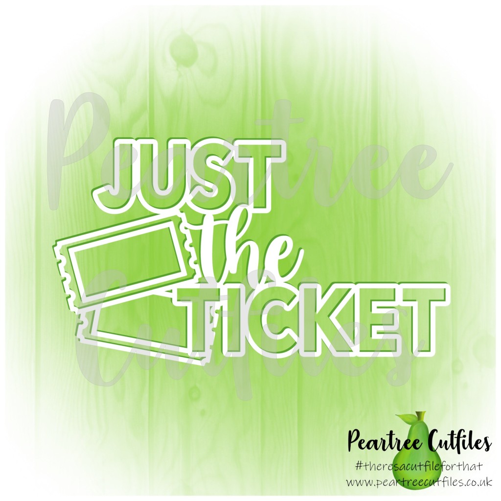
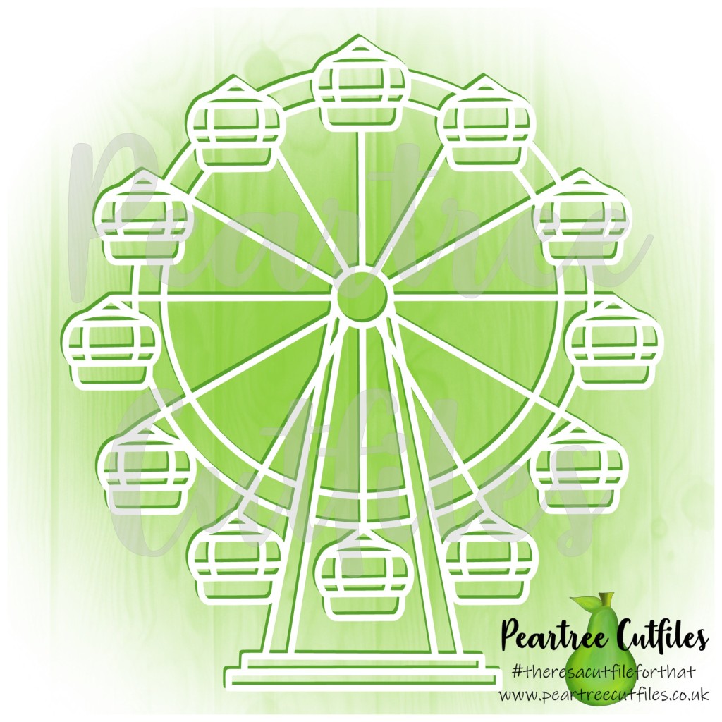
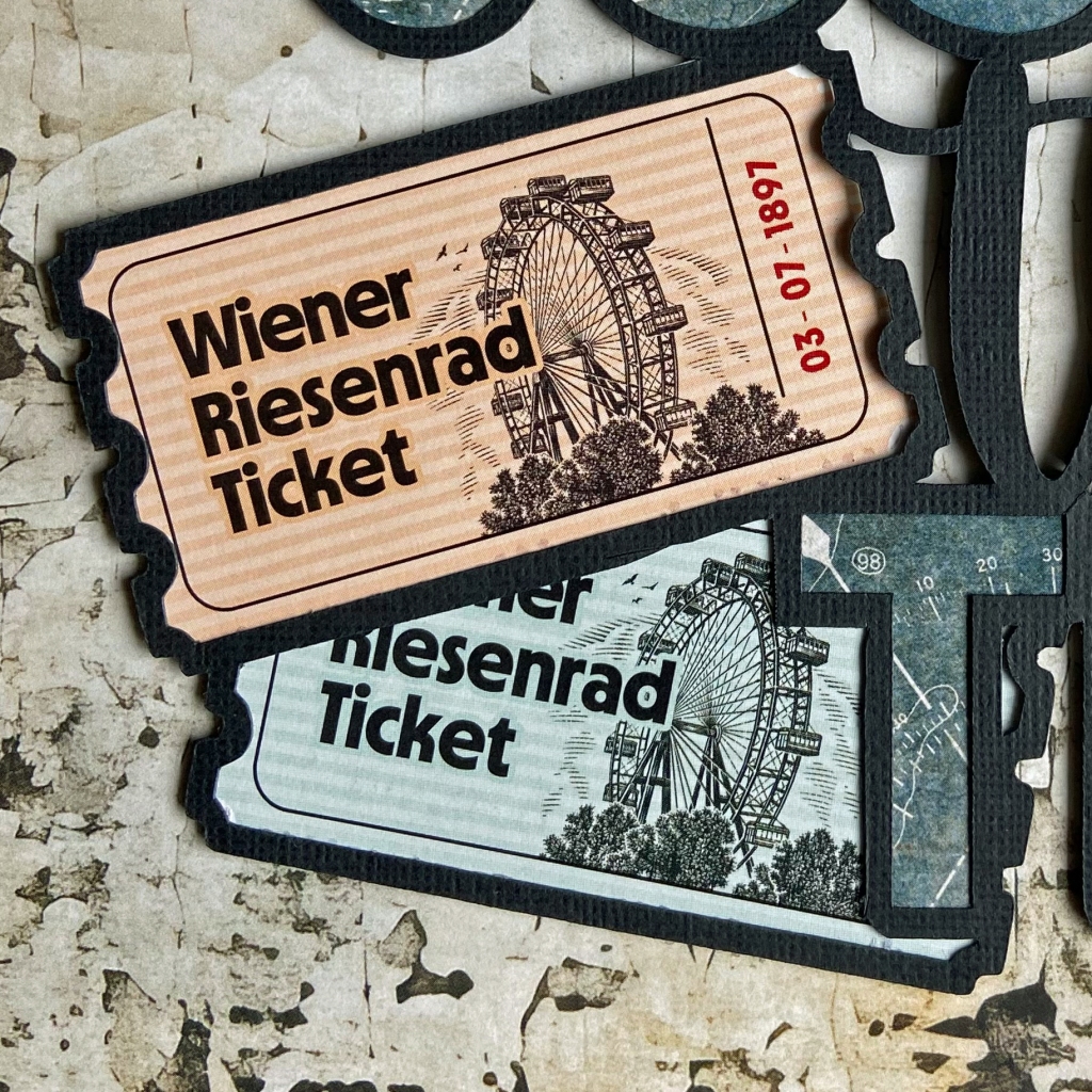
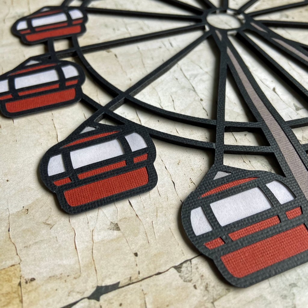
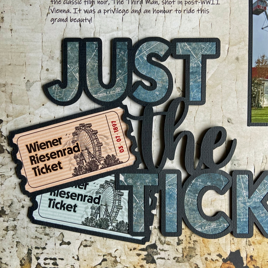
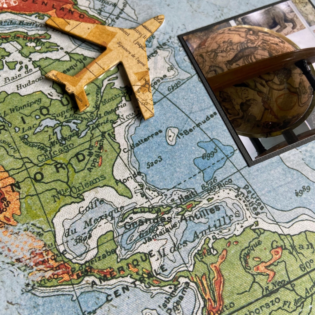
I resized and slightly manipulated the Just the Ticket cut file to fit our tickets from our ride on the Riesenrad, and I backed the Ferris Wheel cut file to mimic the ride’s look. The Ferris Wheel was positioned slightly off the page to accommodate the picture, and I carefully trimmed the excess away. Once I completed both cut files, I adhered them to the background paper using double-sided fun foam.
The beautiful papers in this double-page layout belong to Mintay Paper’s Traveller Collection. Specifically, the background paper is the back side of sheet 02. I purchased two collection packs to accomplish this. I backed the title, Just the Ticket, using the back side of sheet 04. I typically buy a coordinating pack of 6″ x 6″ or 6″ x 8″ patterned paper in a collection to use for backing cut files. I then use these papers to back my cut files, saving my 12′ x 12″ patterned papers for additional layouts.
Before I adhered my picture and cut file on the left-hand page, I wrote the journalling for this layout in Word. I wanted to print the story directly onto the patterned paper. I did a test run on a piece of vellum to ensure my positioning was correct before sending it to print. This test allowed me to overlay the vellum onto the patterned paper and make any adjustments necessary before printing directly on the layout.
For the final touches on this layout, I added some ephemera from the coordinating Traveller’s collection. This die-cut package contains sixty elements and will provide plenty of finishing touches to several future layouts.
That’s a wrap on my design process for this double-page layout. It is a special memory for me, as this experience meant so much to my husband. Thanks for stopping by today, and until next time, stay safe and well. Happy Scrapping!
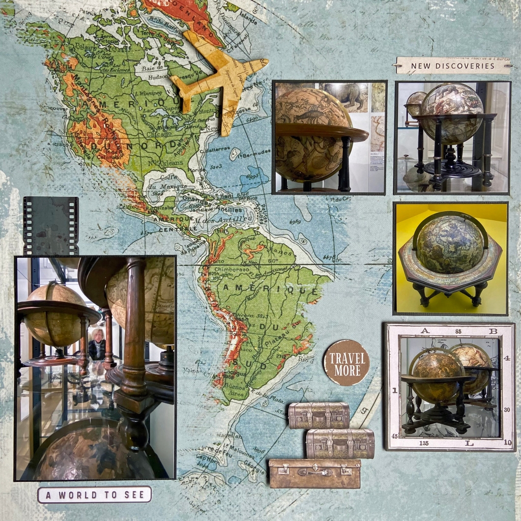
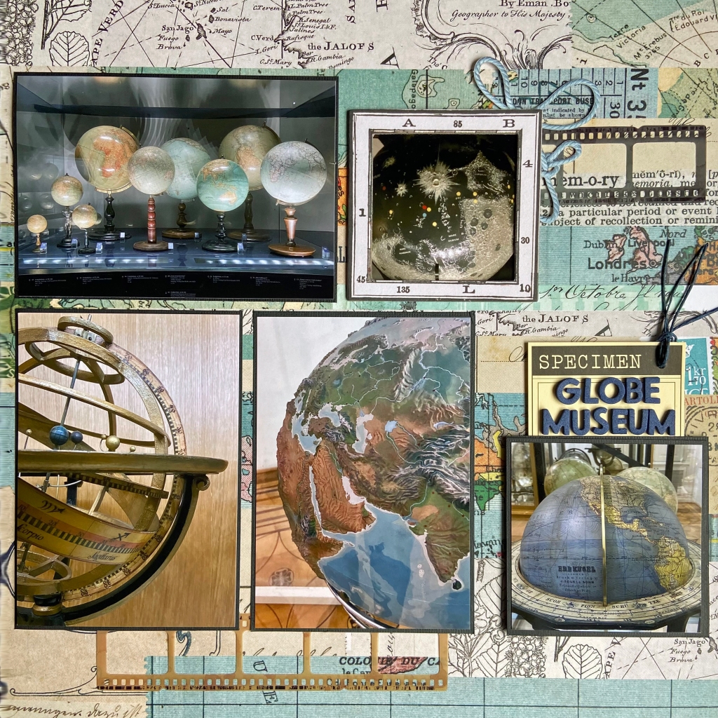
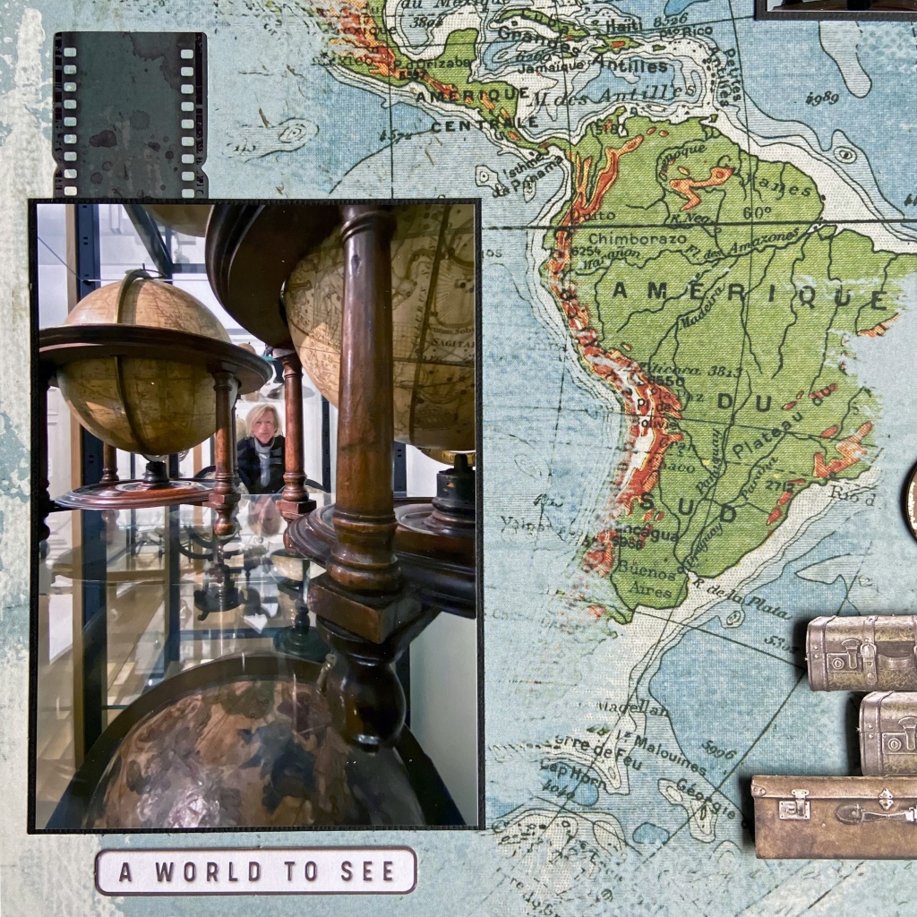
Since the Ancient Greeks discovered that our world was round, our fascination with this beautiful planet has never waned. Finding out that our earth is a sphere has been one of the most important discoveries in history. From understanding our place in the universe and creating accurate maps to designing buildings and bridges that can outlast earthquakes, understanding the earth’s shape has scientific and practical purposes we apply daily.
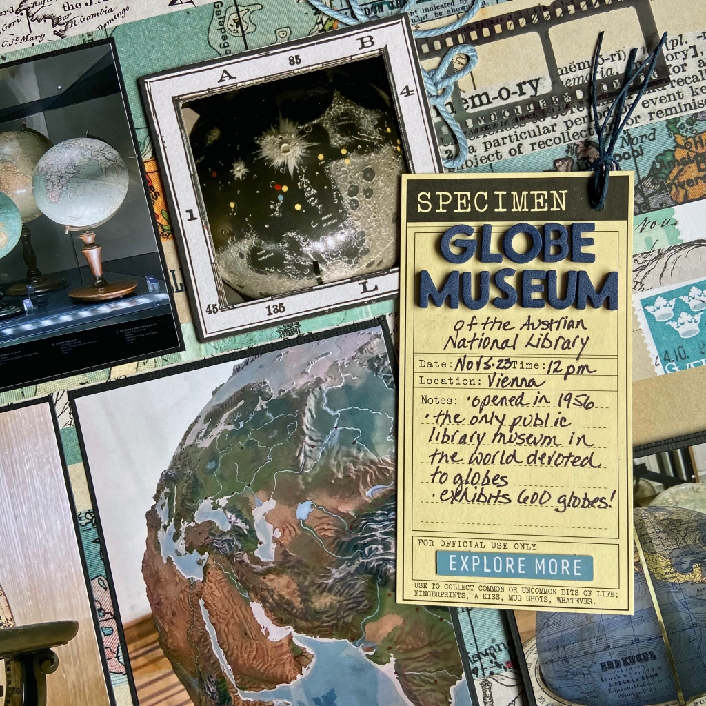
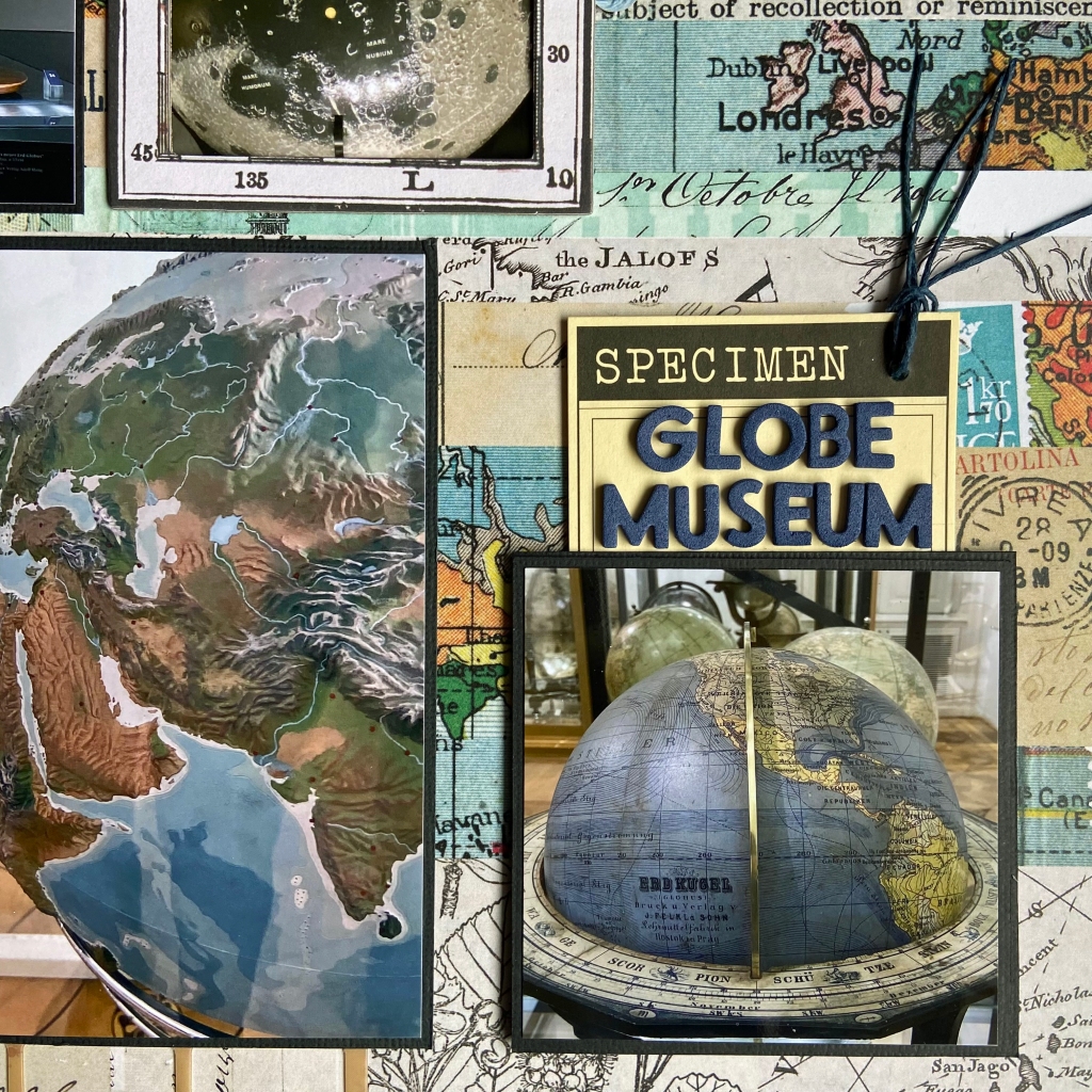
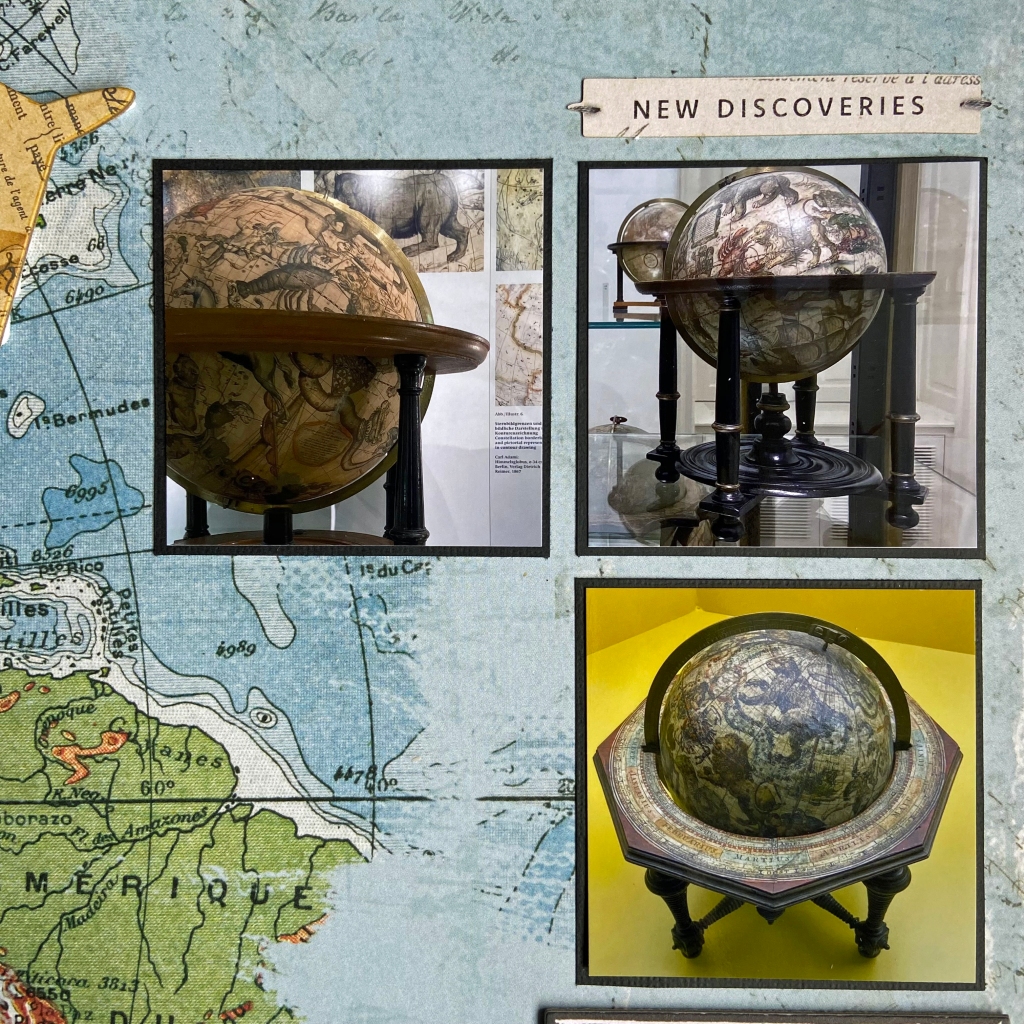
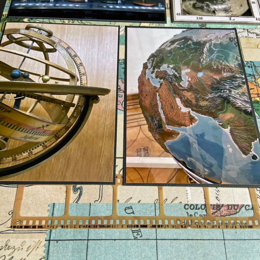
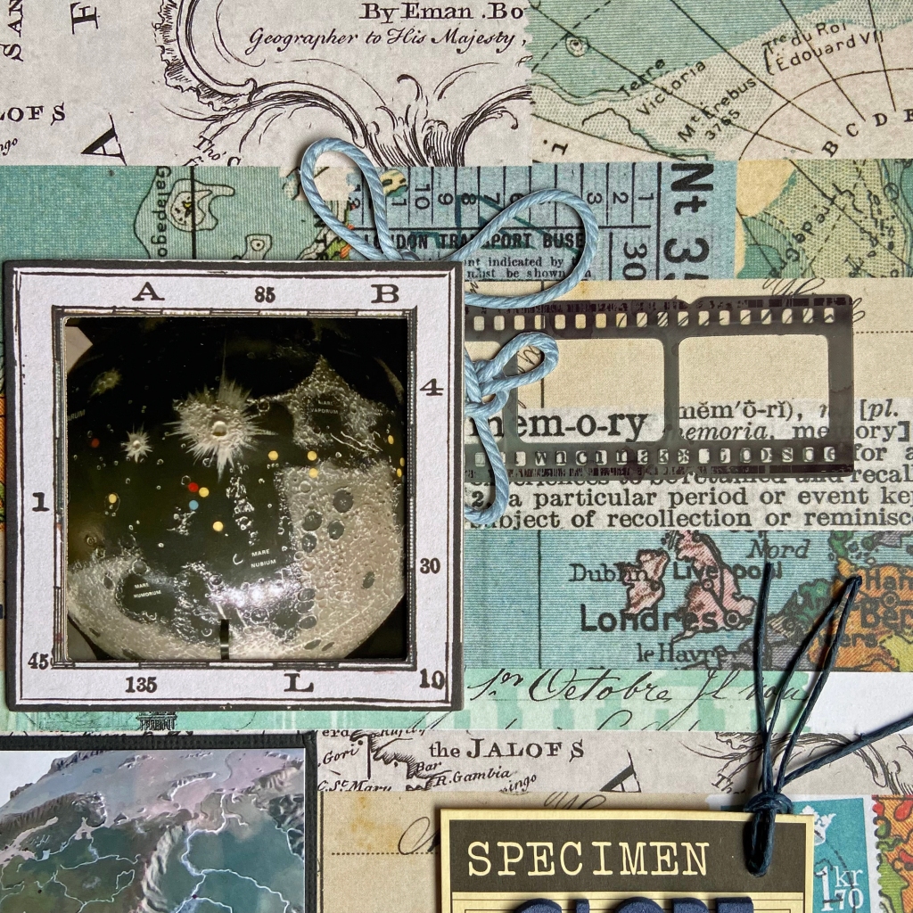
We were delighted to visit the Globe Museum in Vienna, Austria, late last fall. This museum is unique in the world. It contains over 250 exclusive terrestrial and celestial globes, globes of the moon and other planets, as well as numerous astronomical instruments. It was a visually beautiful and highly educational experience. It has something for everyone. Seeing these fascinating spheres firsthand was a moving experience. The hardest part of creating this layout was deciding which globes to include!
I didn’t want my journalling to distract from the beautiful globes on the layout, so I created a hidden journalling pocket to accomplish this goal. The pocket and the journalling tag are 7Gypsies products I have owned for over a decade. I placed the title for the layout on the tag using blue Happy Life Thickers. The blue twine attached to the tag is a Macrame Jewelry Cord from The Beadery.
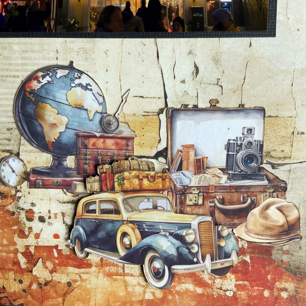
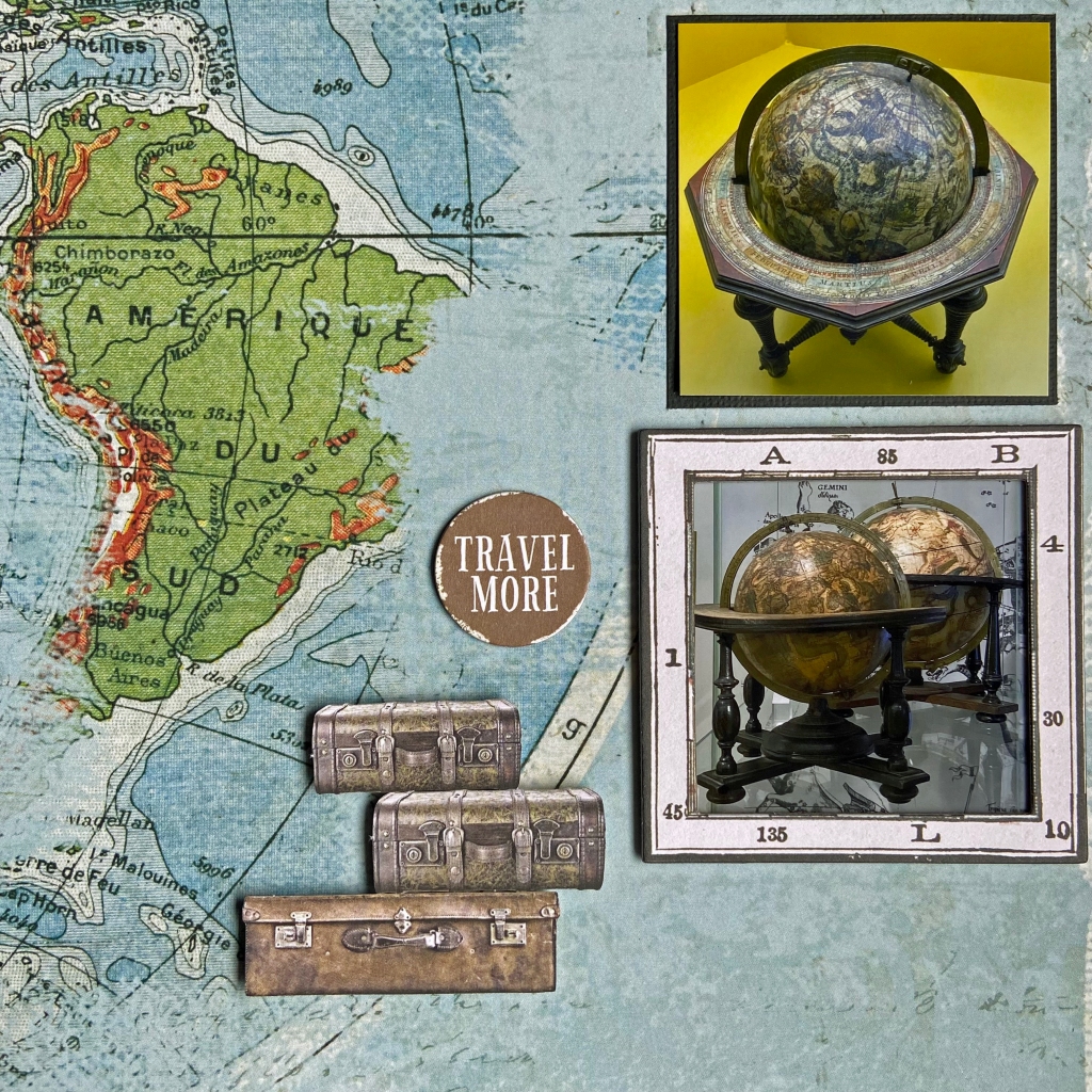
Additional embellishments on these pages included utilizing a couple of Chipboard Map Frames. I used some leftovers from the Everywhere collection, and they coordinated beautifully. The stacked suitcases and the New Discoveries word strip belonged to the Laser Cut Elements package. I backed the suitcases with dimensional fun foam. The Travel More circle and the airplane came from the Wherever Chipboard Bits package.
And there you have it! A relatively simple layout to come together. With patterned papers this gorgeous, you can use fewer embellishments. Did you see me peeking through the globes in the far right-hand picture?
Thanks for stopping in today, and until next time, stay safe, stay well, and Happy Scrapping!
Happy Valentine’s Day to one and all! This scrapbook page is my 2024 Valentine’s tribute to my loving husband and partner of 43 years! Thank you for making me stretch my skills and push through barriers I never thought possible. I will treasure this travel memory for the rest of my life, and I couldn’t have done it without you….
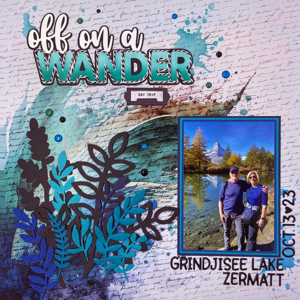
We’ve had the good fortune to travel quite a bit in 2023. Of all our adventures, this five-and-a-half-hour hike in Zermatt, Switzerland, is now considered epic in our memories. We planned a day to complete the Five Lake Trail, offering unforgettable views of the Matterhorn. Our original plans, as laid out by our hotel concierge, were to take the underground funicular to Sunnegga and then switch to a gondola to Blauherd. From Blauherd, we were to follow the hiking trails down the mountain, visiting the five beautiful lakes.
But all good travel plans can quickly go awry, and this day was no exception! The underground funicular was a quick and easy ride to Sunnegga. The gondola, however, had been shut down for the season just two days before our arrival. Not being travellers to be easily discouraged, we quickly rearranged our plans and decided that if we couldn’t hike down, we would hike UP! It seemed like a sensible decision at the time! With the original hiking time estimated at two-and-a-half hours going down the mountain, we estimated it would likely take us three hours to go up and around the trail. Amateurs! Ha! If we only knew, would we have started at all?
We did not plan nor pack a lunch for our hike. Armed with water bottles and a small bag of peanuts, we hit the trail confident that we would complete the journey as planned. My husband, who moves like a gazelle on the slopes, thoroughly enjoyed his day. I, on the other hand, have a severe fear of heights. The literature describing this hike identified the hike as “easy – with a few moderately difficult sections”. Hmmm, while there were some manageable sections, there were times we had to follow the “Alpine Trail”, with very narrow dirt paths, more switchbacks than Italy, and protruding boulders that made the path extremely narrow. Thank goodness for my husband and his patience and humour that kept me going step after step! I won’t lie; we did have moments when we wondered if we would ever find our way back.
Thank goodness for Google Maps and faith that the Sunnegga station would come into view eventually. As we got closer to the station, in quite a challenging section of the trail, we came across an elderly (80+ years old) gentleman and his daughter sitting on a lookout bench. The only way these two arrived at the lookout was to climb. How he managed it, I will never know. But I was so thankful to see him there. I knew then that I, too, would make it back! Our reward on arriving at Sunnegga (aside from the fantastic pictures we took along the way) was a fabulous bowl of pasta for lunch. Add in two Gaterades and two coffees, and it only cost us the equivalent of over $100 Canadian. Nothing in Switzerland is cheap! Quite frankly, I was starved and so relieved to be back that I didn’t care what it cost then!
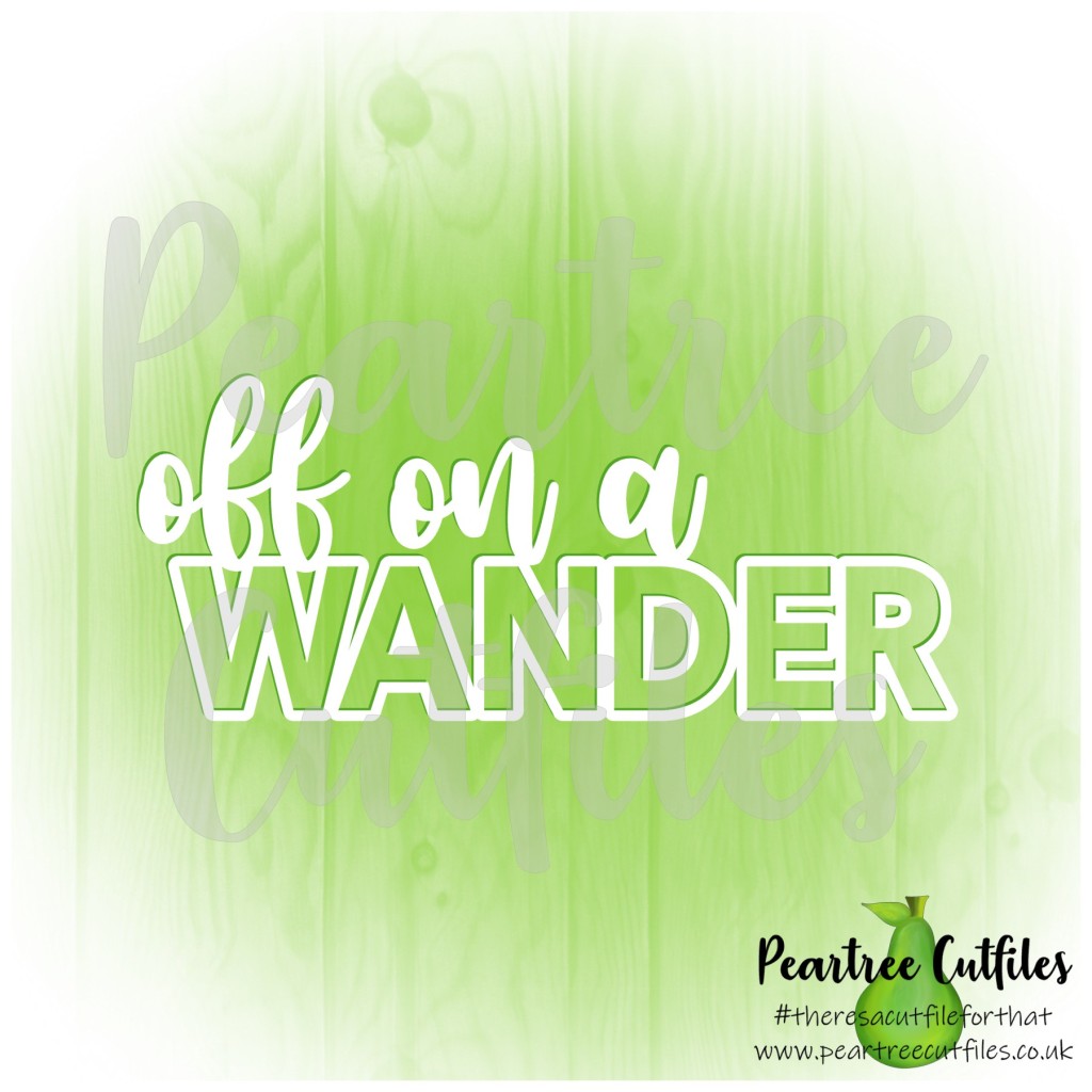
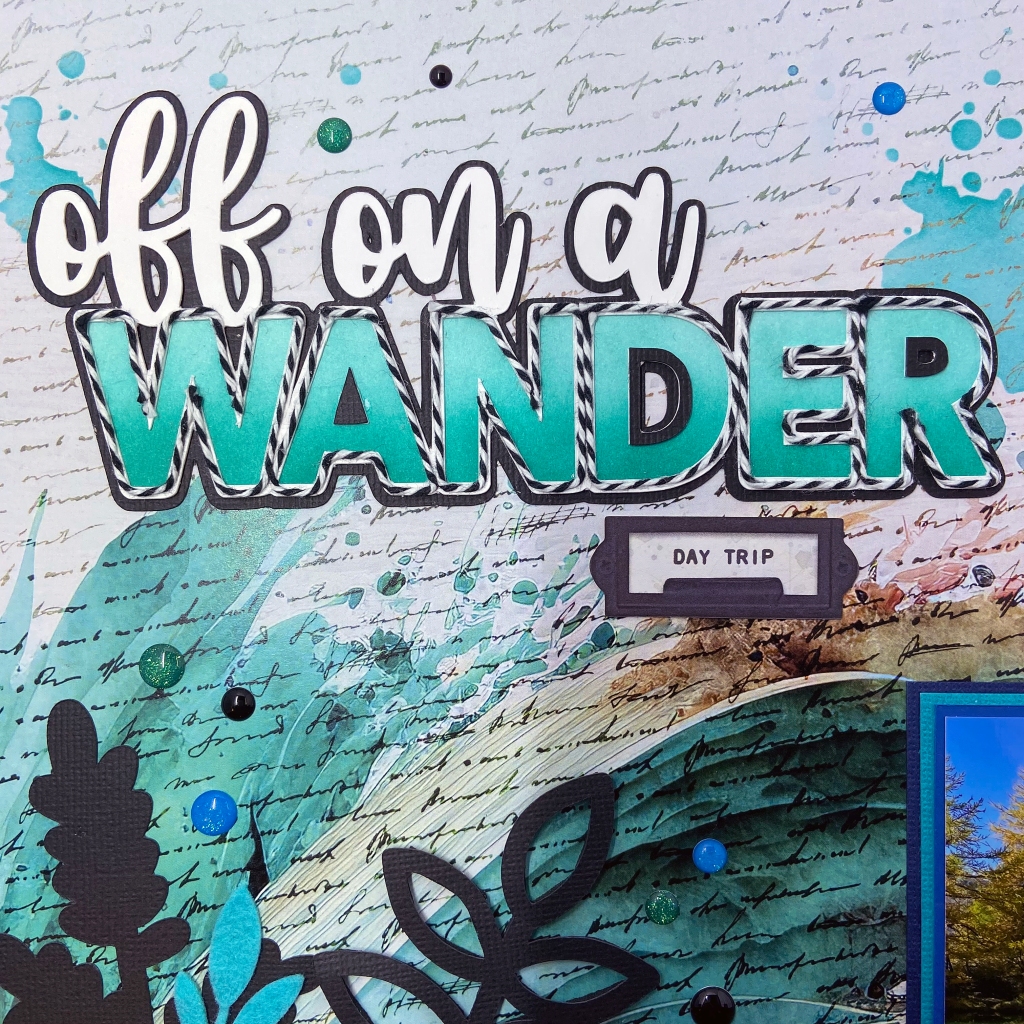
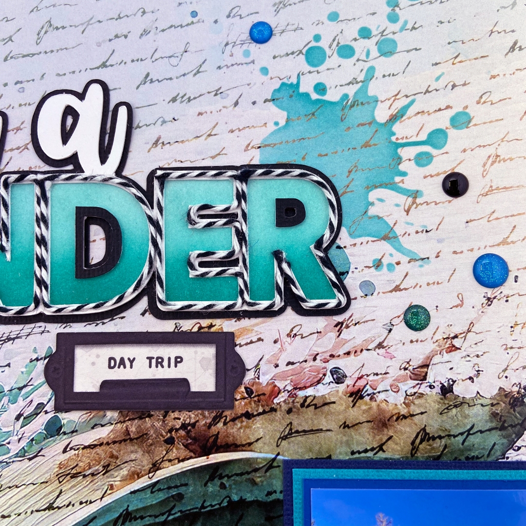
For those interested in my design process, I turned to Paper Rose Studio’sArtsy Print collection for the layout’s background. This paper collection is stunning! I chose the title Off on a Wander from Peartree Cutfiles. It was a phrase that assisted me in poking a little fun at our lengthy hike!
After cutting the title in white cardstock, I created another in black cardstock, offsetting it slightly to help it stand out on the page. The letters in the title were ink blended with two shades of ink from Papertrey Ink (Tropical Teal and Hawaiian Shores). I was looking for a very bold title effect on this layout and chose to outline each letter with white and black twine to achieve this effect.
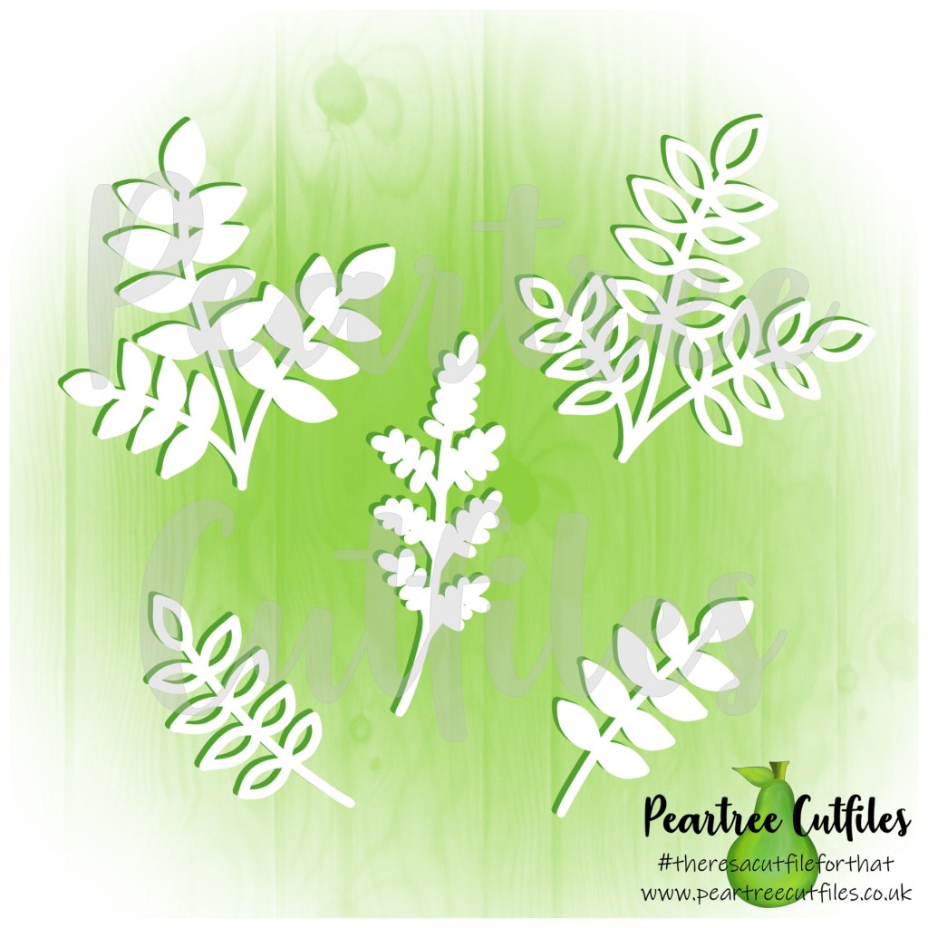
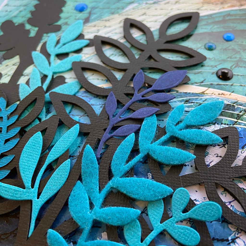
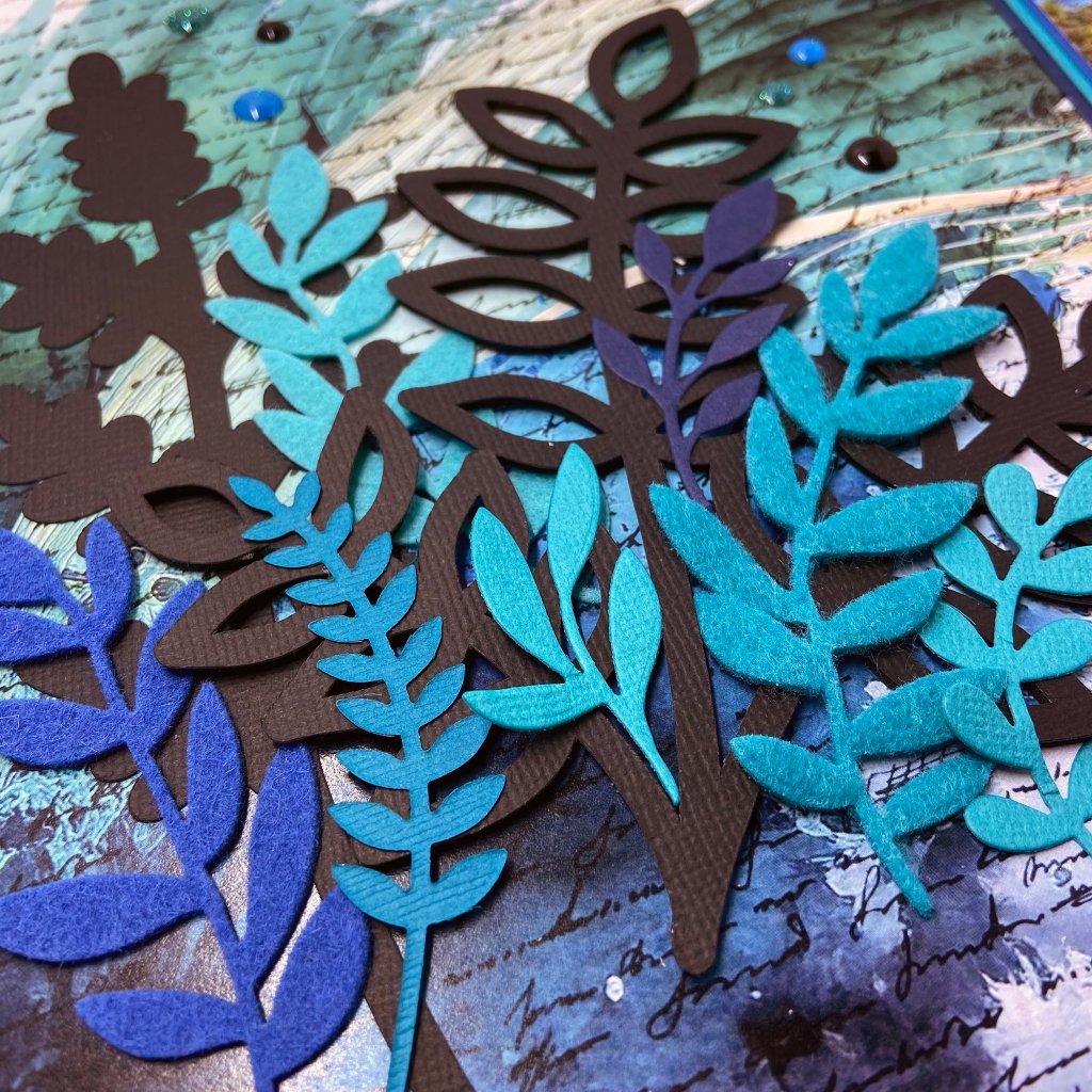
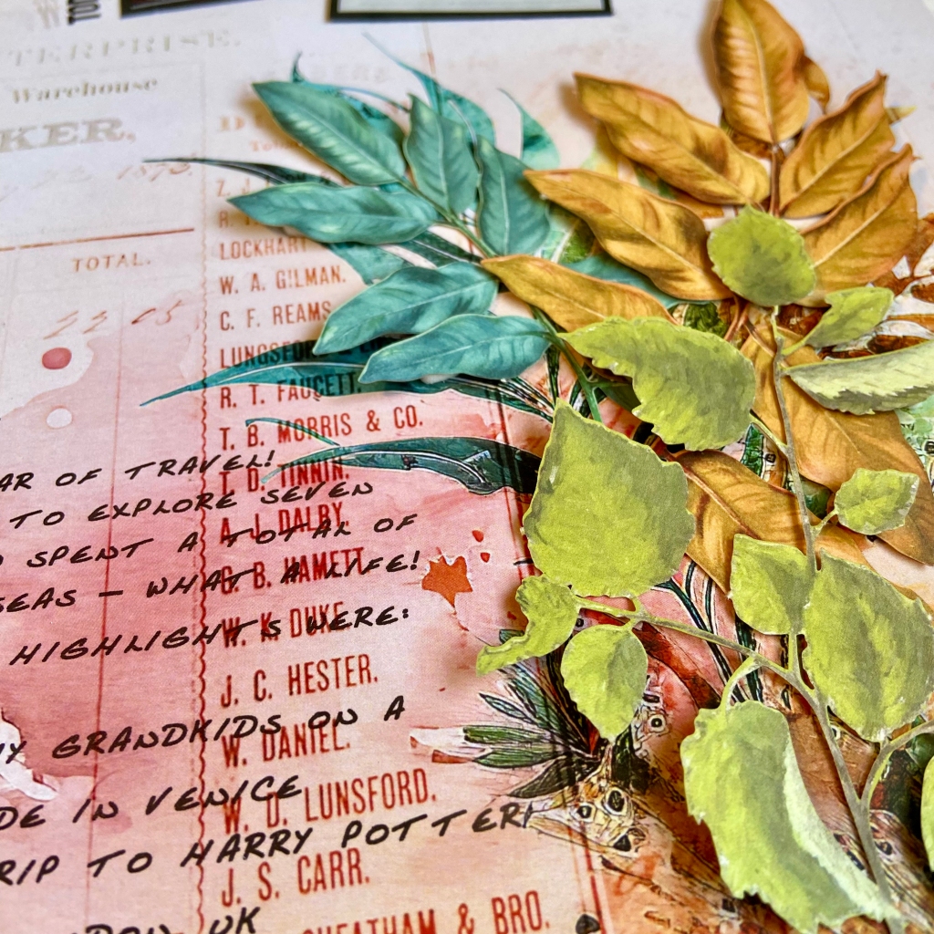
I triple-matted my photo to coordinate the colours in the image and the background paper. I utilized another cut file from Peartree Cutfiles, entitled Leaves Buildable 2. Two of the leaves in this cut file became the black anchor for the cluster of colourful leaves on the bottom left-hand side of the design.
I die-cut additional leaves using Die-Namics from My Favorite Things (Grand Greenery and Grande Greenery). I cut three leaves from felt to add visual texture and interest and die-cut the remaining leaves from coloured cardstock. Once the leaves were all cut and ready to assemble, I backed one of the larger black leaves with black foam from Scrapbook Adhesives. The leaves were then layered and adhered to the background paper.
I added some paint splatters using a Tim Holtz stencil entitled Splatters using Mermaid Lagoon and Peacock Feather Distress Inks. For the final touches, I included the Day Trip ephemera from 49 and Market’s Everywhere Laser Cut Elements and the enamel dots from a mixture of Carta Bella, Your Next Stamp Gumdrops and Doodlebug Designs Winter Assortment Sprinkles.
And that’s a wrap on how I’ve memorialized this epic vacation adventure! I have no regrets about taking on this challenging and fulfilling hike. I will be forever grateful for my husband’s patience, perseverance and love that helped me overcome my fears that day. Would I do it again? Not likely! My mountain climbing days are over until the next great adventure presents itself!
I wish you all the very best this Valentine’s and thank you for stopping by to read about our travel shenanigans. Until next time, stay safe, stay well, and Happy Scrapping!
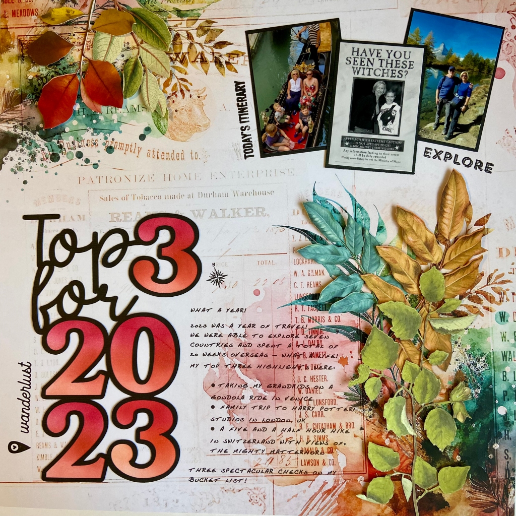
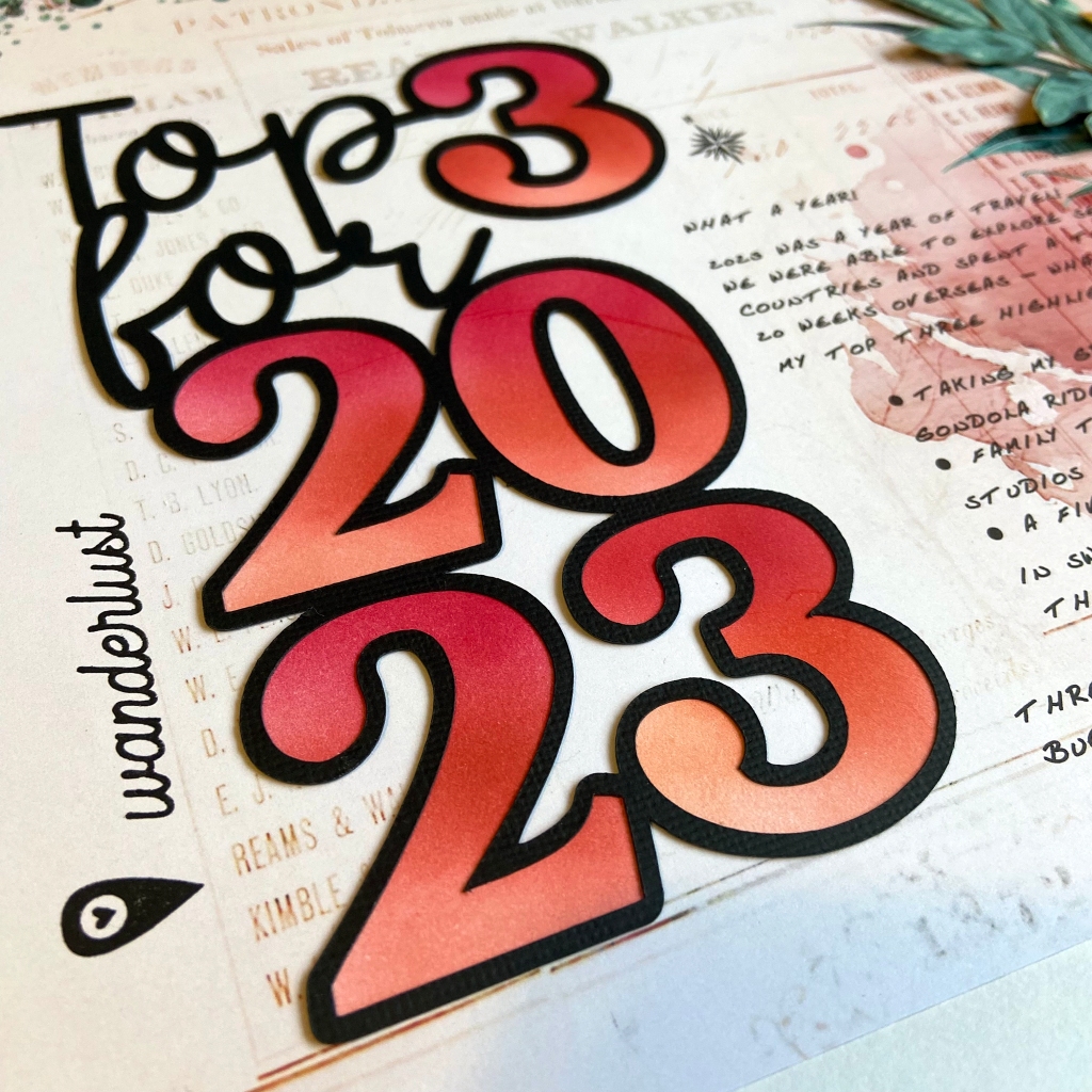
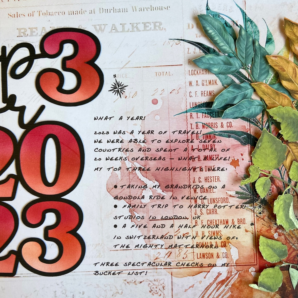
2023 was an incredible year for us. I could sum the whole year up in one simple word – TRAVEL! With my daughter and her family currently living in Austria, we can come and go as we please, and we get to travel all over Europe. It’s the sweetest deal going! We couldn’t be thankful enough for Lindsay and Jeff’s hospitality and generosity! We spent 20 weeks in Europe last year and visited eight countries. The memories we’ve made are precious, and we loved everywhere we travelled.
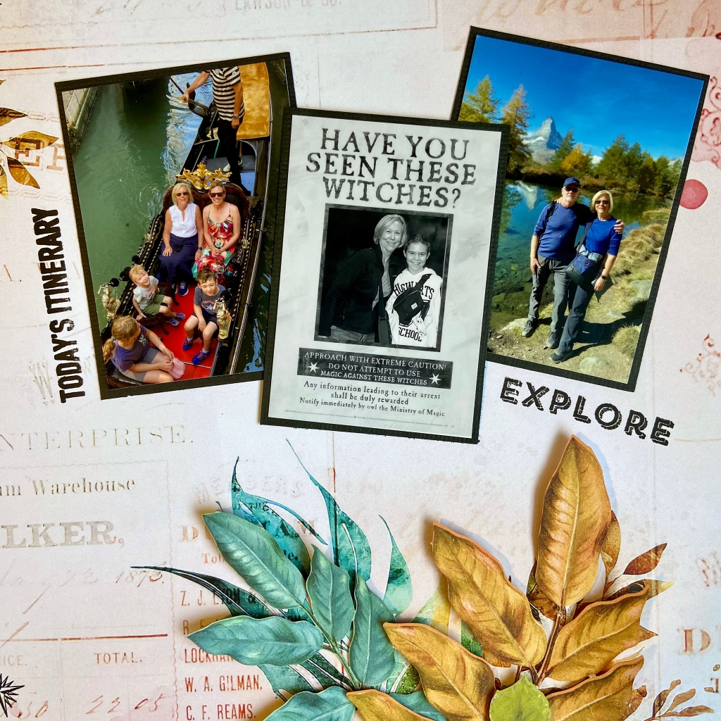
Two of my three top choices centred around family trips. In June, we travelled to Venice, Italy together. Taking a ride in a gondola was at the top of my bucket list in Venice, so you can imagine my excitement at bringing my daughter and grandchildren on the ride! They all loved it as much as I did, and I’d have to say, it was one of my BEST memories for 2023. In late October, we travelled as a family to London, UK. Our focus was a visit to Warner Bros Studios to see the Making of Harry Potter. I read each of the Harry Potter books to my two oldest grandchildren before they moved overseas. Having the opportunity to tour this remarkable location with them was MAGICAL! My final highlight was the five-and-a-half-hour hike my husband and I made in Switzerland. It was a gorgeous fall day with incredible views of the Matterhorn throughout the hike. It was breathtaking every step of the way!
The creation of the title was quite simple for this project. After resizing it to fit my layout, I cut it in black textured cardstock. To back the numbers in the title, I used smooth white cardstock. Each number was ink blended using three Altenew dye inks (Rouge, Velvet and Ruby Red) and adhered to the back of the main cut file. Once completed, I set it aside to work on the journalling for the layout.
I turned to my computer and printer to add the journalling to this page. To ensure the correct placement and to protect the beautiful background paper, I placed a 12″ x 12″ piece of vellum over the patterned paper and traced out the area I wanted the journalling in. Next, I typed out my story on the computer, positioning it as close to the coordinates as possible. I then printed the text on the vellum sheet to see how close I came to my coordinates. With a few little tweaks and a second test run with the vellum, I was ready to print directly on my patterned paper. As you can see from the finished project, the text placement went beautifully!
The next stage involved adhering the title and the pictures to the layout. I then moved to stamping some travel words and images onto the page. I used travel stamps from Jennifer Edwardson Creative Inc. and Recollections.
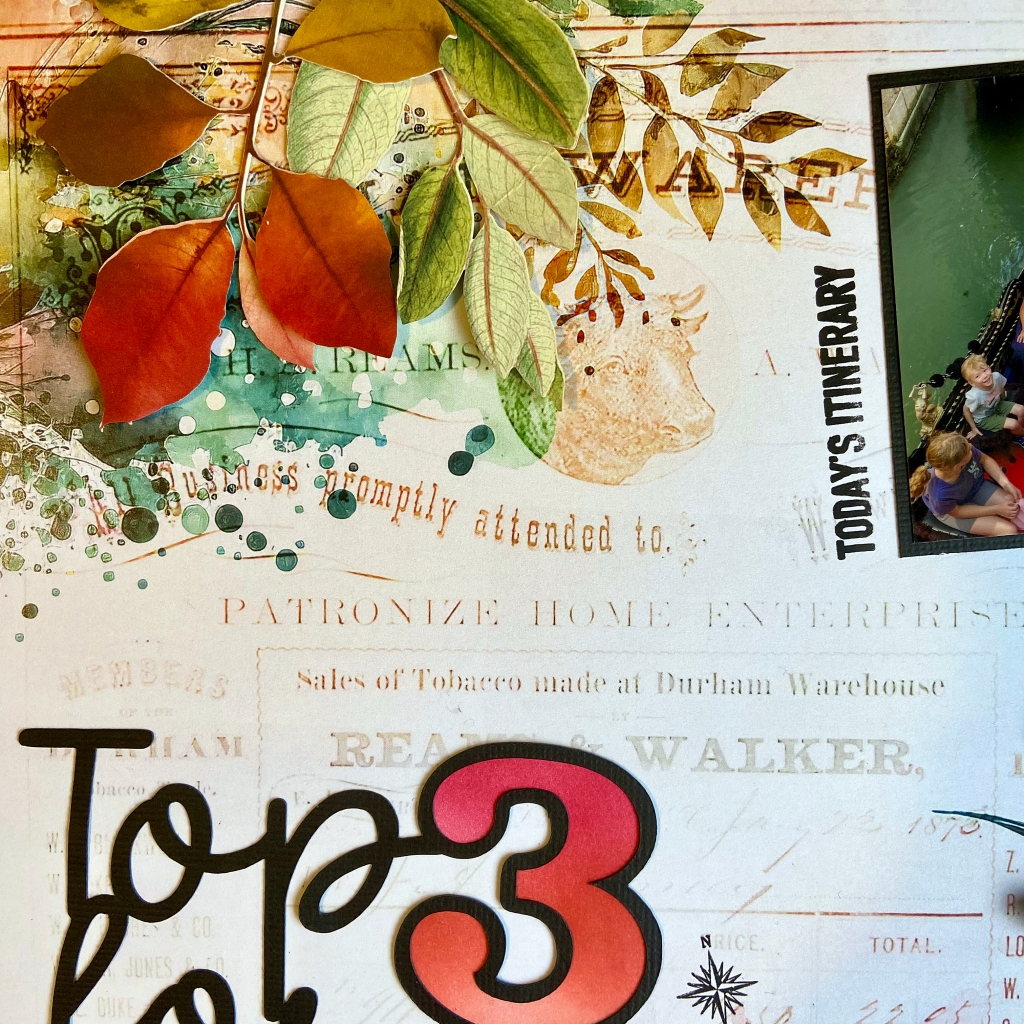
The final step to completing my layout was adding the laser-cut leaves from 49 & Market’s Spectrum Sherbert collection. I used coorinating leaves from both the Tidal Wave and Strawberry Lemonade packages. To create dimension with these leaves, I glued the centre stems down and popped up some of the leaves with 3D foam squares to create some dimension for the final product.
Thanks for taking the time to be with me today. I hope I’ve provided some inspiration to document your favourite memories of the past year. May the coming year be good for you and yours! Until next time, stay safe, stay well, and Happy Scrapping!
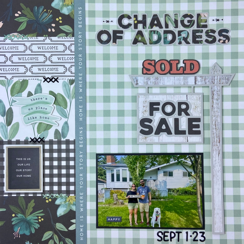
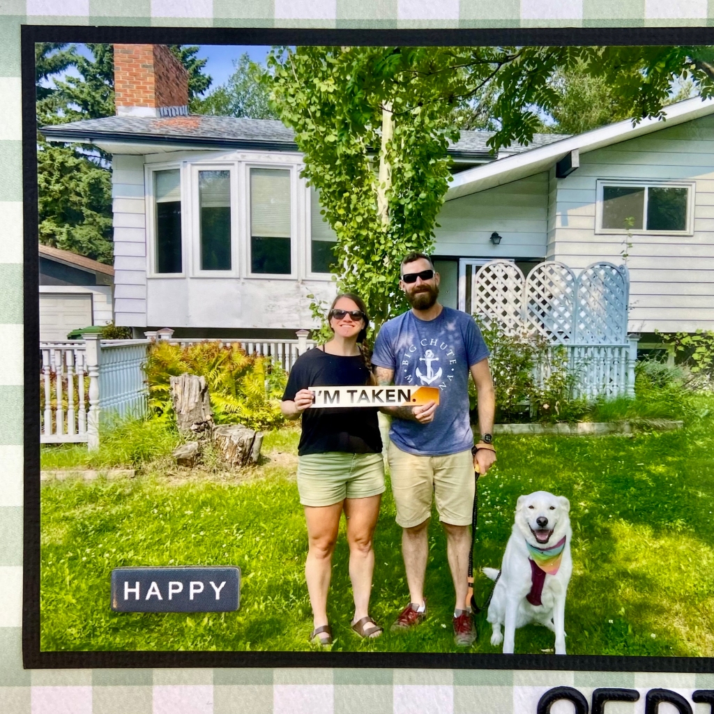
As 2023 draws to a close, it’s that time of year when we begin to take stock of our accomplishments. While the list can be long, few will stand out as a life event. This year has been full of life events for my son and his wife. And while these life events were all challenging in their own right, causing much discomfort and soul-searching, they all had a happy ending! This layout celebrates purchasing their first home – a real milestone in any couple’s relationship!
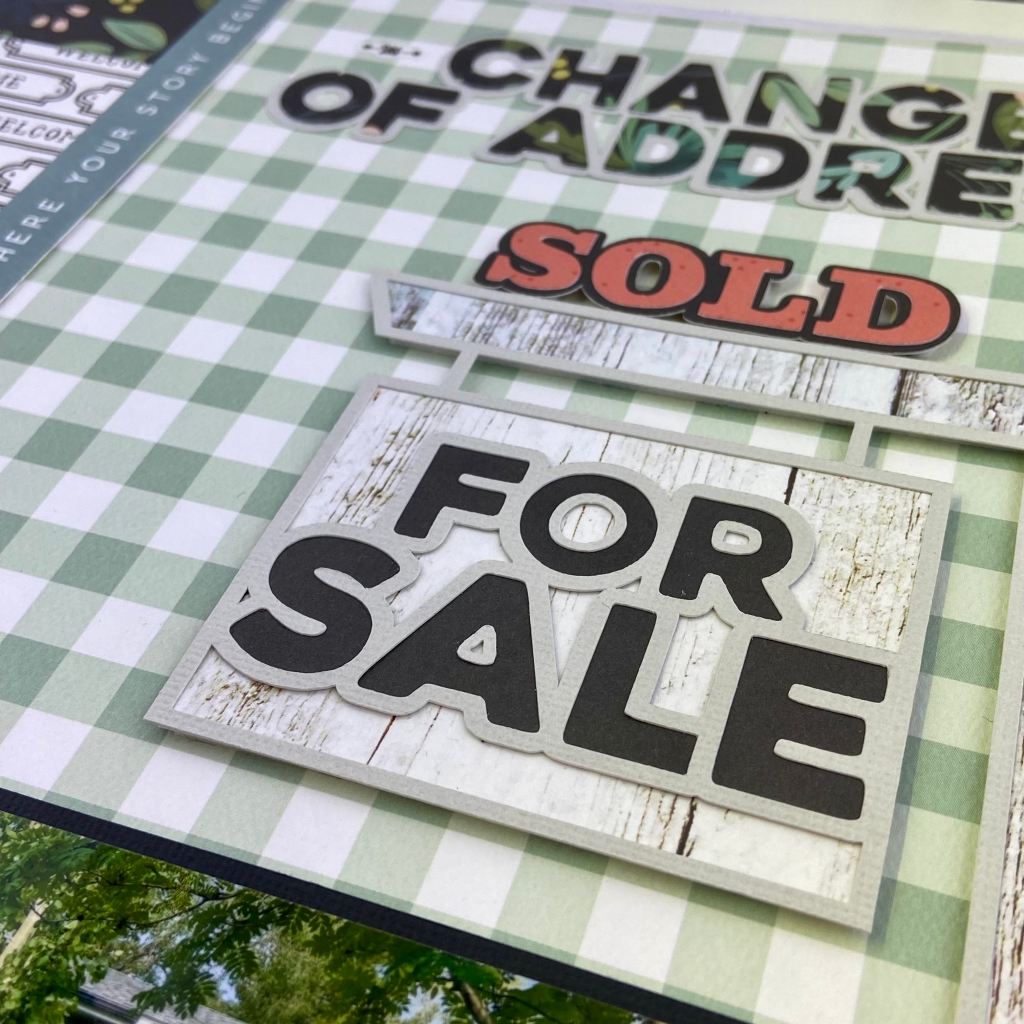
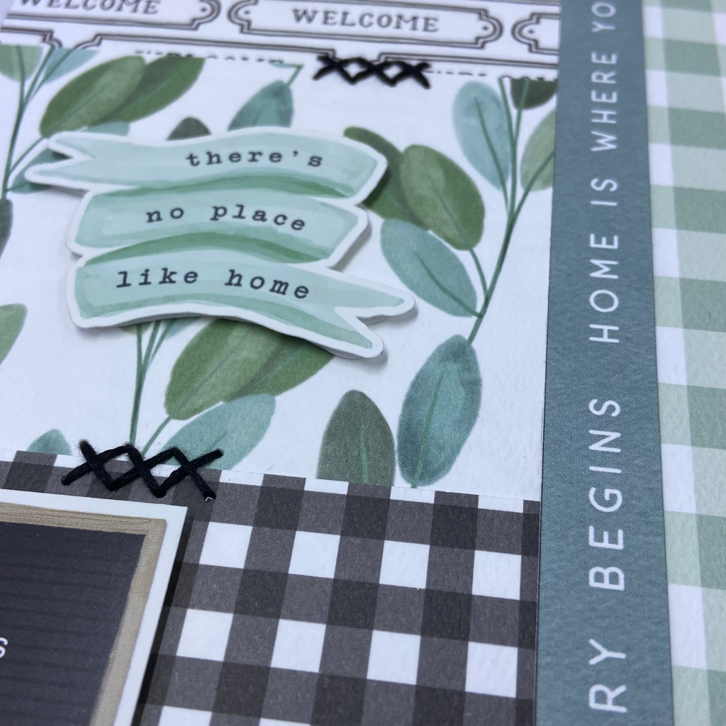
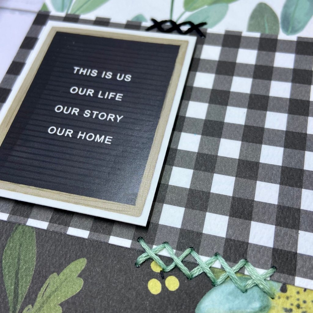
The cut files for this layout come from Jennifer Edwardson Creative. They are named Moving Cut File Bundle. I chose three cut files (For Sale, SOLD, and Change of Address) within this bundle to create this page. Most patterned papers and embellishments come from Carta Bella, primarily the Gather at Home collection. The Paired with Plaid patterned paper provided the background for this page.
I cut the For Sale sign from a soft grey cardstock. The white weather wood pattern paper was just the look I was seeking. Once created, I adhered it to the background paper using Scrapbook AdhesivesCrafty Foam Tape. This dimension helped provide an illusion of movement in the hanging sign. I cut the letters for the SOLD sign using a coordinating patterned paper called Pitcher Perfect from the Gather at Home collection. The completed cut file was also adhered to the background using foam adhesive, enhancing the effect of resting on the top of the For Sale sign. The final cut file I used from this bundle was the Change of Address. I used a dark coordinating patterned paper in the Gather at Home collection to cut the letters. I adhered these letters to grey cardstock that matched the For Sale sign.
In creating the left-hand side of this page, I used four coordinating patterned papers from the Gather at Home collection. They included Fresh Floral (top and bottom) and the back side of the following: 3×4 Journaling Cards, 4×4 Journaling Cards, and Time for Dinner. Each paper was cut 4″ in width and then randomly placed down the page at different lengths. I hand-stitched using two coordinating DMC embroidery flosses (black & 564) to ease the transition between papers. The two stickers in this section belong to Carta Bella’sHome Again collection. They were a perfect fit and matched with the Gather at Home collection. In completing the left-hand side of the page, I added the coordinating Home is Where Your Story Begins strip. This strip helps provide a soft transition to the main section of the layout.
I adore this photo of Sean, Tanis and their dog Lillie. I don’t know about you, but I think the dog has the biggest smile in the picture! You can see and feel the excitement in each of them. I placed the word HAPPY from the coordinating Home Again Chipboard Accents on the photo. I used Doodlebug Designs Alphabet Soup Puffy Stickers to add the date.
I am so glad to have this milestone documented for posterity. I know that as the years progress and they look back at this moment, they will marvel at all the changes they’ve made to their new home. Let the fun begin!
Thanks for joining me today. I hope I’ve nudged you to document this year’s accomplishments and milestones! Until next time, stay safe, stay well, and Happy Scrapping!
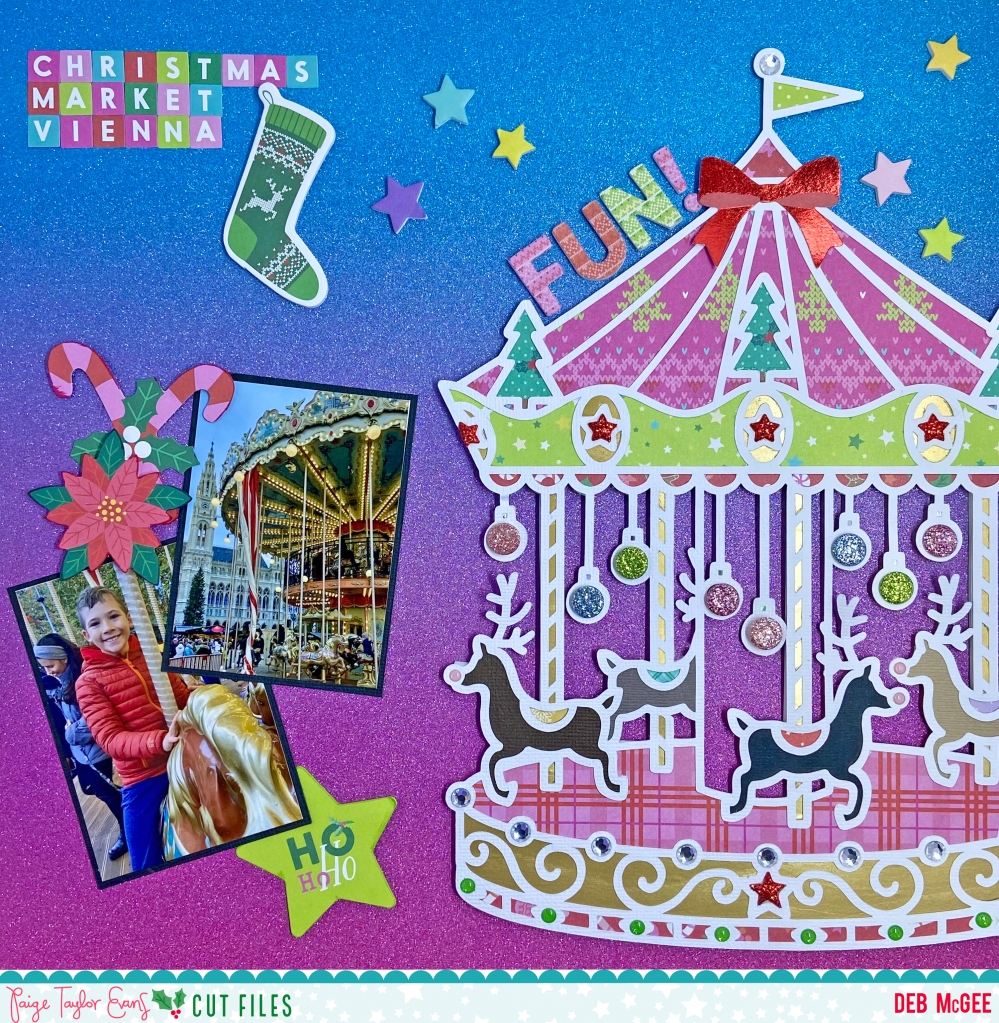
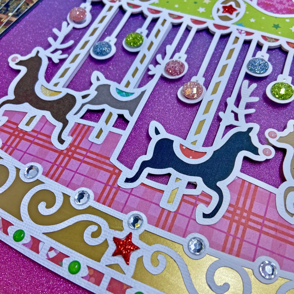
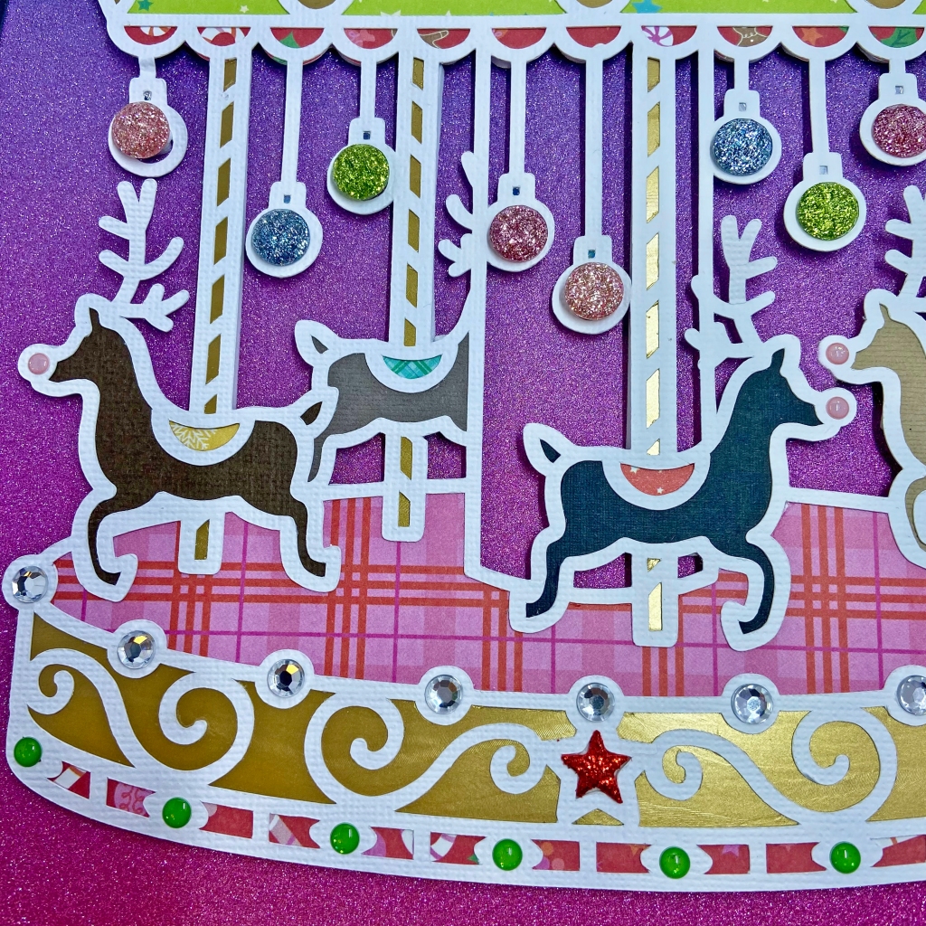
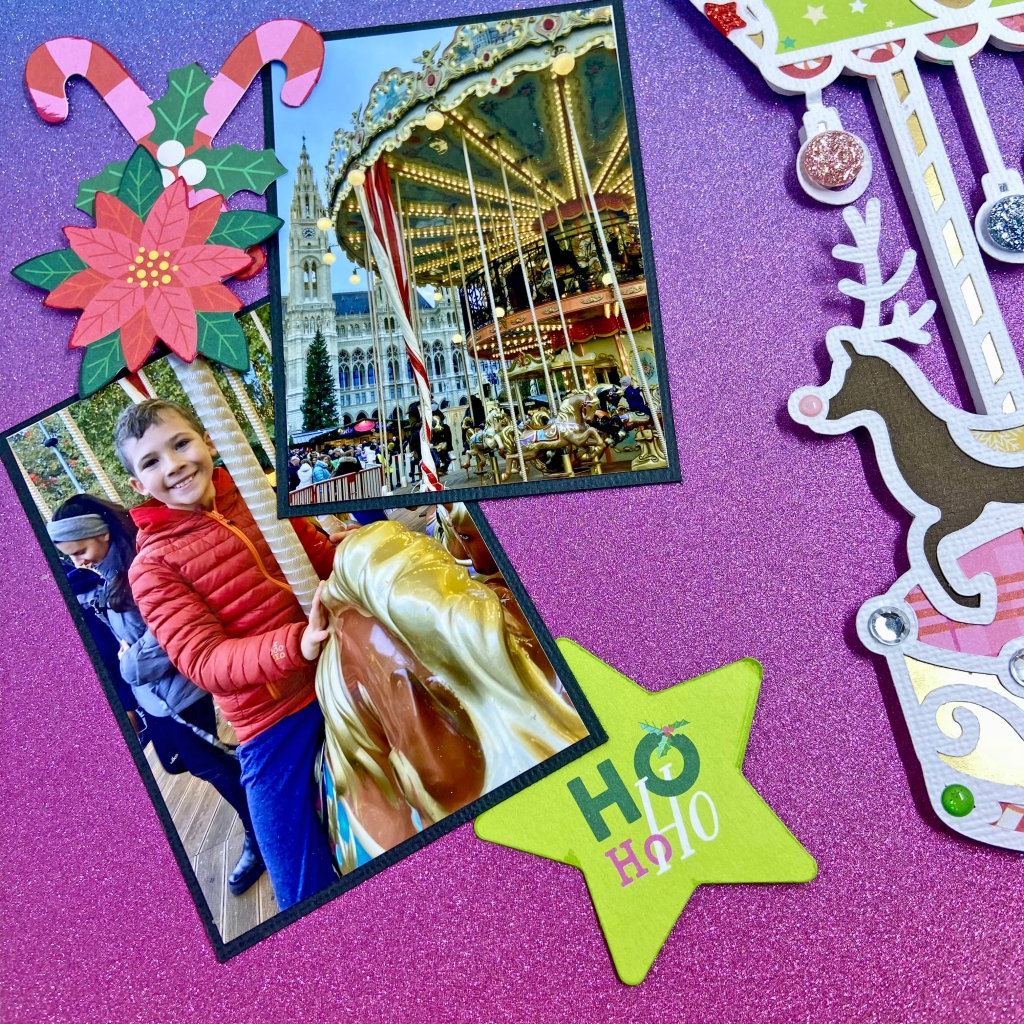
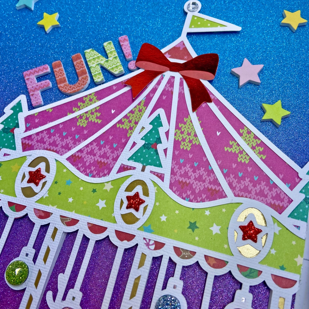
Who’s ready to go on a ride with me?! On a recent visit to see family in Austria, we had the wonderful opportunity to visit the Christmas Market in front of Vienna’s City Hall (Rauthausplatz Christkindlmarkt). To say it was magical, would simply be an understatement. The sights, the sounds, the smells, the tastes – every turn was a new and exciting discovery. The roots of this market date back to the late 18th century and over 3 million visitors are expected to attend this year. I am so fortunate to count myself among them! A highlight for me was taking my grandchildren on this gigantic, two-tier carousel.
I am thrilled to share with you my second layout as a Guest Designer for Paige Evan’s25 Christmas Cut Files! Paige’s Carousel cut file was perfect to help me document this wonderful moment. This cut file is part of the 25 Christmas Cut Files released this year. It can also be purchased separately in Paige’s shop at https://bit.ly/digitalcutfiles. To start this layout I cut the file from white card stock and backed it with several patterned papers from the Sugarplum Wishes collection.
The trees at the top of the carousel were fussy-cut from paper #11. They fit perfectly in the canopy. I included a bit of gold foil cardstock for the star medallions, pony poles and at the base of the carousel. Once I completed this step, I placed the cut file on my background paper and offset it slightly to the right. After trimming the cut file on the right, I adhered fun foam to the entire back to help lift it off the page. This technique aided in the illusion of being able to jump on the carousel. The stars adorning the canopy and at the base of the carousel were cut from red glitter fun foam.
The greenenamel dots at the base of the carousel and the pink enamel dots on the noses of the ponies both come from the Sugarplum Wishes collection. Clear rhinestone dots were also used at the base of the carousel and at the top of the flag pole. The large glitter dots that fill in the hanging ornaments were purchased at a stationary store in Austria.
All of the embellishments on this page came from the Sugarplum WishesEphemera Die Cuts and the Floral & Snowflake Die Cuts packages. The word FUN! and the stars at the top of the page belong to the Foam Stickers sheet. The title, Christmas Market Vienna, was added using the multi-coloured alphabet stickers from the large Stickers package.
And there you have it! A special memory with my grandchildren that we will reflect on for years ahead! Thanks for stopping in today. I wish each one of you the Happiest of Holidays! To quote my Mom: “Go and make wonderful memories!”
Until next time, stay safe, stay well, and Happy Scrapping!
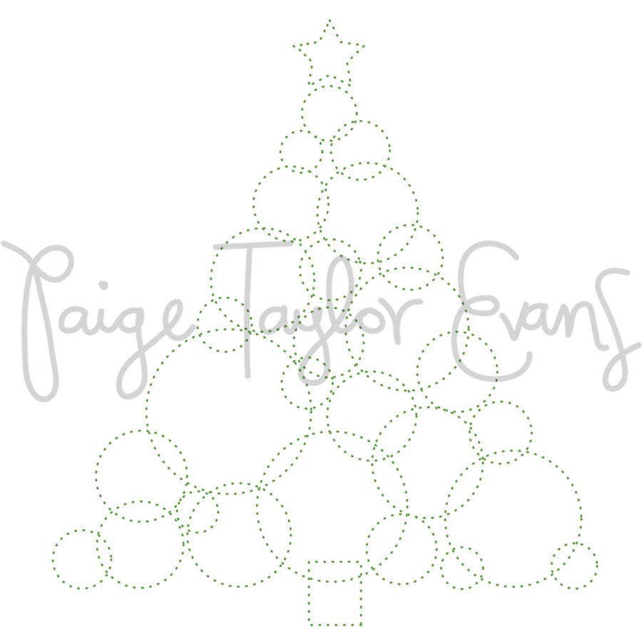
I am extremely excited to share my first project as a Guest Designer for Paige Evans Christmas Cut & Stitching Files for 2023! Here’s where you can purchase each bundle: 25 Christmas Stitching Cut Fileshttps://bit.ly/25christmasstitchingcutfiles, 25 Christmas Cut Fileshttps://bit.ly/25christmascutfiles. Any of these cut files can also be purchased separately in Paige’s shop: https://bit.ly/digitalcutfiles. With the release of these beautiful bundles, Paige is releasing a free cut or stitching file every day from December 1 – 25th, so don’t miss out on all these beautiful designs. This stitching file is one of Paige’s freebies, and you can grab it from her Happy Scrappy Place Facebook Group.
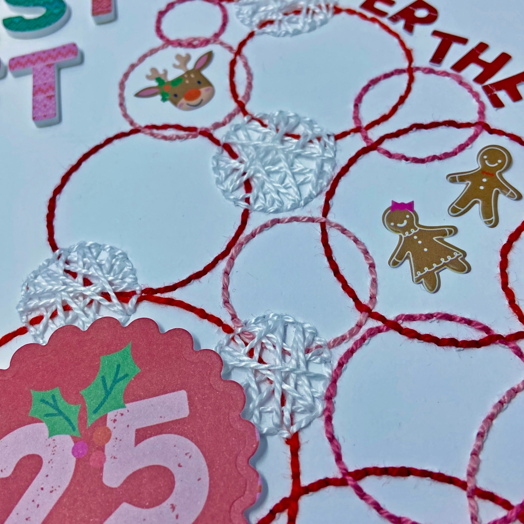
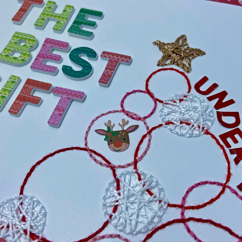
Embroidery and cross-stitching have been part of my crafting adventure for decades. I jump at any chance to incorporate these skills into a scrapbook layout! This cut file is called Christmas Tree Circles for Stitching. And it’s yours free at https://www.facebook.com/groups/happyscrappyplace! To begin this project, I cut the plain white cardstock to 11 & 1/2″ x 11 & 1/2″, and cut the stitch cut file using my Silhouette Cameo. I chose non-traditional colours for the tree and selected coordinating hues of pink, red and white DMC pearl cotton floss to stitch the tree.
I used a simple back stitch technique, alternating the reds and pinks as I worked through the circles in this cut file. I used the white pearl cotton floss on the smaller circles and filled in the circles using a string art technique. To create a string art effect, randomly stitch your thread from one point to another, working in opposite directions and inserting in another point anywhere to create the effect. Make sure you pass the floss through each point in the pattern. I like the completed result. It made these circles look like 3D ornaments on the tree and integrated more texture into the overall layout. I used this same string art technique on the gold start at the top of the tree. I used a chain stitch in brown floss around the tree trunk. This stitch helped provide a sturdy look to the large tree.
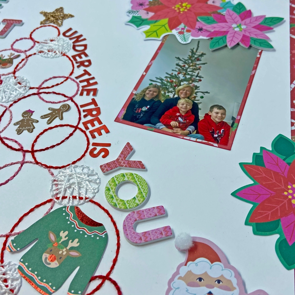
I turned to Paige’s magical Sugarplum Wishes Collection to create this whimsical layout. Sugarplum Wishes transport me to a world of wonder and enchantment. How fitting for the Christmas Season! Once I completed the stitching I centred and adhered the page to the bright red candy cane paper (paper 7) from the collection. My photo was also matted on this bright, fun paper. To build the title for the design, I used coordinating Christmas Sweater Thickers and the red foil letters found in the generous sticker pack.
I used a combination of embellishments from the Sugarplum Wishes collection to complete this layout. In addition to placing several poinsettias from the Floral & Snow Flake Die Cuts package to frame the design, I used the Santa and sweater from the collection of Ephemera Die Cuts to add to the page. I love adding texture and dimension to my layouts, and one of the poinsettias and Santa were backed with fun foam to achieve this effect. I randomly filled the centres of the poinsettias with enamel dots from the Sugarplum Wishes collection and added a small white pompom to Santa’s hat to further enhance this effect.
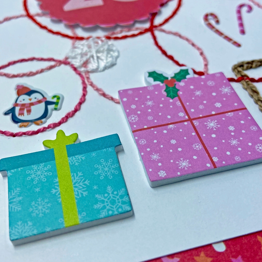
The presents below the tree belong to the Sugarplum Wishes Foam Stickers sheet. I punched the number 25 found on coordinating patterned paper in the collection (paper 8) and adhered it to the layout using more fun foam. I “hung” the remaining ornaments (penguin, candy canes, gingerbread men & reindeer) on the tree using matching puffy stickers.
Be sure to visit Paige’s Happy Scrappy Place Facebook Group to collect the free Christmas Cut File each day (December 1 – 25)! Thanks for joining me today and I hope I’ve inspired you to try some stitching and playing with Paige’s fabulous products! Stay tuned for another one of my layouts from these incredible cut files next week. Until then, stay safe, stay well, and Happy Scrapping!
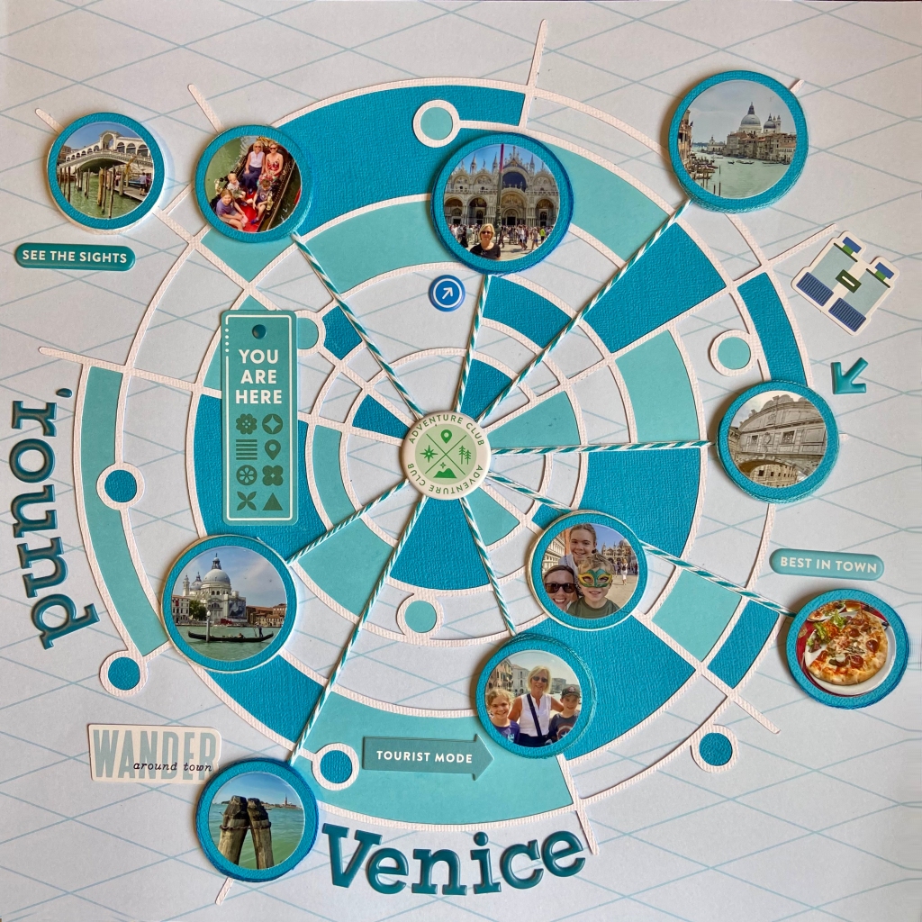
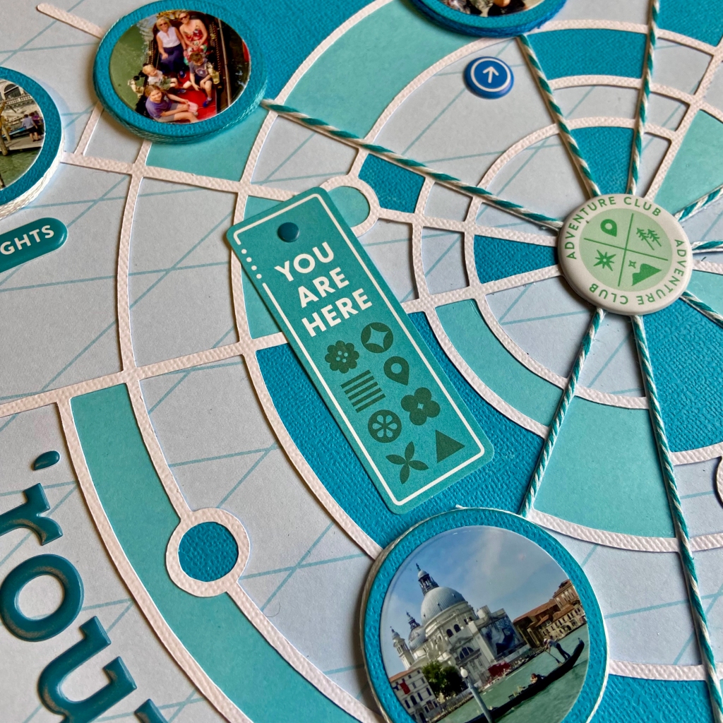
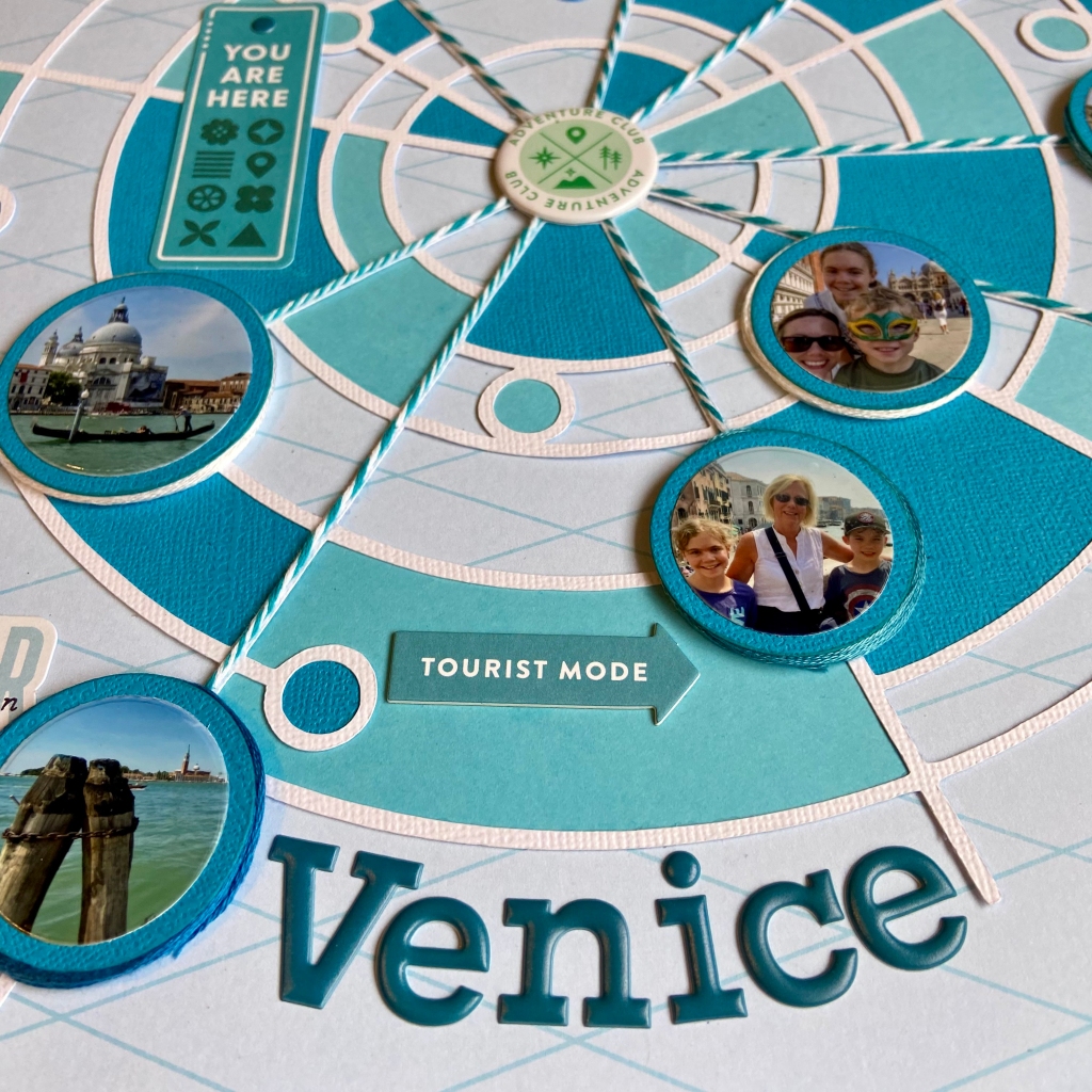
This past June, we experienced the delight of travelling to Venice with our daughter and family. To say that it was a magical time would be an understatement! We soaked in as much of the old city as possible in our time together. My highlight was a gondola ride with my daughter and three grandchildren. The beauty and mystique of this unique city really come to life when you ride a gondola down the winding canals. This layout was a way for me to capture the highlights of our incredible trip all on one page. I was honoured to have this layout published in Creative Scrapbooker Magazine’s Winter 2023/24 edition (page 96)!
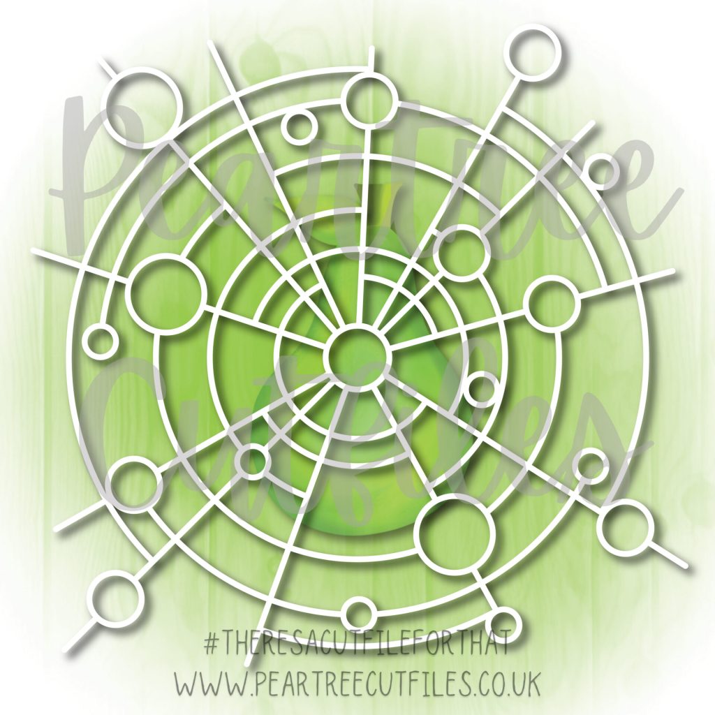
Trying to fit ten photos on one page was no small task. When I saw the Circles Within Circles cut file from Peartree Cutfiles, I immediately visualized a way to make it happen. My first step was to cut the file from white cardstock. Next, I imported the pictures I planned on using into my Silhouette software and resized them to fit into the designated circles on the cut file. The easiest way to ensure success with this technique is to use the “Bring to Front” option in the Silhouette software. Right-click on your cut file and select “Bring to Front”. Your photo(s) are now behind the cut file. Now, you can easily resize them to fit the section of the cut file you chose. Once sized and printed, I cut each photo with a circular die to fit each corresponding position on the cut file.
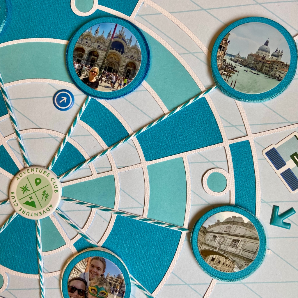
I turned to PinkFresh Studio’sTourist Mode collection to design this layout. I focused on a monochromatic effect and chose blue to mirror the jewel tones of the water surrounding Venice. The next stage in creating this page involved backing parts of the larger cut file with blue-toned cardstock. I turned to the Silhouette software to assist in this task as well. By utilizing the “Fill” panel, I coloured sections in the cut file with corresponding shades of blue. Once I was happy with my selections, I copied, offset them, and cut them out using the Silhouette. Once all these pieces were adhered to the back of the cut file, the cut file was centred and secured to the background paper.
In preparation for completing the layout, I matted each photo on the page in blue cardstock with a slight offset for framing. Next, the strands of blue and white twine were secured to the layout, starting from the centre and ending at several pictures. This effect helps draw the eye to the photos and emphasizes the story of being all over the city. I secured each photograph to the page with a smaller piece of fun foam beneath. A small gap underneath the edge was filled by wrapping embroidery floss in coordinating colours.
I really stepped outside my box to create this layout. I traditionally focus on one or two photos per page when I scrapbook. I am really thrilled with the results and hope you agree. One scrapbook layout that sums up our activities in Venice! Thanks so much for stopping by today. Until next time, stay safe, stay well, and Happy Scrapping!
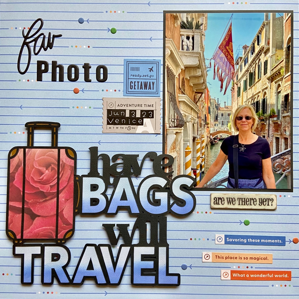
One of my favourite post-Covid activities is travelling! We are truly blessed to have family living in Austria that allow us to visit and use their home as a base to travel from. We made several trips overseas during the last twelve months, and have additional adventures planned ahead. I keep pinching myself that I should be so lucky! The picture in this layout is from Venice, Italy, where we met our family for more exploration and to make unforgettable memories together!
I chose the Tourist Mode paper collection and ephemera pack from PinkFresh Studio to document this romantic picture of Venice. I love how the colours in this collection complemented the beautiful colours of the canal.
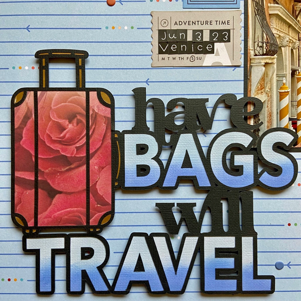
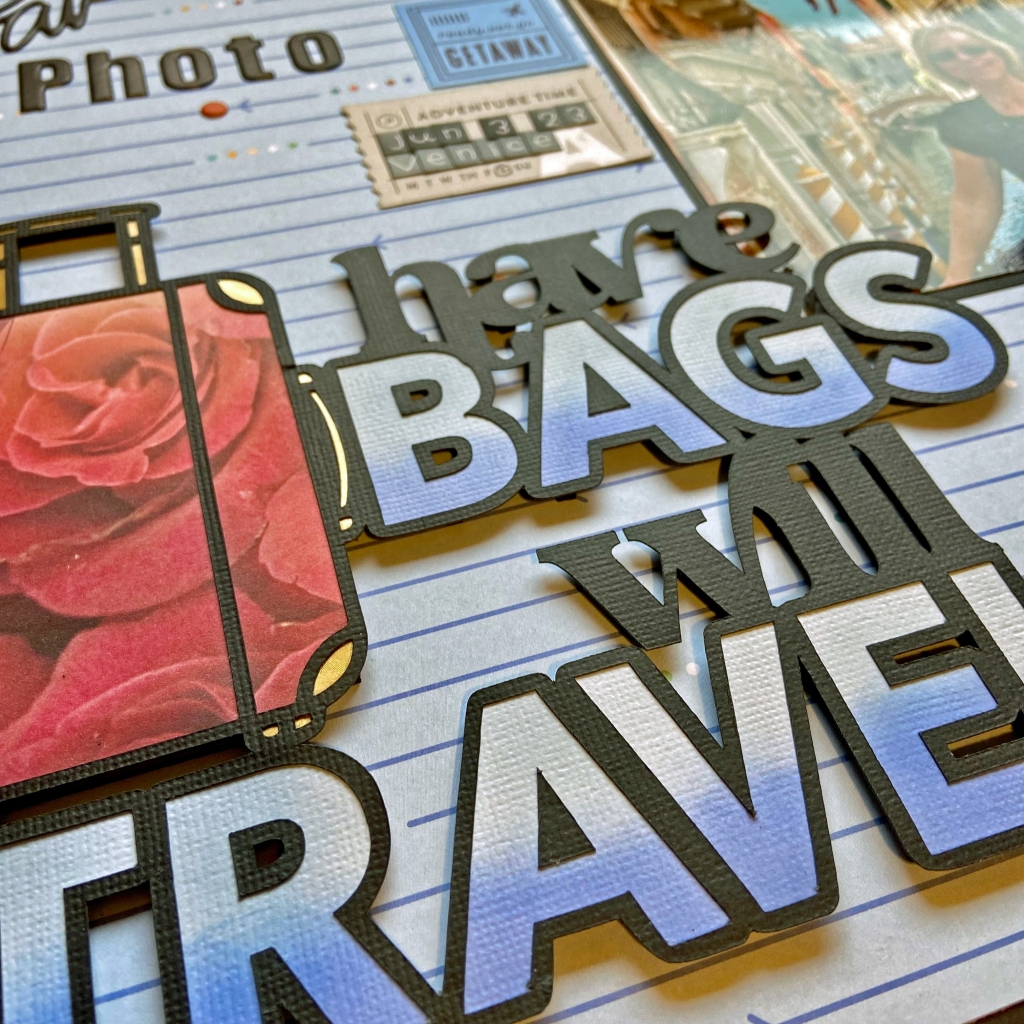
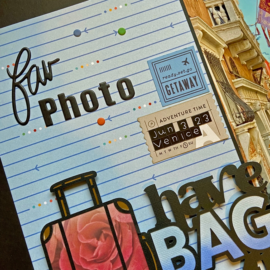
The title cut file, Have Bags Will Travel, comes from Peartree Cutfiles. It perfectly encompassed my feelings for these great adventures we’ve been taking.
I was also attracted to this cut file because it let me personalize the suitcase. Many friends know I travel with a pink and red rosed suitcase with gold fixtures. This beautiful cut file allowed me the ability to mimic this look. I used an older sheet of patterned paper in my stash from Creative Imaginations called Prom Paper to recreate this look. I turned to gold foil cardstock to create the gold accents.
To achieve the blue ombre effect in the title, I offset the letters slightly and cut them from white textured cardstock. Using Altenew inks in Blueberry and Winter Lake, each letter was inked to create the overall effect. Once I was happy with the overall tone and gradation of each letter, they were adhered to the back of the title. The entire title was secured to the layout using black dimensional fun foam for added texture and visual impact.
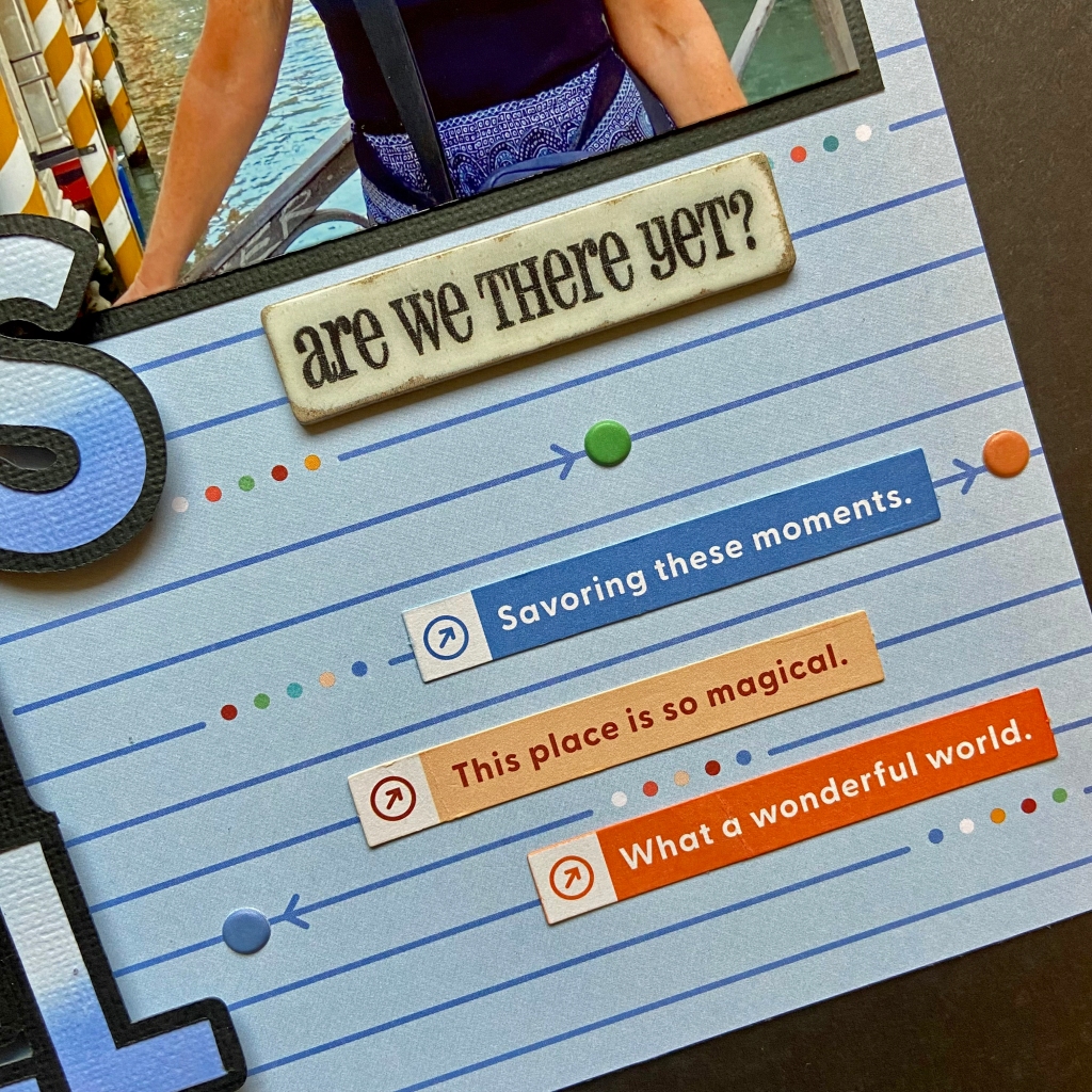
The bottom three phrase strips came from the Tourist Mode ephemera pack. The wording perfectly captured my thoughts and feelings on this trip. The origin of the “Are we there yet?” chipboard accent is unknown, as I have had it in my collection for many years.
The foam “Fav Photo” phrase and all the coordinated foam dots on the layout belong to Vicki Boutin’s “Loving This” thicker collection. The two additional pieces of ephemera belong to the Tourist Mode collection. Each piece of ephemera was inked along the edge with a colour-coordinated Altenew ink (Orange Sherbert, Orange Cream, Caribbean Sky, and Limestone). Doodlebug Designsteensy-type stickers were used to note the date and location.
I hope everyone finds an opportunity in their life to travel. For me, it is not only educational and enlightening, it is truly life-changing. Thanks for taking this trip with me today, and until next time, stay safe, stay well, and Happy Scrapping!
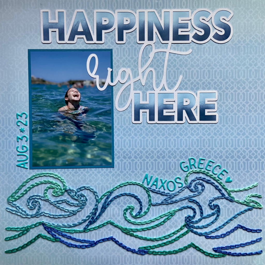
Oh, the pure bliss of swimming! And what could be better than swimming in the South Aegean off Naxos, Greece?! My daughter, son-in-law, and family vacationed in Naxos this summer; as you can see from the picture, it was a huge hit! Madison has always been a water baby, so this vacation was right up her alley. When I saw this picture I knew it was the perfect match for the Happiness Right Here cut file from Peartree Cutfiles. Peartree is celebrating its third birthday this month, and this cut file is free for the month of August. You can find the free version here. Come play along with the birthday celebration!
After cutting the file from white cardstock, the letters in the title were inked using Altenew’sBlueberry and Winter Lake inks. The lighter shade (Blueberry) was applied to the top of each letter and the darker (Winter Lake) was applied to the bottom to mimic the colours in the sea and the differences you see as the light hits the water.
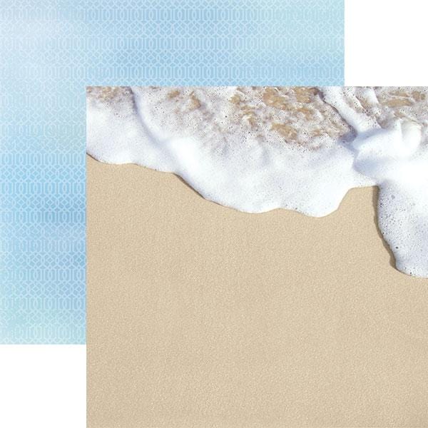
I chose the backside of the Seashore patterned paper from Paper House’sAt the Beach Collection to document this special moment.
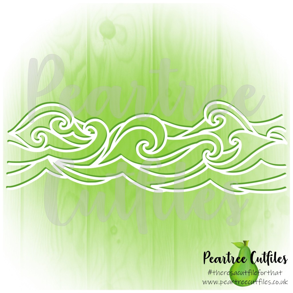
The soft jewel tones and gentle waves of the sea in the picture drew me to the Waves Border cut file to compliment this layout.
Rather than cut the file from coordinating paper with my Silhouette, I chose to stitch it. My first step was to flip the file horizontally and use a sketch pen to draw the design on the back of the patterned paper. I then used a paper piercer to hand pierce the pattern in preparation for stitching. I then gathered coordinating jew tone embroidery floss to mirror the colours of the sea in the picture and began stitching. A total of 8 colours were used to complete this design (Anchor Embroidery Floss: 130, 131, 160, 161, 185, 186, 187, 188). A chain stitch was used and I randomly changed threads as I worked my way through the design. I purposefully choose lighter tones for the top of the wave, and darker tones for those below. This process took several hours, but the results were well worth it!
I’m so happy to share in the celebration of Peartree Cutfiles 3rd Birthday. Their birthday challenge was a lot of fun and made me think outside of the box. Thanks for joining me today, and until next time, stay safe, stay well, and Happy Scrapping!